
Abstract
The last few decades have seen the hospital environment become more and more technologically advanced with the development of advanced diagnostic and surgical tools. The beds have also undergone a radical transformation, thanks to the integration of electrical and electronic components, that have allowed the birth of the modern widespread electric beds. This work presents a checklist developed to test the usability of the pushbutton panels that control their movements, which could be useful in designing a controller capable of considering the needs of users such as caregivers and patients. The checklist items were created starting from the usability guidelines and then placed within an appropriate Nielsen heuristic. The tool thus designed was tested in a usability expert evaluation session with five experts. The data collected were the responses to the checklist, the experts’ comments, the notes collected during the procedure, the time to complete, and the severity and frequency of the problems detected. The results showed that the checklist could detect a substantial series of significant usability problems in a short time, which makes it an easily usable tool in the industrial field for rapid and valuable tests for future interfaces design. The usage of this developed checklist could be useful to design better control panels to facilitate both caregivers’ work and patients’ stay.
Access provided by Autonomous University of Puebla. Download conference paper PDF
Keywords
1 Introduction
Healthcare and eldercare facilities are currently struggling to cope with patients’ needs all over the world. Among others, the problem of staff shortage is very well known in this field, and caregivers found themselves faced with increasingly high workload and stress levels, characterized by risks, precarious working conditions, long and irregular shifts, and emotional pressures [1]. A recent and extensive study carried out in Switzerland in 2018 [2] described a survey with 1840 respondents in the hospital sector showing how the physical, mental, and emotional workload play fundamental roles in developing burnout and intention to leave the profession. The study showed that work stress accounts for 40 to 43% of burnout cases, while for 22–29% of the cases of intention to leave. These data, therefore, show how the health system is greatly affected by the problems deriving from the ageing of the population and the contemporary demographic increment which, combined with the lack of personnel, set hospitals and nursing homes in a difficult condition. Besides, the COVID-19 pandemic and the health crisis have revealed a new set of weaknesses of the sanitary systems, such as the insufficient number of beds in intensive care units [3], and have exacerbated the lack of personnel. Moreover, the large number of patients who needed regular or long-term hospitalization [4] has highlighted the relevance of specific facilities that help caregivers to reduce their workload.
All these issues that in different manner concern both eldercare and healthcare, affect the quality of life and working environment of caregivers, but they also impact the quality of care delivered to guests and patients. Therefore, helping health workers and nurses will allow all categories to improve care quality, given and received. This paper addresses how to help hospital staff work more efficiently without having negative repercussions on work stress. One of the most common solutions and one of the most valuable aids could be the intervention of increasingly sophisticated technologies, capable of making hospital procedures easier or less tiring. These innovations certainly provide proper support, but, at the same time, they can introduce complex tools into the caregivers’ work practice, which require to be studied and understood, especially when it comes into contact also with patients. It is crucial to ensure that these technologies are designed according to principles that make them effective, efficient, and satisfying. These characteristics fall within the concept of Usability, defined as “the extent to which a system, product or service can be used by specified users to achieve specified goals with effectiveness, efficiency and satisfaction in a specified context of use” [5]. Given the strong influence that usability exerts on the increase of work well-being, the reduction of time pressure and other aspects of the work of doctors and the rest of the hospital staff [6], the point is, therefore to make more usable the instruments used in these environments.
This work was born from these concepts and from the intention to create an easy and rapid assessment tool to evaluate hospital bed control panels. To this end, a checklist was devised, and the control panel (Fig. 1.a) present in the Delta4 model (Fig. 1.b) of the beds produced by the Malvestio Spa. was evaluated. The study examined a patient’s push-button panel considering a specific tool that could be potentially exploited to assess any type of bed controller.

a) Patient’s control panel; b) Delta4 bed
1.1 Electrical Medical Beds
The modern history of hospital beds and related innovations has been explored in some recent reviews by Ghersi [7, 8]. In its older work, he tackles the evolution of hospital beds from the 1940s to 2000, identifying three macro stages, starting with the era of electric beds, passing through mechatronic beds up to intelligent mechatronic beds. He identified the origin of the electrical beds when the adjustable sides were invented, between 1815 and 1825 [9]. Following technology development, these supports gradually acquire greater intelligence and automatisms, transforming themselves into what he defines as Intelligent Mechatronic Beds. In modern electric hospital beds, software, and hardware work together to allow the bed and its components to move in a concerted manner, thus integrating mechanics with electronics and computer science.
The most advanced versions of these tools are equipped with an electrical engine, capable of moving some of their parts (e.g., backrest) to meet people’s needs in terms of personalization and comfort. The modern bed is usually divided into four different sections. This configuration, with 3 articulated parts (back, thighs or upper leg, calves or lower leg) and a central part fixed, prevents the mattress from deforming and at the same time guarantees an equal pressure distribution even if the movement of each section reaches its limit. The leg and the torso sections can also be moved thanks to electric or other actuators. Moreover, thanks to the double-section configuration of the leg section, subdivided in thighs (upper leg) and calves (lower leg), the former allows a slight elevation in its central part, at the knees level. This allows reaching a position similar to an armchair (chair position). A scheme of this structure is shown in Fig. 2.

Scheme of the structure of the bed. 1 – backrest; 2 – central fixed section; 3 – thighs or upper leg; 4 – calves or lower leg.
Subsequently, another extensive work by Ghersi [8] highlighted how the hospital bed market is increasingly evolving towards their smart forms. These bed features cutting-edge technologies and are designed to have high functionality and advanced user interfaces. Nowadays, therefore, in the hospital environment, product efficiency is fundamental and has become one of the discriminating factors that will lead to its success [10]. Control panels represent the physical interfaces that allow patients and professional caregivers to control the beds’ movements. Therefore, it would be desirable that the design and development of the control interfaces will consider usability aspects, such as efficacy and efficiency.
1.2 Human Factors on Medical Beds
Despite the increasingly urgent and well-recognised need to study human factors related to hospital beds. The research in this field has mainly focused on technical aspects, such as algorithms for patient monitoring systems to reduce false alarms [11], pressure-sensing mat to optimize repositioning of the patients [12] and pressure sensors to predict falling accidents and bedsores [13].
Studies investigating usability in healthcare environment are less frequent, even though there are a few exceptions. For example, a recent study [14] used semi-structured interviews and a usability questionnaire to define design guidelines for instruments in operating room. A recent review [15] sought to summarize and organize the studies carried out so far in the general field of medical devices, demonstrating the interest of human factors in hospital technologies.
However, pertaining to hospital beds, some investigations concerning their usability are present in the literature. First of all, it is interesting to know that the electric hospital bed has been tested to verify its effectiveness as a technological advance compared to previous versions, such as the hydraulic one. A video analysis study [16] has demonstrated their superiority by analyzing tasks carried out by couples of nurses who had to deal with problems relating to bed hygiene and the transfer of a patient from it to a wheelchair. In this study, the outcomes of a survey administered to 63 caregivers highlighted a high level of usability for the electric bed.
Regarding the design of the bed, an extensive study by Wiggerman [17] has shown how manufacturers are increasingly interested in the human-centric approach, in which users are involved in the development process. This work presents many usability tests (over 20 studies with more than 130 caregivers) that were carried out to identify the interfaces’ potential usability problems. Again, this design approach is then concretized, in the final stages, with tests in a real environment. Regarding this last point, an example of a test is the one carried out by Cai and colleagues [18]. In their study, a smart bed, and the associated functions and technologies, was tested for 12 months in a hospital. The nurses involved were then interviewed to define any technical and usability problems.
Going more specifically to particular parts of the bed, one of the issues most encountered by hospital staff concerned the effort required to move a bed, with a patient on it, from one place to another in the hospital. In this sense, the innovations sought by the manufacturers, such as the 5th motorized wheel and alternative brake positions, have been studied to understand which solution could be the least tiring to use [19]. Thanks to quantitative and qualitative measures, these studies have shown how the 5th wheel drastically reduces perceived fatigue and the need to have the brake pedals particularly accessible to the operators, both for the patient’s safety and any operators’ back pain.
As for the bed controls, the attention to the usability associated with them is more recent, although, even in this field, they are often addressed to new emerging technologies, such as gestures. In a study of 2017 [20], some interviews showed how this control method (i.e., gestures) was recognized by caregivers as potentially suitable, given the possibility of hands-free control and reduced infection ability due to the reduced use of physical interfaces. Despite the advent of these innovations, the physical interface currently remains the golden standard for beds worldwide. In Lin and colleagues [21], they tested the usability of 6 different types of controllers with 20 nurses. Finally, even in one of the aforementioned studies [18], an electronic push-button panel was also tested, defined by the users interviewed as very useful and often used.
1.3 Usability Checklist
Usability checklist is a well-established methodology in Human-Computer Interaction that allow to evaluate the usability of a user interface in a rapid and cost-effective manner. Generally speaking, a usability checklist consists of a set of rules or guidelines that the user interface is expected to meet, and that a number of participants is asked to evaluate [22]. One of the main advantages of usability checklists is that they provide reliable results even with very small samples of evaluators, namely five, thereby being extremely convenient [22]. Initially, usability checklists were developed around the usability heuristics proposed by Nielsen [23]. While still being a seminal reference, such guidelines need to be adapted to the very specific case of study.
Over the years, usability checklists have been deployed to evaluate a variety of different interfaces, including websites [24], Augmented Reality applications [25], virtual environments [26], just to mention a few.
Several studies employed checklists to investigate the usability of mobile apps addressing patient monitoring of specific health issues [27] or to evaluate software for doctors’ appointment management [28]. However, the user interfaces with which healthcare professionals directly interact on a daily basis have rarely been assessed using such method.
The aim of the present work is to apply a purposefully devised usability checklist for the evaluation of the control panel of an electric hospital bed.
2 Materials and Methods
2.1 Checklist Development
The checklist’s creation was divided into three phases: the selection of the usability guidelines, the distribution of the same within the ten Nielsen heuristics, a first pilot to test their effectiveness, and the removal of the unsuitable ones.
-
Usability Guidelines Selection. During the creation of usability questionnaires or checklists, one of the main limitations is forgetting some critical elements to analyze. To overcome this problem, it was decided to start from the guidelines to ensure the greatest number of controlled features. The Checklist items were elaborated based on the usability guidelines for design technology hospital settings [29]. Each guideline consistent with the purpose of the experiment was rephrased to be suitable as a checklist item and translated into Italian.
-
Items Distribution. The ten Nielsen heuristics [30] were used to firstly define the dimensions and general usability principles of the Checklist. Subsequently, they were slightly modified and adapted, when necessary, to the context and to the evaluation of a physical interface to permit the insertion of items generated from the guidelines. The dimensions used were:
-
1.
Visibility of system status. The system should provide clear and rapid feedbacks to inform the user about its current status.
-
2.
Match between system and the real world. The system should use a familiar language to the user, following conventions and logical order. Possible user actions should match the real-world effects.
-
3.
Give the user control with comfort. The user should be free to use the interface without impediments that facilitate errors or make the interaction less pleasant.
-
4.
Consistency and standard. The user should not worry about finding conflicting elements within the system, which should follow platform conventions.
-
5.
Error prevention. The system should be designed to prevent errors. In case of errors or dangerous situations, it must provide quick and punctual help for its resolution.
-
6.
Recognition rather than recall. It is important to minimize the memory load elicited by the system by making the information easily accessible and intuitive.
-
7.
Flexibility, accessibility, and efficiency of use. Experienced users should be able to use shortcuts to reduce system usage time. This should also be flexible and accessible enough to allow use by all types of users.
-
8.
Aesthetic and minimalist design. The system should not present information that is irrelevant or infrequently used. The aesthetics should also be nice.
-
9.
Help users recognize, diagnose, and recover from errors. The error messages should be clear and precise, indicating their resolutions.
-
10.
Help and documentation. The system should be usable without the instructions. When a system could not achieve this objective, the information should be easy to find and centered on the user’s needed actions, with step-by-step guides. The documentation should not be too long.
-
1.
-
Pilot Study. After inserting the items based on the guidelines into the most suitable usability principles categories, a first pilot experiment was carried out with some usability experts (N = 4). The purposes were to test the experimental procedure, refine the items statements eventually, remove the unsuitable items, and potentially add missing ones, according to the expert’s comments. The final checklist (fundable in the Appendix section) integrated items adapted from specific guidelines and from the usability experts’ comments. The total number of items created is 34.
2.2 Scoring and Measures
Participants’ responses to the checklist items could be positive, negative, or not applicable (Yes; No; N.A.). Since the items were formulated to be in accordance with the guidelines, the single items score was obtained by calculating the percentage of positive responses, and as regards the dimensions, the average was then extracted. The only exception was the item 34 (“The documentation material is necessary for the use of the bed control panel”), in which the item was negatively formulated, and it was reversed. In addition, users’ notes were collected in the checklist, together with any behaviour or comments that participants made during the experience. Moreover, the time spent to complete the checklist was considered. After the first analysis of the checklist, the participants fill a questionnaire to assess the level of severity of the problem detected. This Severity Questionnaire follows the scoring scale stated by Nielsen [31] that assign to every problem a score from 0 to 4: 0 = I don’t agree that this is a usability problem at all; 1 = Cosmetic problem only: need not be fixed unless extra time is available on project; 2 = Minor usability problem: fixing this should be given low priority; 3 = Major usability problem: important to fix, so should be given high priority; 4 = Usability catastrophe: imperative to fix this before product can be released. Finally, the frequency in which they were reported on the Checklist or identified by users during the procedure was calculated for each problem.
2.3 Experimental Procedure
The experiment involved 5 usability experts (F = 3, Mean age = 31, SD = 5.8) and took place in a laboratory setting where a hospital bed featuring a cabled control-panel was placed. The bed presents two push-button control panels, one for patients and one for operators. The latter can lock the patient’s one, to deprive people at risk of bed control. Before the participant’s arrival, the experimenter blocked the control-panel to activate the LED associate with this state and permits its visualization to participants who did not have previous experience with the bed. In fact, they did not receive specific instructions on the control panel to test the intuitiveness of the system. They were asked to perform a series of actions to explore all the bed functions: turning on/off the key panel, reaching the minimum/maximum of the backrest, leg section, and bed height, finally setting the chair and safe exit positions. They could freely explore these features in the preferred order as many times as they deem necessary and in every preferred positions. Due to the starting blocked state, participants initially tried to use the panel, but it was blocked, as the experimenter explained. He unlocked the control panel only after they asked for it. After participants decided that they have completed their free exploration of the bed functions, they were administered with the Checklist. Finally, the researcher provided the control panel user manual to enable participants to fill the items of the heuristics Help and Documentation. Following the regulations for the limitations of the COVID-19 spreading, the bed was then sanitized after each use.
3 Results
This procedure has allowed the collection of different types of data, starting from the results of the items. The average percentage of positive responses showed the strengths of the control panel, while the percentage of negative responses showed the weaknesses. The results of these data analyses follow within the dimensions of the checklist. The results are shown below according to the order of dimensions and are summarized in Fig. 3.

The graph shows the mean percentage obtained for each heuristic. Vis = Visibility of system status; Mat = Match between system and the real world; UseF = User control and freedom; Con = Consistency and standards; Err = Error prevention; Rec = Recognition rather than recall; Flex = Flexibility and efficiency of use; Aes = Aesthetic and minimalist design; Help = Help users recognize, diagnose, and recover from errors; Doc = Help and documentation
-
Visibility of System Status. The control panel was found to comply with the usability guidelines in 70% of the cases. In particular, the participants highlighted that there should be more feedback types and a faster bed’s response to clarify the activation of the button. The lack of different types of feedback, other than the movements of the bed, was also highlighted by the experts’ comments. For example: “Lack of visual feedback that indicates to continue pressing the button.”; “Differences in the delay of the response to the key by the movement of the bed”; “At the beginning, it is natural to press shortly the buttons and this does not affect the bed”; “The answer is not always immediate”. However, it has been noted that the materials used for the creation of the keys could create an adequate tactile sensation (“holding the button down, it became concave and gave a feeling of feedback”). The notes were also consistent, highlighting the lack of feedback, especially of a visual type (“the number of LEDs should be increased”). The participants highlight an issue regarding the backrest lifting function, which stops in correspondence of 30° without giving any indication to the user (“apart for the backrest that stops halfway”).
-
Match Between System and the Real World. 60% of responses complying with guidelines. Most of the participants noticed the same problem about the cardiologic chair button (Fig. 4), which appears to be the same both for the upper and for the lower position (“the cardiac chair should be clearer”).
Fig. 4. 
Cardiologic chair buttons highlighted by the oval shape.
-
User Control and Freedom. 80% of responses complying with guidelines. The experts highlighted issues regarding the cable that connects the control panel to the bed (e.g., “if the cable were longer it would be more comfortable”), also confirmed by the experimental notes (“too short cable”). Despite this, the checklist highlighted this problem in the comments but met all participants’ approval. Moreover, the control buttons panel cannot be used with only one hand most of the times (“It would be difficult to reach all the buttons without moving the hand holding the remote control”; “Especially for the higher keys it was more comfortable to hold it with one hand and press them with the other”). The questions also highlighted that it is not clear which one is a safe position button (“It is not so intuitive what the safety positions are”).
-
Consistency and Standards. Despite the majority of responses comply with the guidelines (80%), question 11 once again highlighted the problems concerning the chair’s cardiology button which, unlike the sour buttons, do not have up and down arrows (“Chair buttons do not have up or down”).
-
Error Prevention. The responses were generally positive and in according with the guidelines (71.5%). The buttons for the lowest height (Fig. 5.a) also lack a textual part to clarify its function and the only one present, the word “low” (Fig. 5.b), is in English (“English label”). It is not very clear to the participants why the backrest stop at a certain point and one of them also notice that the buttons may be pressed twice or more to reach the end of the movement due to button slippery (“No, and it is not clear that the movement has not reached the end of its travel and can continue with a further pressure of the key (30°); it is possible to lose pressure in a few moments, and the desired movement is interrupted”). The score is also significantly lowered by the absence of visibility in dark conditions.
Fig. 5. 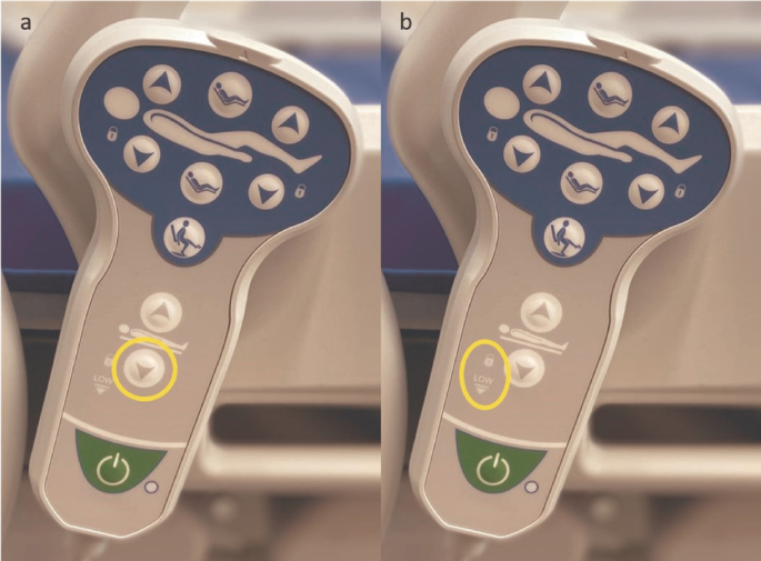
(a) The left image shows the button to set the bed at the lowest height; (b) the image on the right shows the “low” label.
-
Recognition Rather than Recall. 70% of responses complying with guidelines. The cardiologic chair button (Fig. 4) was mentioned as the major usability problem of the control panel. Three out of five participants have remarked this problem in the comments and during the procedure (“therapeutic chair not understandable”; “not all icons are understandable, the therapeutic chair is not “).
-
Flexibility and Efficiency of Use. Despite a good average of responses in accordance with the guidelines (80%), the participants did not highlight major problems regarding visibility and accessibility of the control panel. Although, the score is lowered because of the problem with the English label “low”.
-
Aesthetic and Minimalist Design. No problems founded in this dimension (100%). Materials seem to be very well accepted and liked by all the usability experts.
-
Help Users Recognize, Diagnose, and Recover from Errors. In general, this dimension achieved excellent compliance with the guidelines (100%).
-
Help and Documentation. 80% of responses complying with guidelines. Two of the experts highlights that the arrows in the instruction (Fig. 6) should provide information and point to all the buttons present (“Attention to the arrows of the backrest, lower and upper legs, they should point both directions, up and down”; “they should be indicated for columns”). Also, one of the participants point out that instructions would be necessary to understand the LEDs meaning.
Fig. 6. 
Graphic part of the instructions


Concluding, the mean completion time of the Checklist was 502 s (i.e., ~9 min). The total mean percentage score of all the Checklist dimensions was 79.2% of positive answers. The analysis of the checklist results and the following administration of the Severity questionnaire are described in Table 1.
4 Discussion
The objective of this study was to create a quick, easy to use and efficient tool (i.e., Usability Checklist), able to allow an in-depth analysis of the usability problems of the pushbutton panels of modern hospital beds. The motivation was to fill the absence in literature, as far as we know, of tools that evaluate hospital beds’ control panel design. During the study, this instrument was then tested to assess its ability to highlight usability problems. Consistently, the Checklist devised proved to be able to highlight some critical usability issues in a reasonable time (i.e., about 9 min).
The analyses results and the subsequent categorization of the problems according to their severity have highlighted some critical issues. Firstly, the Checklist showed a lack of multiple feedback (Mdn = 2) provided to the user to assist him/her in understanding how s/he is interacting with the system. The bed itself, with the movement and noises of the actuators, is the primary feedback. Additional feedbacks, such as haptic and visual, were suggested by the experts as possible solutions. The absence of visual feedback underlined a low level of accessibility of the control panel for people in a dark environment or with visual impairment/blindness (Mdn = 3). Combined with the fact that it does not present backlights or LEDs, the checklist results suggest their implementation or the development of a surface, perhaps with elements in relief, which will enable to recognize the buttons without necessarily using the view. Therefore, this attention is necessary to allow everyone to use the control panel correctly and easily and permit an improved accessibility.
Another problem reported by the experts was the “chair position” button (Mdn = 3). To reach this position, one would need to press the button located above the man’s figure while returning to the horizontal position requires to press the lower one. However, since the two icons on the buttons are the same, it was considered not very intuitive. Again, regarding the icons, users have shown how the ones indicating potentially safer positions for the patient (safe exit and minimum height) are not well highlighted (Mdn = 3).
Regarding the ease of access and use of the control panel, the checklist highlighted that the push-button panel is difficult to use with only one hand (Mdn = 2) and that it is not always sufficient to press the button once to get to the end of the movement (Mdn = 2). The latter issue could both due to the loss of grip during the pressure of the button, which is annoying when dealing with the system for a long time, and to the stop of the backrest at 30° by default without a comprehensible feedback (Mdn = 3).
Lastly, the results obtained by the observations of the “low” LED indicate the necessity to use labels in the native language (Mdn = 2).
On the other hand, the checklist was also able to highlight the strengths of the control panel. This last obtained 79.1% of positive responses in according to the guidelines, thus achieving a good degree of general usability. Furthermore, excluding the button of therapeutic chair, the icons used were clear and intuitive. The last four dimensions of the Checklist also showed how the aesthetics, the flexibility of use in terms of ease of grip and recovery from any errors, and, finally, the information materials, represent the panels’ strengths.
5 Conclusions
The usability checklist and the experimental procedure showed the possibility of analyzing the usability aspects of an electric bed button panel in detail, highlighting the strengths and weaknesses of the devised tool. The ease of use and analysis of the collected data, combined with its rapidity, makes it a valid tool for improving these essential control interfaces for hospital beds quickly and at reasonable costs. A possible limitation of the present study is to use the heuristics defined by Nielsen [22], which represent rules for interfaces in general. During the development phase, the items created were then included in the usability heuristic that seemed most suitable to accommodate them. In some cases, not all the items appeared to fit perfectly with the specific heuristics definition. Future work may be necessary to redefine some of these Nielsen’s heuristics, as already accessed in other areas [32, 33], to adapt them to these particular devices to improve the usability checklist. Finally, future studies could consider different versions of the checklist for assessing various types of control interfaces, such as touchscreens that start to be used in the most advanced hospital beds.
References
Büssing, A., Falkenberg, Z., Schoppe, C., et al.: Work stress associated cool down reactions among nurses and hospital physicians and their relation to burnout symptoms. BMC Health Serv. Res. 17, 1–13 (2017). https://doi.org/10.1186/s12913-017-2445-3
Hämmig, O.: Explaining burnout and the intention to leave the profession among health professionals - a cross-sectional study in a hospital setting in Switzerland. BMC Health Serv. Res. 18, 1–11 (2018). https://doi.org/10.1186/s12913-018-3556-1
Ma, X., Vervoort, D.: Critical care capacity during the COVID-19 pandemic: global availability of intensive care beds. J. Crit. Care 58, 96–97 (2020). https://doi.org/10.1016/j.jcrc.2020.04.012
Pecoraro, F., Clemente, F., Luzi, D.: The efficiency in the ordinary hospital bed management in Italy: an in-depth analysis of intensive care unit in the areas affected by COVID-19 before the outbreak. PLoS ONE 15, e0239249 (2020). https://doi.org/10.1371/journal.pone.0239249
ISO: Ergonomics of human-system interaction—Part 11: Usability: Definitions and concepts. ISO 9241-112018(E) (2018). https://www.iso.org/obp/ui/#iso:std:iso:9241:-11:ed-2:v1:en.
Vainiomäki, S., Aalto, A.M., Lääveri, T., et al.: Better usability and technical stability could lead to better work-related well-being among physicians. Appl. Clin. Inform. 8, 1057–1067 (2017). https://doi.org/10.4338/ACI-2017-06-RA-0094
Ghersi, I., Mario, M., Miralles, M.T.: From modern push-button hospital-beds to 20th century mechatronic beds: a review. In: Journal of Physics: Conference Series, vol. 705 (2016). https://doi.org/10.1088/1742-6596/705/1/012054
Ghersi, I., Mariño, M., Miralles, M.T.: Smart medical beds in patient-care environments of the twenty-first century: a state-of-art survey. BMC Med. Inform. Decis. Mak. 18, 1–12 (2018). https://doi.org/10.1186/s12911-018-0643-5
Who Invented Medical Beds - Medical Beds. http://www.medical-beds.co.uk/who-invented-medical-beds.html
de Bruin, A.M., Bekker, R., van Zanten, L., Koole, G.M.: Dimensioning hospital wards using the Erlang loss model. Ann. Oper. Res. 178, 23–43 (2010). https://doi.org/10.1007/s10479-009-0647-8
Schmid, F., et al.: Reduction of clinically irrelevant alarms in patient monitoring by adaptive time delays. J. Clin. Monit. Comput. 31(1), 213–219 (2015). https://doi.org/10.1007/s10877-015-9808-2
Gunningberg, L., Carli, C.: Reduced pressure for fewer pressure ulcers: can real-time feedback of interface pressure optimise repositioning in bed? Int. Wound J. 13, 774–779 (2016). https://doi.org/10.1111/iwj.12374
Hong, Y.S.: Smart care beds for elderly patients with impaired mobility. Wirel. Commun. Mob. Comput. 2018 (2018). https://doi.org/10.1155/2018/1780904
Surma-aho, A., Hölttä-Otto, K., Nelskylä, K., Lindfors, N.C.: Usability issues in the operating room – towards contextual design guidelines for medical device design. Appl. Ergon. 90 (2021). https://doi.org/10.1016/j.apergo.2020.103221
Bitkina, O.V., Kim, H.K., Park, J.: Usability and user experience of medical devices: an overview of the current state, analysis methodologies, and future challenges. Int. J. Ind. Ergon. 76 (2020). https://doi.org/10.1016/j.ergon.2020.102932
Capodaglio, E.M.: Electric versus hydraulic hospital beds: differences in use during basic nursing tasks. Int. J. Occup. Saf. Ergon. 19, 597–606 (2013). https://doi.org/10.1080/10803548.2013.11077010
Wiggermann, N., Rempel, K., Zerhusen, R.M., et al.: Human-centered design process for a hospital bed: promoting patient safety and ease of use. Ergon. Des. 27, 4–12 (2019). https://doi.org/10.1177/1064804618805570
Cai, H., et al.: A qualitative study on implementation of the intelligent bed: findings from a rehabilitation ward at a large Chinese tertiary hospital. Wirel. Pers. Commun. 90(1), 399–420 (2016). https://doi.org/10.1007/s11277-016-3375-9
Kim, S., Barker, L.M., Jia, B., et al.: Effects of two hospital bed design features on physical demands and usability during brake engagement and patient transportation: a repeated measures experimental study. Int. J. Nurs. Stud. 46, 317–325 (2009). https://doi.org/10.1016/j.ijnurstu.2008.10.005
Fudickar, S., Flessner, J., Volkening, N., Steen, E.-E., Isken, M., Hein, A.: Gesture controlled hospital beds for home care. In: Wichert, R., Mand, B. (eds.) Ambient Assisted Living. ATSC, pp. 103–118. Springer, Cham (2017). https://doi.org/10.1007/978-3-319-52322-4_7
Lin, X., Zhang, Z.: Designing remote control of medical bed based on human factors. In: 2020 IEEE 7th International Conference on Industrial Engineering and Applications, ICIEA 2020, pp. 838–841 (2020). https://doi.org/10.1109/ICIEA49774.2020.9101944
Nielsen, J., Molich, R.: Heuristic evaluation of user interfaces. In: Conference on Human Factors in Computing Systems - Proceedings, pp. 249–256. Association for Computing Machinery (1990). https://doi.org/10.1145/97243.97281
Nielsen, J.: Usability inspection methods. In: Conference on Human Factors in Computing Systems - Proceedings, pp. 413–414. Association for Computing Machinery (1994). https://doi.org/10.1145/259963.260531
Keevil, B.: Measuring the usability index of your Web site. In: Proceedings of the 16th Annual International Conference on Computer Documentation, SIGDOC 1998, pp. 271–277. ACM Press, New York (1998). https://doi.org/10.1145/296336.296394
De Paiva Guimarães, M., Martins, V.F.: A checklist to evaluate augmented reality applications. In: Proceedings of 2014 16th Symposium on Virtual and Augmented Reality, SVR 2014, pp. 45–52 (2014). https://doi.org/10.1109/SVR.2014.17
Munoz, R., Barcelos, T., Chalegre, V.: Defining and validating virtual worlds usability heuristics. In: Proceeding of the International Conference of the Chilean Computer Science Society, SCCC, pp. 171–178 (2012). https://doi.org/10.1109/SCCC.2011.23
Anderson, K., Burford, O., Emmerton, L.: App chronic disease checklist: protocol to evaluate mobile apps for chronic disease self-management. JMIR Res. Protoc. 5, e204 (2016). https://doi.org/10.2196/resprot.6194
Inal, Y.: Heuristic-based user interface evaluation of the mobile centralized doctor appointment system: a case study. Electron. Libr. 37, 81–94 (2019). https://doi.org/10.1108/EL-06-2018-0114
Weinger, M., Wiklund, M., Gardner-Bonneau, D.: Handbook of Human Factors in Medical Device Design (2010). https://doi.org/10.1201/b10439
Nielsen, J.: Heuristic Evaluation Ten Usability Heuristics (2005). https://www.nngroup.com/articles/ten-usability-heuristics/
Nielsen, J.: Severity Ratings for Usability Problems. Nielsen Norman Group (1995). http://www.nngroup.com/articles/how-to-rate-the-severity-of-usability-problems/
Inostroza, R., Rusu, C., Roncagliolo, S., Rusu, V.: Usability heuristics for touchscreen-based mobile devices: update. In: Proceedings of the 2013 Chilean Conference on Human-Computer Interaction, pp. 24–29 (2013). https://doi.org/10.1145/2535597.2535602
Quiñones, D., Rusu, C.: How to develop usability heuristics: a systematic literature review. Comput Stand. Interfaces 53, 89–122 (2017). https://doi.org/10.1016/j.csi.2017.03.009
Acknowledgment
The research project was partially supported by Malvestio Spa.
Author information
Authors and Affiliations
Corresponding author
Editor information
Editors and Affiliations
Appendix
Appendix
The complete list of the Checklist items is provided.
Visibility of system status
-
1.
Pressing a key corresponds to immediate feedback from the push-button panel.
-
2.
If present, the feedback provided is easily identifiable.
-
3.
If present, the feedback provided takes place in multiple ways.
-
4.
When a key is pressed, it provides tactile feedback.
-
5.
It is easy to tell if the push of a button affects the bed.
-
6.
Understanding when the movement has ended is easy.
Match between system and the real world
-
7.
The movements that the bed can make are represented understandably by the buttons on the control panel.
Give the user control with comfort
-
8.
Pushing the buttons does not require excessive physical effort.
-
9.
It is always possible to use the push button panel while remaining in a comfortable position.
-
10.
The push button panel can always be used with one hand.
Consistency and standard
-
11.
The icons used are consistent with each other.
Error prevention
-
12.
A single push of the button is enough to perform the desired movement until it ends.
-
13.
The positioning of the push-button panel prevents accidental actions from being performed.
-
14.
The keys for the safety positions are well identifiable.
-
15.
The buttons are adequately spaced from each other.
-
16.
The buttons have a surface that facilitates pressing.
-
17.
The buttons are clearly visible even in darkness.
-
18.
In case the wrong key is pressed, it is easy to return to the previous position.
Recognition rather than recall
-
19.
The meaning of the icons is intuitive.
-
20.
The icons have understandable symbols.
Flexibility, accessibility, and efficiency of use
-
21.
The push-button panel is easily accessible.
-
22.
The push-button panel is always visible.
-
23.
The push-button panel can be easily grasped with both hands.
-
24.
The travel of the buttons, i.e., the space between pressing the button and its activation, is adequate.
-
25.
The height of the buttons is adequate.
-
26.
The icons have both graphic and textual elements where needed.
Aesthetic and minimalist design
-
27.
The icons used are aesthetically pleasing.
-
28.
The icons used are large enough.
-
29.
The materials used for the buttons are pleasant to the touch.
-
30.
The materials used for the buttons are aesthetically pleasing.
Help users recognize, diagnose, and recover from errors
-
31.
It is easy to understand when the hand control is locked.
-
32.
It is easy to understand when the hand control is off.
Help and documentation
-
33.
The documentation material is easily understandable.
-
34.
The documentation material is necessary for the use of the bed control panel.
Rights and permissions
Copyright information
© 2021 Springer Nature Switzerland AG
About this paper

Cite this paper
Bacchin, D., Pluchino, P., Orso, V., Sardena, M., Malvestio, M., Gamberini, L. (2021). Development and Testing of a Usability Checklist for the Evaluation of Control Interfaces of Electrical Medical Beds. In: Duffy, V.G. (eds) Digital Human Modeling and Applications in Health, Safety, Ergonomics and Risk Management. AI, Product and Service. HCII 2021. Lecture Notes in Computer Science(), vol 12778. Springer, Cham. https://doi.org/10.1007/978-3-030-77820-0_1
Download citation
DOI: https://doi.org/10.1007/978-3-030-77820-0_1
Published:
Publisher Name: Springer, Cham
Print ISBN: 978-3-030-77819-4
Online ISBN: 978-3-030-77820-0
eBook Packages: Computer ScienceComputer Science (R0)