
Abstract
This work is an initial investigation into the way cybersecurity companies convey the concept of cyber-related threat and/or cyber-related risk to their clients. We survey the current cybersecurity business landscape and examine product outputs from a select group of companies identified by the analyst firm Forrester [24] as leading providers of vulnerability risk management services. Of specific interest are those tools/products that reflect a cybersecurity company’s efforts to combine data related to vulnerability information, threat intelligence, asset criticality, and/or network exposure in order to distill and quantify the complex ideas of cyber threat and cyber risk into relatively simple outputs like a single value or chart. We conduct a heuristic evaluation [9, 11] of static views of the vendors’ offerings and introduce the concept of the mythical average, reasonable IT professional (MARIP) to inspect the product outputs with respect to the key HCI principles of familiarity and consistency as they pertain to use of colors, numbers, and charts.
Access provided by Autonomous University of Puebla. Download conference paper PDF
Keywords
1 Introduction
Aggregating and then distilling complex data into a single number, a few words, a simple chart or image, etc., to convey meaning effectively and efficiently presents a continual challenge in almost every field of endeavor. In the education field, the academic grade point average (GPA) is probably one of the best-known of such efforts. But there are also very commonly used and less well-understood examples in other fields such as the FICO® Score 5 (Equifax) for mortgage applicants. Walk into any hospital emergency room and you are likely to see numbers and graphs used in concert to convey vital information to medical professionals regarding the current state of a patient’s heart and lungs via the output of an electrocardiograph, plethysmograph, pulse oximeter, and respiratory monitor. Gathering, quantifying, and reducing data into a recognizable and commonly understood form is one indication in a field that the understanding of key aspects of that field are maturing; however, it remains a difficult undertaking and one quite likely to improve slowly and incrementally.
While a few groups of people have fully understood the importance of cybersecurity for over half a century, it is only relatively recently that the importance of cybersecurity has become more commonly apparent among many members of organizations of all sizes across the public and private sectors. Along with this common awareness has come the need to convey complex concepts related to cyber threat and cyber risk to people with a broad range and varying depth of cybersecurity knowledge and skills. Finding ways to effectively quantify the degree of cyber threat/risk posed by some aspect of the cyber landscape and to helpfully communicate that information to non-experts has become paramount.
Many groups and organizations have worked to usefully quantify and express cybersecurity concepts of threat or risk as easy to understand numeric values or with color coding. A fundamental example is the Common Vulnerability Scoring System (CVSS) that assigns scores of 0–10 to publicly disclosed common vulnerabilities and exposures (CVE) [2]. The CVEs are further assigned to a severity group which has an associated color as well. The CVSS has been through two revisions since its introduction in 2005 with the latest adjustments reflected in Table 1.
The following sections provide background on some of the efforts to convey threat/risk in the cybersecurity area, the method followed to collect relevant data for this investigation, the results of data examination, some analysis, and conclusions and ideas for future work based on the results.
2 Background
The National Institute of Standards and Technology (NIST) defines a vulnerability as “a weakness in an information system, system security procedures, internal controls, or implementation that could be exploited by a threat source [15].” Within the context of the Common Vulnerabilities and Exposures (CVE) list maintained in the National Vulnerability Database (NVD) coordinated between NIST and the MITRE Corporation, the definition is refined further to “a weakness in the computational logic found in software and hardware components that, when exploited, results in a negative impact to confidentiality, integrity, or availability [13].”
Prior to 1999, organizations interested in maintaining awareness of cybersecurity vulnerabilities independently managed their own lists using disparate naming and numbering schemes. In a white paper [8] presented in January 1999, Mann and Christey outlined a concept for a centralized mechanism for Common Vulnerability Enumeration (CVE) which directly led to the creation of the original CVE list of 321 entries.
Consensus can take a long time and remain a work-in-progress for many years. While adoption was quick for some organizations, others joined the CVE effort more slowly. For example, it was not until 2017 that Microsoft stopped publishing their Security Bulletins with their own numbering scheme and opted into the CVE system. Today, the centralized CVE-enumeration mechanism is widely adopted and the de facto standard for identifying vulnerabilities by cybersecurity companies building tools and products that help organizations manage their cybersecurity posture.
Shortly after the CVE list was established, it became clear that a mechanism was needed to provide standard severity ratings for the CVEs. This led, in 2005, to the creation of the Common Vulnerability Scoring System (CVSS) [2] by the National Infrastructure Advisory Council (NIAC). In releasing CVSSv1, NIAC declared, “There is a critical need to help organizations appropriately prioritize security vulnerabilities across their constituency. The lack of a common scoring system has security teams worldwide solving the same problems with little or no coordination.”
The initial version was reportedly not sufficiently peer-reviewed before release and suffered from many issues when used in production, which led to CVSSv2 being released just two years later, in 2007. Further refinements were made to the scoring system culminating in the release of CVSSv3 in 2015.
As CVSS became an accepted standard and the CVSS score provided cybersecurity practitioners a way to consistently judge the severity of CVEs, many IT departments began to make use of CVSS scores to prioritize which vulnerabilities to patch first. When faced with a small number of vulnerabilities in a small network, this might be a workable approach. However, prioritizing vulnerability mitigation strictly by CVSS in large enterprise networks has become less and less workable for several reasons.
For one thing, the number of disclosed vulnerabilities has significantly changed over time. Since 2017, we have seen a very rapid rise in the annual number of disclosed vulnerabilities (Fig. 1). The current disclosure rate would require a 7 × 24 × 365 operation to read, process, evaluate, and action (or not) ~2 vulnerabilities every hour.

Number of CVEs disclosed annually.
Secondly, since the release of CVSSv3 in 2015, the CVSS score distribution has skewed more heavily into the High and Critical severity categories (Fig. 2). This leads to the common problem that when more things are designated a high priority, the less anything is really a high priority.

Five-year distributions of CVSS scores by severity for 2011–2015 and 2016–2020.
The CVSS score is an objective evaluation of a vulnerability’s severity outside of any operational context. It does not consider any notion of a vulnerability’s subjective appeal to the hacker community, the business criticality of an asset that has the vulnerability, or the network exposure of that asset. Despite some NIST guidance [14] that CVSS data “can be used by itself to aid in prioritizing vulnerability remediation efforts,” some research [1] has found that the efficacy of prioritizing patching by CVSS is no better than patching by random when considering which vulnerabilities are actually exploited. Other research [6] has found prioritization by CVSS to be a bit better than random in some cases (i.e. CVSS >= 9) due to the non-uniform distribution of CVSS scores of those vulnerabilities exploited-in-the-wild; however, a significant drawback is that it is still quite work intensive, inefficient, and only narrowly useful.
It turns out that the number of vulnerabilities actually exploited in the wild is relatively low. Studies of these numbers have resulted in values ranging from 1.3% [22] to 15% [10] with a mean of around 3%. Regardless of the exact value, the results indicate that a large majority of vulnerabilities (85% – 98.7%) appear to never be exploited.
Because the number of exploited vulnerabilities is low and the number of publicly disclosed vulnerabilities is so high – to say nothing of the multiple instances of each disclosed vulnerability found in networks – methods beyond CVSS are needed to assist with prioritization of mitigation efforts. These efforts have primarily shifted focus to considerations of cyber threat and risk.
NIST has defined risk as “a measure of the extent to which an entity is threatened by a potential circumstance or event, and is typically a function of: (i) the adverse impacts that would arise if the circumstance or event occurs; and (ii) the likelihood of occurrence [15].” This definition implies the following:
If we reorder the terms, substitute the word consequences for impacts, and further understand NIST defines likelihood as the combination of a threat exploiting a vulnerability, we can arrive at a formulation well-known to cybersecurity practitioners:
This helps us understand where cybersecurity companies have shifted their focus beyond CVSS when creating tools. All the companies in this investigation try to add value beyond CVSS by considering some combination of asset criticality, network exposure, existence of known exploits, and threat intelligence about hacker interest in select vulnerabilities. They create tools that try to capture as much related data as possible and then distill it into simple numbers, words, or charts to convey what level of cybersecurity risk is posed to a company, a class of assets, a single computer, or by a particular vulnerability.
3 Method
This study is designed to narrowly consider how the complex ideas of cyber threat and cyber risk are presently being conveyed by cybersecurity companies that provide tools for purposes related to vulnerability risk management. Of particular interest are outputs from tools that calculate the threat posed by vulnerabilities and that determine levels of risk for organizations and/or assets. The authors conducted a heuristic evaluation of a subset of the outputs produced by selected companies’ tools. During the evaluation, we were not concerned with how users might interact with and manipulate the tools, but rather were only interested in the display of the threat/risk data and how easily they might be understood by an “average” IT worker.
3.1 Participants
The three authors conducted the heuristic evaluation. None have a degree of training, education, or experience in HCI/visualization that would constitute an expert level, but all are familiar with the general principles and spent time understanding the narrow set of principles of interest for this evaluation. All three have extensive IT cybersecurity domain knowledge from education and/or work experience that ranges from 10–20+ years. Using three evaluators falls in line with recommendations [12] for conducting a heuristic evaluation.
To evaluate each company’s threat/risk presentation techniques, we introduce the concept of the mythical average, reasonable IT professional (MARIP). The MARIP was a useful convention for thinking about the concepts of familiarity and consistency [4] since we were interested in the degree to which a MARIP’s experience and knowledge could be drawn upon for insight versus the “average” person on the street. We understand the potential risk and likely concern of some readers in our adopting this approach, but we lean on the long-established reasonable person standard in law [5] in deciding that using this mechanism is worth the risk. As well, contextual reasonableness has its place, for example it seems reasonable to believe that someone from northern Mexico is likely to be familiar with the Spanish greeting “Hola” and unfamiliar with the Basque greeting “Kaixo,” whereas someone from northern Spain is likely to be familiar with both. Given this working and “reasonable” description of MARIP, we conducted our evaluations.
3.2 Dataset
There are many ways to choose which and how many cybersecurity companies’ offerings to evaluate. Given the prominence of tech industry analysts, Gartner, Forrester, and International Data Corporation (IDC), we first looked to see what they had to say about leaders in the vulnerability risk management space. We decided to make use of a Q4 2019 report [24] from Forrester that had identified 13 companies as being leaders in the vulnerability risk management area. There are many popular cybersecurity companies not included in this particular report (e.g. FireEye, Symantec, ThreatConnect, etc.), but the scope of this investigation is such that it is not likely to be greatly disadvantaged by their exclusion.
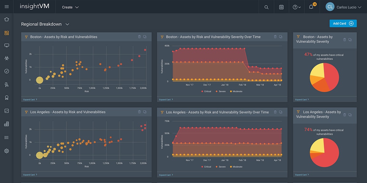
Finding the 13 companies’ interfaces of interest required web searches of company web sites, YouTube, and the internet at large for data sheets, user guides, demo videos, promotional videos, and screenshots/images. For 11 of the 13 companies we were able to find meaningful and useful product outputs. One company, Expanse, interestingly has a white paper titled “Security Ratings Are a Dangerous Fantasy” [3] and takes the stance that, “Security professionals don’t like security ratings, also known as cybersecurity risk scores.” Thus, they do not readily provide any. The other company from the 13 not evaluated was RiskIQ which appears to be more of a tool helping customers discover infrastructure they did not know existed, rather than a threat/risk evaluation provider. Regardless of where we found images/videos, we took screenshots of the relevant portions of the tool outputs and placed them in a PowerPoint slide deck, one slide per company. This slide deck is available upon email request but is not included for space reasons. A sampling of the outputs from parts of 4 tools randomly selected from the 11 is provided in Fig. 3 to give a sense of what we were evaluating.
3.3 Procedure
Each company’s slide was evaluated independently by each of the authors from the MARIP perspective while considering three specific categories: color use, number scheme, and visual chart.
There are many HCI principles with which we were not concerned and which we leave for future investigation. We focus in this study exclusively on how these cybersecurity companies’ presentations of cybersecurity threat/risk relate to the principles of familiarity and consistency. Drawing from Hinze-Hoare’s 2007 review of HCI Principles [4], our working definitions for these two principles as they apply to the MARIP engaged in cybersecurity tasks are:
-
Familiarity – the degree to which the average IT practitioner can draw on real-world experience and knowledge to most easily understand the way data are presented. The more intuitive the numbers, graphs, colors, etc., the less cognitive load and the more likely the user will be able to quickly extract meaning. For example, red means stop, threat, or that something is wrong.
-
Consistency – similarity of appearance of the way data is presented as the average IT practitioner moves from one context to another within a given tool and amongst different tools. For example, number lines that increase in value from left to right, regardless of the context being used, would be expected in all tools.

To score the tool outputs, we settled on a severity scale from 0 to 3 with the following parameters:
-
0 – no usability issue noticed
-
1 – minor usability issue; causes user some hesitation (< ~1 s, but no “reasoning” required); minor irritation
-
2 – moderate usability issue; causes user delay (> ~1 s and < ~30 s, reasoning/recall needed); moderate irritation
-
3 – major usability issue; causes user failure or significant delay (> ~30 s, requires hard reasoning effort); extreme irritation
For each of the 11 companies evaluated, we recorded 3 scores per evaluator – one each for color use, number scheme, and visual chart. The lowest score in any area could be 0 – no usability issue noticed, while the highest score would be unbounded and depend on the number of issues noted and the severity of those issues. For example, if when considering color use an evaluator noted two minor issues and one major issue, the color use score for that evaluator would be (2 * 1) + (1 * 3) = 5.
The evaluators’ scores in each of the three categories were then averaged and the averages then summed to create a total score. Lower scores represent a combination of fewer issues noted and/or lower severity of the issues noticed.
4 Results
In this section, results from the heuristic evaluation of the static images of selected cybersecurity companies’ tool outputs are presented and discussed. As well, some data and observations are provided on the three usability categories: color use, number scheme, and visual chart.
4.1 Relationship of Scores to Tool Outputs
Total scores computed from the heuristic evaluation are displayed in Table 2. The rows alphabetically list all 13 companies identified in the Forrester Wave™ report [24] as leading vulnerability risk management providers (Expanse and RiskIQ had no meaningful tool outputs to evaluate.). The lowest possible theoretical total score is 0 while total scores on the high end are unbounded. Scores ranged from 1.7 to 6.3 with Skybox Security receiving the lowest score and Qualys receiving the highest.
While the total scores have the look of a precise calculation, they are more useful as a relative comparison among tool outputs than as a “grade” with well-defined meaning. Higher numbers indicate that more and/or more severe usability issues were noticed by the evaluators. What is not captured in the evaluation is the difference in what was found during web searches and the quantity/quality of tool outputs readily available for evaluation. For example, Skybox Security has the lowest score indicating a mix of the fewest/least severe issues found. This is in part because the images/videos available for review were more limited compared with other companies. This is a limitation of this investigation that could be overcome in future work by scheduling demos and talking with actual users of these systems.
4.2 Color Use
In addition to the heuristic evaluation scores, we provide in this subsection and the next two some additional details regarding the three specific categories considered. In Table 3, we present color use information for each company as it maps to severity categories. The different shades of color presented in the table reflect the sampling of actual outputs and is meant to match as closely as possible to what companies are using.
All 11 companies use colors to augment representation of the degree of risk or threat posed by a vulnerability or to an asset or group of assets. Shades of orange and red are used by all 11 companies to indicate some level of threat/risk. Five companies use shades of yellow-orange-red – colors normally associated with risk/threat, while six companies use colors to represent threat/risk at the low level that are not traditionally associated with risk/threat/danger (green/blue). One company, Digital Defense, uses a non-traditional danger color, purple, at the high end to indicate critical.
Perhaps modeled after CVSS categories, six of the companies explicitly use categories of low-medium-high and/or critical. For Brinqa, Kenna Security, and Rapid7, category naming is not explicit. Qualys uses its own category naming of “Severity 1” through “Severity 5.” RedSeal uses different categorization entirely and colors groups of issues: model problems, configuration problems, and vulnerabilities, without differentiation of severity within those category groups.
4.3 Number Scheme
In Table 4, we indicate which companies use which different scales for assigning threat or risk scores with their tools. While all 11 of the companies make some kind of numeric calculation to determine levels of threat/risk, 9 of the companies explicitly display those values when conveying the threat/risk information to users and 2 do not. Of the 9 displaying numeric values, 8 of them use some kind of base-10 scale while 1, RedSeal, uses an 850-point scale similar to what is used for many U.S. credit score models. Two companies, Digital Defense and NopSec, augment these scores with a GPA conversion and/or letter grade assignment. Kenna Security uses two scales: a 100-point scale for scoring vulnerabilities and a 1000-point scale for scoring assets.
4.4 Visual Chart
All 11 companies use some kind of chart to help convey risk/threat information. Five of the companies use dials or semi-circular gauges (e.g. Fig. 3, a & d) combined with numbers and colors when presenting threat or risk scores. Eight companies use donut or pie charts (e.g. Fig. 3, b & c) to present information about the proportional relationship of severity categories of vulnerabilities or other risks.
5 Analysis
This initial investigation into several leading companies’ cyber threat/risk score presentations has revealed that there is not currently a lot of convergence towards what might be considered a useful standard. Considering that it took Microsoft 17 years to agree to participate in the CVE list as the centralized, industry-standard vulnerability enumeration mechanism, it is not surprising at this point that leaders in vulnerability risk management services do not share more in common when presenting scores for cyber threat and cyber risk. It is perhaps especially telling that one of the Forrester-identified leaders (Expanse) seems highly critical of the industry efforts to date. Adding to the general difficulties of finding convergence among any large group is the seeming disincentive created by the fact that these companies are all trying to make a living selling their cybersecurity tools and likely prefer differentiation. We are still early in the arc of cybersecurity industry history, so perhaps in time, companies will glean lessons from older industries (e.g. automobiles) which struck a balance in conveying information to users (think speedometer, tachometer, gas gauge, etc.) while still remaining attractive to different groups of consumers.
It seems unfortunate that 5 of the 11 companies’ tool outputs evaluated are using green to indicate low levels of threat/risk. Given green’s traditional use in traffic lights internationally, it is confusing to expect users of cybersecurity tools to switch to thinking that green means low threat/risk. Color should be relatively easy to standardize. Shades of the colors yellow, orange, and red have long been used to indicate warning or danger (no one receives a green card in football/soccer). Green could reasonably be used to indicate “no risk” when appropriate or track when tasks, like vulnerability remediation, are complete.
It is unsurprising that all but one company are using a base-10 scoring system. Nor is it surprising that efforts are pretty evenly spread across the various orders of magnitude scales: 10-point, 100-point, and 1000-point. Standardizing to one particular scale could probably be accomplished; however, because the individual calculations of threat/risk are likely considered “secret sauce” by each company, comparing a score of 771 from one company with a score of 771 at another company would presumably be much more difficult.
Chart convergence is currently a mixed bag. The use of circular/semi-circular dials/gauges by 5 of the 11 companies to augment the use of numbers and colors to convey the magnitude of a threat/risk score is helpful. All dials/gauges fill logically clockwise from lower left (low) to lower right (high). This is even one area where standardization is probably less important as far as the exact look of dials/gauges is concerned. The use of donut or pie charts by eight companies is less helpful and seems to buck the adage to “communicate do not decorate.” It has, unfortunately, become very easy to generate donut/pie chart widgets, so they are used a lot and often with data that would be better conveyed with a different presentation [23]. Common problems seen with pie chart use include: adjacent pie charts of the same size showing proportions of populations that differed by one or two orders of magnitude, ordering pie pieces by severity in different directions in different charts, and presenting a donut or pie with more than 5 parts (often 8–13) making it difficult to reason about the data.
6 Conclusions and Future Work
This article examined the current state of cybersecurity companies’ attempts to distill complex concepts of cyber threat and cyber risk into easy-to-understand depictions. In the three specific areas of color use, number scheme, and visual chart considered during this evaluation, there appears to be some convergence on:
-
the use of shades of orange/red to indicate various medium/high levels of threat/risk
-
the use of base-10 scales for threat/risk scores
-
the use of circular/semi-circular gauges to reinforce the idea of threat/risk levels
However, there is also a fair amount of divergence or inappropriate use across the three specific areas of consideration that would make switching from one tool to another a non-trivial cognitive load task for a MARIP. This includes:
-
companies labeling risk categories with colors (e.g. green) not traditionally associated with threat/risk/danger
-
companies using different base-10 orders of magnitude scales, as well as one-off uses of an 850-point credit-score-like scale, letter grades, and a GPA
-
companies too often using pie charts which makes differentiation among many categories difficult and hides differences in orders of magnitude
There is likely not much incentive for independent companies to synchronize how ideas of cyber threat and cyber risk are conveyed to users, but convergence in this area would provide a definite benefit to the cybersecurity community at large.
While conducting this initial investigation using heuristic inspection of static views of a select group of cybersecurity companies’ tool outputs with three evaluators generated interesting insights, there are clear ways to pursue a deeper understanding of this important topic. These ways include expanding the number of companies evaluated, inspecting tools while in operation, and surveying IT practitioners using the tools.
It would be interesting to first extend this examination beyond the 13 companies selected from the Forrester Wave™ report [24] to include other well-known cybersecurity companies like FireEye, Symantec, ThreatConnect, etc. as well as well-known IT companies that have significant cybersecurity divisions like Microsoft and AT&T. Observing demos or IT practitioners using tools would permit more comprehensive evaluations across a greater number of HCI principles. Subsequently broadening this study to gather feedback from IT professionals who use the tools examined (or a subset of them) on a regular basis would provide both richer data and a way to judge the validity of the idea of MARIP as a “reasonable” means of an initial heuristic evaluation context.
References
Allodi, L., Massacci, F., Comparing vulnerability severity and exploits using case-control studies. In: ACM Transactions on Information and System Security (2014). https://dl.acm.org/doi/pdf/10.1145/2630069. Accessed 2 Feb 2021
Common Vulnerability Scoring System SIG. https://www.first.org/cvss/. Accessed 2 Feb 2021
Expanse White Paper. Security Ratings Are a Dangerous Fantasy (2020). https://go.expanse.co/rs/221-SBF-942/images/WP_Expanse_Security_Ratings_101_EN.pdf. Accessed 2 Feb 2021
Hinze-Hoare, V.: Review and Analysis of Human Computer Interaction (HCI) Principles (2007). arXiv preprint. https://arxiv.org/ftp/arxiv/papers/0707/0707.3638.pdf. Accessed 2 Feb 2021
Holmes, O.W.: The Common Law. Little, Brown, and Company, Boston, MA (1909). https://www.google.com/books/edition/The_Common_Law/xXouAAAAIAAJ?hl=en&gbpv=1&bsq=reasonable. Accessed 2 Feb 2021
Jacobs, J., Romanosky, S., Adjerid, I., Baker, W.: Improving vulnerability remediation through better exploit prediction. J. Cybersecurity 6, 1 (2020) https://academic.oup.com/cybersecurity/article/6/1/tyaa015/5905457. Accessed 2 Feb 2021
Kenna Security. Getting Started w/ Kenna.VM. https://www.youtube.com/watch?v=CvnEp7MJZSk. Accessed 2 Feb 2021
Mann, D.E., Christey, S.M.: Towards a common enumeration of vulnerabilities. In: 2nd Workshop of Research with Security Vulnerability Databases (1999). https://cve.mitre.org/docs/docs-2000/cerias.html. Accessed 2 Feb 2021
Molich, R., Nielsen, J.: Improving a human-computer dialogue. Commun. ACM 33(3), 338–348 (1990). https://dl.acm.org/doi/pdf/10.1145/77481.77486. Accessed 2 Feb 2021
Nayak, K., Marino, D., Efstathopoulos, P., Dumitras, T.: Some vulnerabilities are different than others. In: International Workshop on Recent Advances in Intrusion Detection, pp. 426–446 (2014). https://ssltest.cs.umd.edu/~kartik/papers/1_vuln.pdf. Accessed 2 Feb 2021
Nielsen, J., Molich, R.: Heuristic evaluation of user interfaces. In: Proceedings of the SIGCHI Conference on Human Factors in Computing Systems, pp. 249–256 (1990). https://dl.acm.org/doi/pdf/10.1145/97243.97281. Accessed 2 Feb 2021
Nielsen, J.: How to conduct a heuristic evaluation. Nielsen Norman Group 1, pp. 1–8 (1995). https://www.ingenieriasimple.com/usabilidad/HeuristicEvaluation.pdf. Accessed 2 Feb 2021
NIST National Vulnerability Database, Vulnerabilities. https://nvd.nist.gov/vuln. Accessed 2 Feb 2021
NIST Special Publication 800–126, Revision 3. The Technical Specification for the Security Content Automation Protocol (SCAP) (2018). https://nvlpubs.nist.gov/nistpubs/SpecialPublications/NIST.SP.800-126r3.pdf. Accessed 2 Feb 2021
NIST Special Publication 800–30, Revision 1. Guide for Conducting Risk Assessments (2012). https://nvlpubs.nist.gov/nistpubs/Legacy/SP/nistspecialpublication800-30r1.pdf. Accessed 2 Feb 2021
NopSec Datasheet, New Unified VRM. https://www.nopsec.com/wp-content/uploads/UnifiedVRM-datasheet.pdf. Accessed 2 Feb 2021
NopSec Image C. https://www.nopsec.com/wp-content/uploads/Home-page.png. Accessed 2 Feb 2021
NopSec Image D. https://www.nopsec.com/tag/unified-vrm/page/2/. Accessed 2 Feb 2021
Outpost24 Risk Overview Snapshot. https://outpost24.com/sites/default/files/glazed_builder_images/Outpost24%20full%20stack_3.png. Accessed 2 Feb 2021
Rapid7 InsightVM Dashboard image. https://www.rapid7.com/globalassets/_images/product/insightvm/insightvm-key-features-dashboard.jpg. Accessed 2 Feb 2021
Rapid7 Solution Brief, Quantifying Risk with InsightVM. (2020). https://www.rapid7.com/globalassets/_pdfs/product-and-service-briefs/rapid7-solution-brief-quantifying-risk-insightvm.pdf. Accessed 2 Feb 2021
Sabottke, C., Suciu, O., Dumitras, T.: Vulnerability disclosure in the age of social media: exploiting twitter for predicting real-world exploits. In: 24th (USENIX) Security Symposium, pp. 1041–1056 (2015). https://www.usenix.org/system/files/conference/usenixsecurity15/sec15-paper-sabottke.pdf. Accessed 2 Feb 2021
Siirtola, H.: The cost of pie charts. In: 23rd International Conference Information Visualisation (IV), pp. 151–156 (2019). https://core.ac.uk/download/pdf/250169498.pdf. Accessed 2 Feb 2021
Zelonis, J., Lyness, T., The Forrester WaveTM: Vulnerability Risk Management, Q4 2019 (2019). https://www.rapid7.com/info/vrm-wave/. Accessed 2 Feb 2021
Author information
Authors and Affiliations
Corresponding author
Editor information
Editors and Affiliations
Rights and permissions
Copyright information
© 2021 Springer Nature Switzerland AG
About this paper

Cite this paper
Nichols, C., Stoker, G., Clark, U. (2021). Heuristic Evaluation of Vulnerability Risk Management Leaders’ Presentations of Cyber Threat and Cyber Risk. In: Moallem, A. (eds) HCI for Cybersecurity, Privacy and Trust. HCII 2021. Lecture Notes in Computer Science(), vol 12788. Springer, Cham. https://doi.org/10.1007/978-3-030-77392-2_14
Download citation
DOI: https://doi.org/10.1007/978-3-030-77392-2_14
Published:
Publisher Name: Springer, Cham
Print ISBN: 978-3-030-77391-5
Online ISBN: 978-3-030-77392-2
eBook Packages: Computer ScienceComputer Science (R0)