
Abstract
Big data analytics and machine learning applications are often used to detect and classify anomalous behaviour in telecom network measurement data. The accuracy of findings during the analysis phase greatly depends on the quality of the training dataset. If the training dataset contains data from network elements (NEs) with high number of failures and high failure rates, such behaviour will be assumed as normal. As a result, the analysis phase will fail to detect NEs with such behaviour. Effective post-processing techniques are needed to analyse the anomalies, to determine the different kinds of anomalies, as well as their relevance in real-world scenarios. Manual post-processing of anomalies detected in an Anomaly Detection experiment is a cumbersome task, and ways to automate this process are not much researched upon. There exists no universally accepted method for effective classification of anomalous behaviour. High failure ratios have traditionally been considered as signs of faults in NEs. Operators use well-known key performance indicators (KPIs) such as drop call ratio and handover failure ratio to identify misbehaving NEs. The main problem with these KPIs based on failure ratios is their unstable nature. This paper proposes a method of measuring the significance of failures. The usage of this method is proposed in two stages of anomaly detection: training set filtering (pre-processing stage) and classification of anomalies (post-processing stage) using an automated process.
1 Introduction
Anomalies in telecommunication networks can be signs of errors or malfunctions, which originate from a wide variety of reasons. Huge amount of data collected from network elements (NEs) in the form of counters, server logs, audit trail logs, etc. can provide significant information about the normal state of the system as well as possible anomalies [1]. Anomaly detection (AD) forms a very important task in telecommunication network monitoring [2] and has been the topic of several research works in the past few years [1, 3]. Since it is very difficult to obtain reference data with labelled anomalies from industrial processes, unsupervised methods are chosen for AD [4]. Among these unsupervised techniques, self-organizing maps (SOMs) [5] are a tool often used for analysing telecommunication network data [1, 6, 7], characterized by its high volume and high dimensionality. The key idea of SOM is to map high-dimensional data into low-dimensional space by competitive learning and topological neighbourhood so that the topology is preserved [8].
Network traffic data obtained from several sources need to be pre-processed before they can be fed to SOMs or other AD mechanisms. These pre-processing steps could include numerization of log data, cleaning and filtering of training set, scaling and weighting of variables, etc. depending on the type of data analysed and goal of the AD task. SOMs, as well as other neural network models, follow the “garbage in–garbage out” principle. If poor-quality data are fed to the SOM, the result will also be of poor quality [4].
The important events that happen in various NEs during the operation of the network are counted, which forms the raw low-level data called counters. Since the number of these low-level data counters is too large and often unmanageable, several of these counters are aggregated to form high-level counter variables called key performance indicators (KPIs) [9].
Several well-known KPIs used by telecom operators such as drop call ratio (DCR), handover failure ratio (HO_Fail) and SMS failure ratio (SMS_Fail) are typical examples of failure ratio-based KPIs. The failure ratio metric (u, n) for u failures out of n attempts, defined in Eq. (1), does not take the magnitude of the number of attempts into account. Hence, one failure out of one attempt, as well as hundred failures out of hundred attempts, gives the same resultant failure ratio.
If there has been a lot of activity and both numerator and denominator of the equation are high, the failure ratio is a meaningful metric. However, if there has not been much activity, both numerator and denominator are low, and the resulting failure ratio metric can be randomly high. Using \({\text{fr}}(u,n)\) as a metric for filtering, the training set can have mainly two drawbacks.
Firstly, it removes random points from the training dataset and overall quality of the dataset cannot be guaranteed to be high. Secondly, network monitoring personnel can be misguided by such wrong signals and is likely to spend their time analysing an anomaly which might result due to a high failure ratio and low number of attempts. It is possible to give thresholds for \(n\) and \(u\), above which the failure ratio can be considered as a measure of failure. However, this approach too, comes with its own set of problems. Regional, seasonal, daily, weekly and even hourly traffic variations can lead to such rules being unable to detect important anomalies.
The post-processing phase is a very critical phase in an AD experiment and includes validation of information, interpretation and presentation. If the analysis results are not presented in an understandable and plausible way to a human analyst, he/she will be unable to verify the results against the data and domain knowledge [10].
Post-processing of anomalies detected from multidimensional KPI counter data poses a serious challenge. There are no well-defined ways of classifying behaviour of data points in general and anomalous data points in particular. Consider an AD experiment performed on a set of k KPIs where k is a large number. This experiment produces p anomalies. It is a tedious task to classify each of these p anomalies in order to find what the fault in the network and its impact. For that, he/she may have to go through a maximum of (k × p) attribute values. Automated tools are highly required for the process.
Clustering of data points can be used here. Consider a scenario in which KPI counter data obtained from thousands of NEs need to be analysed automatically. Clustering solutions such as k-means clustering [11] can be used here to classify behaviour into different clusters. Once the cluster centroids are found, they can further be analysed to identify the behaviour of the cluster and identify faults (if any). This technique can prove to be useful for identifying NEs having similar faulty behaviour and the operator could then suggest further action. However, the problem with many clustering techniques is that the number of detected clusters can be high and manually going through each of the k KPIs of the cluster centres is in itself a cumbersome and error-prone task.
For each of the data points, its attributes are classified based on its magnitude (high or low) and multiple attributes needs to be observed to identify what functionality is broken. For example, monitoring a KPI which denotes SMS failure counts alone is not sufficient. The number of SMS attempts is also needed to identify if there is a serious fault in the SMS functionality in a cell. This task is prone to human errors and misjudgement. Automated systems of identifying the behaviour of cluster centres are required which help in quick decision-making process.
A good automated tool for identifying the data behaviour from the cluster centre should work by taking in the k KPIs and provide a meaningful abstraction for the behaviour of the cluster centre and the data points belonging to the cluster. For this to happen, the automated tools need to have application domain knowledge built into them using specific formulas.
In this paper, we introduce more stable failure significance metric in Sect. 2 and introduce the use of this metric in two areas of anomaly detection: training set filtering (pre-processing stage) in Sect. 2.1 and data point classification (post-processing stage) in Sect. 2.2. Sections 3 and 4 shortly introduce an AD method and a few training dataset filtering techniques that we used. Section 5 presents a case study of approaches listed in Sect. 2 on LTE network management data. Finally, Sect. 6 concludes the paper.
2 Failure significance metric
The failure significance metric (fsm) is a metric that evaluates the significance of a failure based on the number of attempts that have been made. The fsm metric balances the failure ratio so that the failure ratios based on lesser number of attempts are scaled to be of smaller value, when compared to the failure ratio based on higher number of attempts. Equation (2) defines a weight function that helps in scaling a value based on the sample size n.
The term \(w\) is a term that can be used to adjust the sensitivity of the function. The value of this parameter could vary from 0 to 1. In cases when \(w\) is 0, there is no scaling based on number of attempts as the whole fraction becomes equal to 1. The behaviour is opposite at the other end of the range (\(w\) = 1). Figure 1 depicts how the value of the scaling function \(f\left( n \right)\) varies for different values of the sensitivity tuning parameter \(w\).

Variation in scaling function with sensitivity tuning parameter w
As the number of attempts increases, the denominator increases, resulting in high value of \(f(n)\). This property of the function can be used to scale the difference of a failure ratio from the average value of failure ratio in the training set. When the difference between the failure ratio of a data point and the average failure ratio of the training set is high, the scaling function \(f(n)\) results in a higher scaled value in cases where the number of attempts is high, in contrast to cases where the number of attempts is low. On applying this scaling function to the difference of the failure ratio with the average failure ratio gives a scaled value of failure ratio \({\text{fr}}_{{\text{scaled}}} (u,n)\) as shown in Eq. (3). Here \({\text{fr}}(u,n)_{{\text{avg}}}\) represents the average failure ratio in the entire dataset.
Let us consider \(u\) as the total number of failures that occur in an NE during an aggregation interval and \(u_{{\text{avg}}}\) as the average number of failures that occur for all the NEs during the same aggregation interval in training set. When the number of failures \(u\) is high, the impact it has on the network is also high. The value of logarithm of (\(u + 1)\) to the base \((u_{{\text{avg}}} + 1)\) (which is also \(\log \,(u + 1)/{ \log }(u_{{\text{avg}}} + 1)\)) gives a measure of relative magnitude of failure count when compared to average failure counts. This factor defined here as an impact factor is given in Eq. (4).
Adding one to the numerator and denominator eliminates the need to separately handle the zeroes in the data. The value of \(fsm\, (u,n )\) is further obtained by multiplying the two terms \({\text{fr}}_{{\text{scaled}}} (u,n)\) and \(i(u)\) as represented by Eq. (5). Figure 2 depicts two views of a three-dimensional plot of the obtained fsm function.

Graphical representation of the failure significance metric (w = 0.5)
2.1 Significance metric in training dataset filtering
This section proposes a method of training set filtering using the failure significance metric. An operator monitoring the network for anomalies will be interested in observing the network elements which have faults corresponding to high fsm. By removing the data points, which correspond to high fsm from the training set, the observations in the analysis dataset which correspond to similar behaviour will be detected as anomalies. This is a typical example of a case in which application domain knowledge is used in filtering the training dataset.
Consider a set of n observations measured from m cells. The fsm-based training set filtering approach removes the top k percentile of observations which have the highest value of the fsm metric. For the experiments done as part of this research, the values of \(k\) was kept at 1 %. The top 1 % of the observations in the training set are considered as corresponding to high values of failure significance metric. A suitable value of the threshold for filtering depends on the dataset under consideration. A higher value of threshold percentage results in higher number of anomalies detected in the analysis phase. By choosing a higher threshold percentage, we assume that the acceptable failure levels are much lesser in the training set. As a result, if our assumption is wrong, there will be a higher number of false positive anomalies detected in the analysis phase.
As can be seen in Fig. 1, the value of w does not affect significantly when number of attempts n is larger than 10. Thus, w is a tool to tune sensitivity of failures in NEs with low traffic. After some preliminary experiments, the value of w was set to 0.5 and kept at that.
2.2 Anomaly classification using significance metric
This section proposes a method of classifying anomalous data point behaviour using the fsm derived in Eq. (5). The steps involved in the process are described below:
-
Step 1 The features (KPIs) to be observed from a set of observations are decided. In telecom network measurement data, a suitable selection of features for following the most common services could be call set-up failure ratio, dropped call ratio, handover failure ratio, SMS failure ratio, data connection failure ratio, etc. The selection of KPIs depends on the information needed, which is derived from the objective of the monitoring or analysis task at hand. Composition of monitored KPI set can vary from physical link layer KPIs to those of highest application layer.
-
Step 2 The failure significance metric for each of the features selected in Step 1 is calculated using Eq. (5). For this, the system has to have access to numerator and denominator of each ratio. For example, in the calculation of the failure significance metric for dropped calls, the required metrics are: number of dropped calls and total number of calls.
-
Step 3 The metrics obtained are clustered into multiple severity levels as shown in Fig. 3. We have used univariate clustering (threshold selection) for classifying into different severity levels, denoted by different colours in the figure below.
Fig. 3 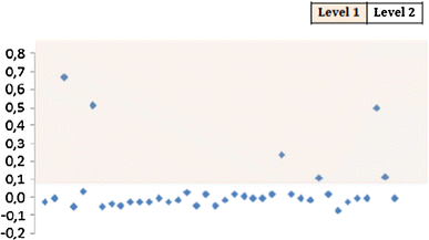
Classification of fsm into severity levels. The figure is a plot with y-axis representing the fsm values and x-axis representing consecutive data points
-
Step 4 The severity of each observation is further derived from the fsm severity levels of the contributing KPIs.

3 The anomaly detection mechanism
The AD system used in this research work is based on the method by Höglund et al. [12]. This method uses quantization errors of a one or two-dimensional SOM for AD. The basic steps in the algorithm are listed step by step below.
-
1.
A SOM is fitted to the reference data of \(n\) data points. Nodes without any hits are dropped out.
-
2.
For each of the \(n\) data points in the reference data, the distance from the sample to its BMU is calculated. These distances, denoted by \(D_{1}\) … \(D_{n}\), are also called as quantization errors.
-
3.
A threshold is defined for the quantization error which is a predefined quantile of all the quantization errors in the reference data.
-
4.
For each of the data points in the analysis dataset, the quantization errors are calculated based on the distance \(D_{n + 1}\) from its BMU.
-
5.
A data point is considered as an anomaly if its quantization error is larger than the threshold defined in Step 3.
4 Training dataset filtering techniques
This section focuses on some techniques of cleaning up the training set before it is used in the AD process. The presence of outliers in the training set can dominate the analysis results and thus hide essential information. The detection and removal of these outliers from the training set result in improved reliability of the analysis process [13]. The objective for training set filtering is to remove from the training set, those data points that have a particular pattern associated with them. As a result, similar behaviour in the analysis dataset is detected as anomalous. The training set filtering techniques evaluated as part of this research are listed in the following subsections.
4.1 SOM smoothening technique
This is one of the widely used training set filtering techniques. This technique is a generic one and does not use any application domain knowledge in filtering the training set. The steps in this process are:
-
1.
The entire training set is used in the training to learn a model M of the training data.
-
2.
AD using model M is carried out on the training set to filter out the non-anomalous data points.
-
3.
The non-anomalous data points from the training set obtained in the previous step are used to learn a refined model M′ of the training set.
-
4.
This new model M′ is used in the analysis of anomalies in the analysis dataset.
4.2 Statistical filtering techniques
The general assumption behind this kind of techniques is that extreme values in either side of distribution are representative of anomalies. Hence, statistical filtering techniques try to eliminate extreme values from the training set to reduce their impact on scaling variables.
Two statistical filtering techniques are evaluated as part of this research: one which uses application domain knowledge and another which does not.
-
Percentile-based filtering: This kind of filtering removes \(k\)% of the observations of each of the KPIs from either side of the distribution.
-
Failure ratio-based filtering: This kind of filtering removes from the training set \(k\)% of the observations, which correspond to the highest values of a relative KPI. The failure ratio-based technique can be considered to be one that uses the application domain knowledge in filtering the training set, as high failure ratios are considered as anomalies in networks.
5 Case study: LTE network management data
5.1 Traffic measurement data
The AD tests done as part of this research were performed on mobile network traffic measurement data obtained from Nokia Serve atOnce Traffica [14]. This component monitors real-time service quality, service usage and traffic across the entire mobile network owned by the operator. It stores detailed information about different real-time events such as call or SMS attempts and handovers. Based on the goal of the AD task, as well as the monitored network functionalities, KPIs are extracted out and they form the data on which the AD task is carried out.
5.2 Training set filtering using failure significance metric
The impact of the fsm-based training set filtering technique is evaluated by measuring the SMS counters of a group of 11,749 cells over a period of 2 days. The measurement data from the first day are chosen as the training dataset, and the data from the subsequent day are chosen as the analysis dataset. A set of five KPIs were chosen for this experiment. The five SMS KPIs monitored for this experiment were (1) number of text messages sent from the cell, (2) number of text messages received to the cell, (3) number of failed text messages, (4) number of failures due to core network errors and (5) number of failures due to uncategorized errors.
A set of five anomalous cells are modelled programmatically, and 120 synthetic observations corresponding to them are added into the analysis dataset. The error conditions which describe the operation of these synthetically added anomalous NEs are described in Table 1. The SMS counts and the failure percentage are uniformly distributed over the range specified in the table. The percentage of anomalies and the percentage of anomalous NEs detected through the AD experiment would give a good measure of the effectiveness of the fsm-based filtering approach.
The performance of a technique is evaluated in five realms: (1) number of synthetic anomalies detected, (2) number of synthetic anomalous NEs detected, (3) total number of anomalies detected, (4) total number of anomalous NEs detected and (5) quality of anomalies detected.
To measure comparatively the AD capabilities of the fsm-based filtering technique with other techniques, three other methods were chosen: (1) SOM smoothening method (2) percentile-based training set filtering and (3) failure ratio-based training set filtering. In each of the cases, 1 % of the observations from the training set were filtered out. Linear scaling technique was used for scaling the KPIs prior to feeding them to the AD system. This kind of scaling divides the variable by its standard deviation as shown in Eq. (6).
A total of 50 neurons in a 5 × 10 grid were allocated to learn the training set. The initial and final learning rates were chosen as 8.0 and 0.1, respectively. The neighbourhood function was chosen to be Gaussian and a rectangular neighbourhood shape was used.
5.2.1 Illustration
Figure 4 represents the structure of the 2-D SOM (in logarithmic scale) trained with the training set data and projected to two dimensions by using Neural Net Clustering App of MATLAB 2014a [15]. The graphs show SOM structures obtained with and without different training set filtering techniques. Logarithmic scales are suitable to understand in more detail the structure of SOMs. The darker and bigger dots represent the positions of the neurons and smaller green (or grey) dots represent the data points. The figure shows only the first two dimensions (sent SMS count and received SMS count), for the sake of simplicity in understanding the SOM structure changes with different filtering techniques. The main regions where the structures of the SOMs are different when compared to the case with no filtering are marked with ellipses for easy comprehension. For each of the figures, the ellipses correspond to the region from the training set from where the data points were filtered out before training. Since the data points from this region are removed due to the filtering, the neurons which correspond to this behaviour are removed as well.

SOM weight positions (weight 1—sent SMS count, weight 2—received SMS count) in logarithmic scale for different filtering techniques
5.2.2 Quantitative evaluation
The severity levels were defined manually using the application domain knowledge, percentage failure rates as well as the traffic volumes. Synthetic NEs with ids 30003 and 30004 were not detected in the experiment. The reason for these not being detected is due to the lower traffic produced by the cells. Table 2 summarizes the results in terms of the total number of non-synthetic anomalies and anomalous NEs detected in each of the scenarios.
The number of anomalies detected using the fsm-based filtering technique is higher when compared to all other techniques. The results clearly show that filtering the training set has a huge impact on the number of anomalies and anomalous NEs detected. This behaviour is consistent for synthetic anomalies as well. It is interesting to note that approximately 43 % of the synthetic anomalies still remain undetected even using the fsm-based filtering technique. In the absence of training set filtering techniques, none of the anomalous NEs nor their anomalous observations could be detected.
5.2.3 Qualitative evaluation
Since this experiment monitored just a few KPIs, a manual analysis of quality of anomalies was not a tedious task and hence was chosen in this case. Detailed analysis of the entire set of anomalies exhibited ten different kinds of anomalies. The detected types of anomalies along with their severity are provided in Table 3. The severity levels were defined manually using the application domain knowledge, percentage failure rates as well as the traffic volumes. Synthetic NEs with ids 30003 and 30004 were not detected in the experiment. The reason for these not being detected is due to the lower traffic produced by the cells.
Table 4 presents the number of anomalies and anomalous groups with their severity levels. fsm-based training set filtering outperforms all other filtering techniques on the basis of the number of critical and important anomalies detected. It is interesting to note here that fsm-based training set filtering finds approximately four times the number of critical anomalies that are found without any sort of filtering.
However, it is also important to note that the fsm-based filtering does not outperform other methods in terms of the proportion of critical anomalies detected out of the total number of anomalies detected. Moreover, the number of distinct anomaly groups found by using the application domain knowledge incorporated filtering techniques (failure ratio and fsm) is higher than the cases which do not employ it.
5.3 Anomaly classification using failure significance metric
A total of 845 anomalies were detected as part of the AD experiment. One of the main goals of an AD experiment is to detect different types of anomalies. It is a cumbersome task to go through 845 anomalies to decipher the number of distinct kinds of anomalies that were detected. Hence, the process outlined in Sect. 2.2 are used. The steps are:
-
Step 1 Hierarchical clustering was able to identify a total of 15 different kinds of anomalies corresponding to 15 clusters. Ward’s minimum variance method [16] was used to identify the number of clusters.
-
Step 2 The cluster centres (centroids) were calculated to find the failure significance metric corresponding to known faults in a telecom system such as call set-up failure, dropped calls, handover failures, SMS failures and overall call failures.
-
Step 3 Plotting consecutive points of the failure significance metric for each of the known fault scenarios (call set-up failure, dropped calls, etc.) revealed that choosing two levels of severity would give a good enough classification as shown in Fig. 5. The classification was done manually after looking the graphs as they generally indicated two levels of values.
Fig. 5 
fsm-based severity calculation approach using plots of the fsm metric. y-axis corresponds to the fsm metric and x-axis to consecutive data points. a Call set-up fsm categorization, b dropped call fsm categorization, c handover failure fsm categorization, d SMS failure fsm categorization, e overall call fsm categorization
-
Step 4 Using the fsm severity of each fault area, the centroids are classified into two severity levels. In the current analysis, if any of the fault areas of the cluster centroids are of level 1, the centroid itself is considered to be of level 1, else the centroid is of level 2 (see Table 5). Level 1 is considered as more severe compared to level 2. Table 5 depicts the process.
Table 5 Anomaly cluster centroid and their classification

As can be seen from Table 5, 9 level 1 category and 6 level 2 category anomalies were detected by the AD experiment. Such concise information representation is valuable to the telecom network monitoring person as it helps in better understanding of the reason behind anomalies. There is a high probability that the anomalies which fall into the same cluster are a result of same kind of network problems. Hence, the network monitoring person can suggest the same kind of maintenance activity for anomalous NEs which have same kind of anomalies.
Another benefit of the approach is the substantial decrease in the number of anomalies to analyse. The monitoring person only needs to identify the anomaly cluster centroids (15 in number), instead of the entire 845 anomalies. Moreover, sufficient clues about the behaviour of the cluster centroids are also provided by the severity levels of the fsm of the contributing KPIs.
6 Conclusions
The fsm-based training set filtering technique does not aim to replace any of the standard methods of AD in the presence of outliers. This technique should be considered more as a supplement to existing techniques. In cases when there exists some form of prior knowledge about what can be considered as an anomaly, using this information in the training set filtering stage can lead to improved accuracy of AD experiments. The results presented in this paper emphasize the importance of pre-processing techniques in general and training set filtering techniques in particular. Since this approach is a generic approach for cleaning up training data, there is no dependency on the AD algorithms or mechanisms used commonly.
This paper introduced a novel approach of training set filtering using fsm and analysed its impact on the quantity and quality of anomalies detected in an AD experiment performed on network management data obtained from a live LTE network. fsm-based training set filtering was found to detect the largest number of synthetic anomalies as well as anomalous NEs. The total number of anomalies and anomalous NEs found were also the highest using this approach. In the absence of training set filtering, the results were poor. AD as well as other data analysis experiments produces results, which need to be easily comprehendible by the analyst. Currently, there are no well-known ways of post-processing of anomalies detected from counter data.
This paper proposed a technique of classifying anomalies into clusters and providing information regarding the behaviour of the anomaly cluster by analysing its centroid. This technique was further used to determine the severity of the anomaly group by making use of the failure significance metric. AD experiments performed on live LTE network measurement data from a group of cells detected 845 anomalies which were further classified using this approach to detect 15 different kinds of anomalies. These anomalies were further classified into different severity levels.
In general, it is much easier to detect anomalies than to find out reasons for anomalous behaviour. As shown in [4] by clustering found anomalies, it is possible to find symptom combinations that can be used to suggest corrective actions. This will require careful manual analysis by experts. Unfortunately, in many cases, the most anomalous KPI does not even refer to the root cause of the problem. Instead, it shows the greatest deviation in reflections of problem under selected distance measure and normalization functions. Depending on the information needed for the task at hand and also due to complexity of the telecommunications network, successful root cause analysis requires lots of expertise and competence. As presented in this research, good-quality AD can help in pointing out possible starting points from vast amounts of data.
References
Kumpulainen P (2014) Anomaly detection for communication network monitoring applications. Doctoral Thesis in Science and Technology, Tampere University of Technology, Tampere
Kumpulainen P, Hätönen K (2008) Anomaly detection algorithm test bench for mobile network management. In: MathWorks/MATLAB user conference Nordic. The MathWorks conference proceedings
Chernogorov F (2010) Detection of sleeping cells in long term evolution mobile networks. Master’s Thesis in Mobile Technology, University of Jyväskylä, Jyväskylä
Kumpulainen P, Kylväjä M, Hätönen K (2009) Importance of scaling in unsupervised distance-based anomaly detection. In: Proceedings of IMEKO XIX World Congress, fundamental and applied metrology. Lisbon, Portugal, pp 2411–2416
Kohonen T (1997) Self-organizing maps. Springer, Berlin
Laiho J, Raivio K, Lehtimäki P, Hätönen K, Simula O (2005) Advanced analysis methods for 3G cellular network. IEEE Trans Wirel Commun 4(3):930–942
Kumpulainen P, Hätönen K (2008) Local anomaly detection for mobile network monitoring. Inf Sci 178(20):3840–3859
Yin H (2008) The self-organizing maps: background, theories, extensions and applications. Comput Intell Compend Stud Comput Intell 115:715–762
Suutarinen J (1994) Performance measurements of GSM base station system. Thesis (Lic.Tech.), Tampere University of Technology, Tampere
Hätönen K, Kumpulainen P, Vehviläinen P (2003) Pre and post-processing for mobile network performance data. In: Finnish Society of Automation, Helsinki, Finland, September
Anonymous. k-means clustering. Mathworks. http://se.mathworks.com/help/stats/k-means-clustering.html. Accessed 20 Dec 2014
Höglund AJ, Hätönen K, Sorvari AS (2000) A computer host-based user anomaly detection system using the self-organizing map. IEEE-INNS-ENNS Int Joint Conf Neural Netw (IJCNN) 5:411–416
Kylväjä M, Hätönen K, Kumpulainen P, Laiho J, Lehtimäki P, Raivio K, Vehviläinen P (2004) Trial report on self-organizing map based analysis tool for radio networks. Veh Technol Conf 4:2365–2369
Anonymous. Serve atOnce Traffica. Nokia Solutions and Networks Oy. http://networks.nokia.com/portfolio/products/customer-experience-management/serve-atonce-traffica. Accessed 16 Dec 2014
Anonymous. MATLAB—the language of technical computing. Mathworks. http://se.mathworks.com/products/matlab/. Accessed 12 June 2016
Ward JJH (1963) Hierarchical grouping to optimize an objective function. J Am Stat Assoc 58(301):236–244
Author information
Authors and Affiliations
Corresponding author
Rights and permissions
About this article

Cite this article
Jerome, R.B., Hätönen, K. Anomaly detection and classification using a metric for determining the significance of failures. Neural Comput & Applic 28, 1265–1275 (2017). https://doi.org/10.1007/s00521-016-2570-7
Received:
Accepted:
Published:
Issue Date:
DOI: https://doi.org/10.1007/s00521-016-2570-7