We present two moment-ratio diagrams along with guidance for their interpretation. The first moment-ratio diagram is a graph of skewness vs. kurtosis for common univariate probability distributions. The second moment-ratio diagram is a graph of coefficient of variation vs. skewness for common univariate probability distributions. Both of these diagrams, to our knowledge, are the most comprehensive to date. The diagrams serve four purposes: (1) they quantify the proximity between various univariate distributions based on their second, third, and fourth moments, (2) they illustrate the versatility of a particular distribution based on the range of values that the various moments can assume, (3) they can be used to create a short list of potential probability models based on a data set, and (4) they clarify the limiting relationships between various well-known distribution families. The use of the moment-ratio diagrams for choosing a distribution that models given data is illustrated.
Originally published in the Journal of Quality Technology, Volume 42, Number 3, in 2010, this summary of moment-ratio diagrams is yet another example of how APPL worked behind the scenes to create diagrams that can be of use in probability modeling. In this case, the primary figures were built in a two-step process. First, every distribution’s moments were calculated in APPL. In this step, the algorithm (in the appendix) was used to create the points on each moment curve for various parameter combinations of each distribution. This set of points was then imported into the statistical package R, which turned the points into curves in the figures in the paper.
The moment-ratio diagram for a distribution refers to the locus of a pair of standardized moments plotted on a single set of coordinate axes (Kotz and Johnson [82]). By standardized moments we mean: the coefficient of variation (CV)
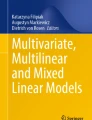
where μX and σX are the mean and the standard deviation of the implied (univariate) random variable X. The classical form of the moment-ratio diagram, plotted upside down, shows the third standardized moment γ3 (or sometimes its square γ32) plotted as abscissa and the fourth standardized moment γ4 plotted as ordinate. The plot usually includes all possible pairs (γ3, γ4) that a distribution can attain. Since γ4 −γ32 − 1 ≥ 0 (see [156, Exercise 3.19, page 121]), the moment-ratio diagram for a distribution occupies some subset of the shaded region shown in Figure 12.1.
Fig. 12.1
The shaded region represents the set of attainable pairs of third and fourth standardized moments (γ3, γ4) for any distribution. The solid line is the limit γ4 = 1 +γ32 for all distributions
Moment-ratio diagrams, apparently first introduced by Craig [36] and later popularized by Johnson et al. [71] especially through the plotting of multiple distributions on the same axes, have found enormous expediency among engineers and statisticians. The primary usefulness stems from the diagram’s ability to provide a ready “snapshot” of the relative versatility of various distributions in terms of representing a range of shapes. Distributions occupying a greater proportion of the moment-ratio region are thought to be more versatile owing to the fact a larger subset of the allowable moment pairs can be modeled by the distribution. Accordingly, when faced with the problem of having to choose a distribution to model data, modelers often estimate the third and fourth standardized moments (along with their standard error estimates), and plot them on a moment-ratio diagram to get a sense of which distributions may be capable of representing the shapes implicit in the provided data. In this sense, a modeler can compare several “candidate” distributions simultaneously in terms of their moments. Another use for these diagrams has been in getting a sense of the limiting relationships between distributions, and also between various distributions within a system. An excellent example of the latter is the Pearson system of frequency curves where the region occupied by the various distributions comprising the system neatly divides the (γ32, γ4) plane (Johnson et al. [71, page 23]).
Since Craig [36] published the original moment-ratio diagram, various authors have expanded and published updated versions. The most popular of these happen to be the various diagrams appearing in Johnson et al. [71] (e.g., pages 23, 390). Rodriguez [138], in clarifying the region occupied by the Burr Type XII distribution in relation to others, provides a fairly comprehensive version of the moment-ratio diagram showing several important regions. Tadikamalla [158] provides a similar but limited version in clarifying the region occupied by the Burr Type III region.
More recently, Cox and Oakes [35] have popularized a moment-ratio diagram of a different kind—one that plots the CV (γ2) as the abscissa and the third standardized moment (γ3) as the ordinate. Admittedly, this variation is location and scale dependent unlike the classical moment-ratio diagrams involving the third and fourth standardized moments. Nevertheless, the diagram has become unquestionably useful for modelers. A slightly expanded version of this variation appears in Meeker and Escobar [113].
12.1.1 Contribution
Our contributions in this paper are threefold, stated here in order of importance. First, we provide a moment-ratio diagram of the CV versus skewness (γ2, γ3) involving 36 distributions, four of which occupy two-dimensional regions within the plot. To our knowledge, this is most comprehensive diagram available to date. Furthermore, it is the first time the entire region occupied by important two-parameter families within the CV versus skewness plot (e.g., generalized gamma, beta, Burr type XII) has been calculated and depicted. The CV versus skewness plot first appeared in Cox and Oakes [35], and later in Meeker and Escobar [113]. The diagrams appearing in both these original sources either depict only families with a single shape parameter (e.g., gamma), or vary only one of the shape parameters while fixing all others. Second, we provide a classical moment-ratio diagram (γ3, γ4) that includes 37 distributions, four of which occupy two-dimensional regions within the plot. While such diagrams are widely available, the diagram we provide is the most comprehensive among the sources we know, and seems particularly useful due to its depiction of all distributions in the same plot. In constructing the two moment-ratio diagrams, we have had to derive the limiting behavior of a number of distributions, some of which seem to be new. Expressions for γ2, γ3, and γ4 for some of these distributions are listed in the appendix. We also host the moment-ratio diagrams in a publicly accessible website where particular regions of the diagram can magnified for clearer viewing. Third, using an actual data set, we demonstrate what a modeler might do when having to choose candidate distributions that “model” given data.
12.1.2 Organization
The rest of the paper is organized as follows. We present the two moment-ratio diagrams along with cues for interpretation in Sections 12.2, 12.3, and 12.4. Following that, we demonstrate the use of the moment-ratio diagrams for choosing a distribution that models given data in Section 12.5. Finally, we present conclusions and suggestions for further research in Section 12.6. This is followed by the appendix, where we provide analytical expressions for the moment-ratio locus corresponding to some of the distributions depicted in the diagrams, along with some of the APPL code that was used to create the diagrams.
12.2 Reading the Moment-Ratio Diagrams
Two moment-ratio diagrams are presented in this paper. The first, shown in Figure 12.2, is a plot containing the (γ3, γ4) regions for 37 distributions.
Figure 12.3 is a plot containing the (γ2, γ3) regions for 36 distributions. For convenience, in both diagrams, we have chosen to include discrete and continuous distributions on the same plot. In what follows we provide a common list of cues that will be useful in reading the diagrams correctly.
Distributions whose moment-ratio regions correspond to single points (e.g., normal) are represented by black solid dots, curves (e.g., gamma) are represented by solid black lines, and areas (e.g., Burr Type XII) are represented by colored regions.
The names of continuous distributions occupying a region are set in sans serif type; the names of continuous distributions occupying a point or curve are set in roman type; the names of discrete distributions occupying a point or curve are set in italics type.
The end points of curves, when not attained by the distribution in question, are represented by an unfilled circle (e.g., logistic exponential).
When the boundary of a moment-ratio area is obscured by another area, we include a dotted line (Figure 12.2) or an arrow (Figure 12.3) to clarify the location of the obscured boundary.
When a distribution represented by points in one of the moment-ratio diagrams converges as one of its parameters approaches a limiting value (e.g., a t random variable as its degrees of freedom approaches infinity), we often decrease the font size of the labels to minimize interference.
The parameterizations used for the distributions are from Leemis and McQueston [95] unless indicated otherwise in the paper.
Whether the locus corresponding to a distribution in Figure 12.2 is a point, curve, or region usually depends on the number of shape parameters. For example, the normal distribution has no shape parameters and its locus in Figure 12.2 corresponds to the point (0, 3). By contrast, since the gamma distribution has one shape parameter, its locus corresponds to the curve γ3 = 1. 5γ22 + 3. An example of a distribution that has two shape parameters is the Burr Type XII distribution. It accordingly occupies an entire region in Figure 12.2. In all, Figure 12.2 has 37 distributions with 4 continuous distributions represented by regions, 19 distributions (15 continuous and 4 discrete) represented by curves, and 14 distributions (13 continuous and 1 discrete) represented by one or more points. A list of other useful facts relating to Figure 12.2 follows.
The “T” plotted at (γ3, γ4) = (0, 9) corresponds to the t distribution with five degrees of freedom, which is the smallest number of degrees of freedom in which the kurtosis exists.
The chi square (S) and Erlang (X) distributions coincide when the chi square distribution has an even number of degrees of freedom. This accounts for the alternating pattern of “S” and “SX” labels that occur along the curve associated with the gamma distribution.
Numerous distributions start at (or include) the locus of the normal distribution and end at (or include) the locus of the exponential distribution. Two examples of such are the gamma distribution and the inverted beta distribution.
Space limitations prevented us from plotting the values associated with the discrete uniform distribution between its limits as a two-mass value with (γ3, γ4) = (0, 1) and its limiting distribution (as the number of mass values increases) with (γ3, γ4) = (0, 1. 8). It is plotted as a thick line.
The regime occupied by the inverted beta distribution has the curves corresponding to inverted gamma and the gamma distributions as limits.
The regime occupied by the generalized gamma distribution has the curves corresponding to the power distribution and the log gamma distribution as partial limits.
The regime occupied by the Burr Type XII distribution has the curve corresponding to the Weibull distribution as a partial limit.
Barring extreme negative skewness values, virtually all of the regime occupied by the generalized gamma distribution is subsumed by the beta distribution.
The beta and the Burr Type XII distributions seem complementary in the sense that the beta distribution occupies the “outer” regions of the diagram while the Burr Type XII distribution occupies the “inner” regions of the diagram. Furthermore, the collective regime of the beta and Burr Type XII distributions, with a few exceptions (e.g., Laplace), encompasses all other distributions included in the plot.
12.4 The CV-Skewness Diagram
Unlike in the skewness-kurtosis diagram (Figure 12.2), the locus of a distribution in the CV-skewness diagram (Figure 12.3) depends on the distribution’s location and scale parameters. For this reason, in Figure 12.3, there are fewer distributions (compared to Figure 12.2) whose locus is a singleton. Figure 12.3 represents a total of 36 distributions with 4 continuous distributions represented by regions, 24 distributions (19 continuous and 5 discrete) represented by curves and 8 distributions (7 continuous and 1 discrete) represented by one or more points. A list of other useful facts relating to Figure 12.3 follows.
Distributions that are symmetric about the mean have γ3 = 0. Since CV can be adjusted to take any value (by controlling the location and scale), symmetric distributions, e.g., error, normal, uniform, logistic, have the locus γ3 = 0 in Figure 12.3.
The regime occupied by the beta family has the gamma curve γ3 = 2γ2, γ2 ∈ (0, 1) and the Bernoulli curve γ3 = γ2 − 1∕γ2 as limits.
The regime occupied by the inverted beta distribution has the gamma curve γ3 = 2γ2, γ2 ∈ (0, 1) and the inverted gamma curve γ3 = 4γ2∕ (1 −γ22), γ2 ∈ (0, 1) as limits.
The regime occupied by the generalized gamma distribution has the curves corresponding to the power distribution and the Pareto distribution as partial limits.
The regime occupied by the Burr Type XII distribution has the curves corresponding to the Weibull and Pareto distributions as limits.
12.5 Application
The moment-ratio diagrams can be used to identify likely candidate distributions for a data set, particularly through a novel use of bootstrapping techniques, e.g., Cheng [31] and Ross [141]. Toward illustrating this, we first formally set up the problem. Let X1, X2, …, Xn be iid observations of a random variable having an unknown CDF F(x). Suppose θ is some parameter concerning the population distribution (e.g., the coefficient of variation γ2), and let \(\hat{\theta }\) be its estimator (e.g., the sample coefficient of variation \(\hat{\gamma }_{2}\) constructed from X1, X2, …, Xn). Also let Fn(x) denote the usual empirical CDF constructed from the data X1, X2, …, Xn, i.e.,
A lot is known about how well Fn(x) approximates F(x). For example, the Glivenko–Cantelli theorem (from Billingsley [13]) states that Fn → F uniformly in x as n → ∞. Furthermore, the deviation of Fn(x) from F(x) can be characterized fully through Sanov’s theorem (from Dembo and Zeitouni [44]) under certain conditions.
We are now ready to demonstrate how the above can be used toward identifying candidate distributions to which a given set of data X1, X2, …, Xn might belong. As usual, the sample mean and sample standard deviation are calculated as
In order to obtain a nonzero standard deviation, we assume that at least two of the data values are distinct. The point estimates for the CV, skewness, and kurtosis are
for \(\bar{X}\neq 0\). The points \(\left (\hat{\gamma }_{3},\hat{\gamma }_{4}\right )\) and \(\left (\hat{\gamma }_{2},\hat{\gamma }_{3}\right )\) can be plotted in Figures 12.2 and 12.3 to give a modeler guidance concerning which distributions are potential parametric models for statistical inference. Probability distributions in the vicinity of the point estimates are strong candidates for probability models. Unfortunately, these point estimates do not give the modeler a sense of their precision, so we develop an approximate interval estimate in the paragraph below.
Bootstrapping can be used to obtain a measure of the precision of the point estimates \(\left (\hat{\gamma }_{3},\hat{\gamma }_{4}\right )\) and \(\left (\hat{\gamma }_{2},\hat{\gamma }_{3}\right )\). Let B denote the number of bootstrap samples (a bootstrap sample consists of n observations drawn with replacement from the original data set). For each bootstrap sample, the two parameters of interest (e.g., skewness and kurtosis) are estimated using the procedure described in the previous paragraph and stored. After the B bootstrap samples have been calculated, the bivariate normal distribution is fitted to the B data pairs using standard techniques. Two of the five parameters of the bivariate normal distribution, namely, the two sample bootstrap means, are replaced by the point estimators to assure that the bivariate normal distribution is centered about the point estimators that were calculated and plotted in the previous paragraph. Finally, a concentration ellipse is plotted around the point estimate. The tilt associated with the concentration ellipse gives the modeler a sense of the correlation between the two parameters of interest.
Example 12.1.
Consider the n = 23 deep-groove ball bearing failure times (measured in 106 revolutions)
from Lieblein and Zelen [101], which is discussed in Caroni [27]. For brevity, we consider the plotting of the point and associated concentration ellipse for only the CV vs. skewness moment ratio diagram (Figure 12.3). The first step is to calculate and plot the point \(\left (\hat{\gamma }_{2},\hat{\gamma }_{3}\right )\cong (0.519, 0.881)\). We then take B = 200 bootstrap samples of n = 23 failure times with replacement from the data set. (The value of B was chosen arbitrarily.) The bivariate normal distribution is fitted to the B data pairs and a concentration ellipse is then overlaid on the plot of the CV vs. skewness as a visual aid to identify likely candidate distributions for modeling the ball bearing lifetimes. The results of this process are displayed in Figure 12.4 which provides a close-up view of the concentration ellipse. In terms of candidate distributions, the following conclusions can be drawn.
Fig. 12.4
Using the CV-skewness diagram to choose a candidate distribution (for modeling given data) through estimation and bootstrapping
Because ball bearing lifetimes are inherently continuous, all of the discrete distributions should be eliminated from consideration.
The position of the concentration ellipse implies that several distributions associated with regions in the \(\left (\gamma _{2},\gamma _{3}\right )\) graph are candidate distributions: the gamma distribution (and its special cases), and the Weibull distribution (and the Rayleigh distribution as a special case) are likely to be models that fit the data well.
The gamma and Weibull distributions both have shape parameters that are greater than 1 within the concentration ellipse, confirming the intuition that an appropriate model is in the IFR class (Cox and Oakes [35]) of survival distributions (i.e., the ball bearings are wearing out). Consistent with this conclusion, note that the point for the exponential distribution is far away from the concentration ellipse.
Distributions that are close to the concentration ellipse should also be included as candidates. For this data set, the log normal distribution is just outside of the concentration ellipse, but provides a good fit to the data (see Crowder et al. [38] pages 37–38 and 42–43 for details ). Any distribution in or near the concentration ellipse should be considered a candidate distribution. This is confirmed by the four graphs in Figure 12.5, which show the fitted Weibull, gamma, lognormal, and exponential distributions, along with the empirical CDF associated with the ball bearing failure data. The three distributions that are within or close to the concentration ellipse provide reasonable fits to the data; the exponential distribution, which is far away from the concentration ellipse, provides a poor fit to the data.
Fig. 12.5
Empirical and fitted CDFs for the Weibull, gamma, log normal, and exponential distributions for the ball bearing data set
The size of the concentration ellipse also gives guidelines with respect to sample size. If the concentration ellipse is so large that dozens of probability distribution are viable candidates, then a larger sample size is required. As expected, there is generally more variability on the higher-level moments.
Also, the eccentricity and tilt of the concentration ellipse provide insight on the magnitudes of the variances of the point estimates and their correlation. For the ball bearing failure times, the standard error of the skewness is almost an order of magnitude larger than the standard error of the coefficient of variation. The slight tilt of the concentration ellipse indicates that there is a small positive correlation between the coefficient of variation and the skewness.
If point estimates and concentration ellipses are plotted on both of the moment-ratio diagrams in Figures 12.2 and 12.3, the candidate distributions might not be consistent. The authors believe that the coefficient of variation vs. the skewness plot is more reliable because it is based on lower-order moments. The moment-ratio diagrams can be used in tandem when using any one diagram still leaves a large number of candidate distributions.
12.6 Conclusions and Further Research
The two moment-ratio diagrams presented in Figures 12.2 and 12.3 are useful for insight concerning univariate probability distributions and for model discrimination for a particular data set. Plotting a concentration ellipse associated with bootstrap samples on either chart provides guidance concerning potential probability distributions that provide an adequate fit to a data set. These diagrams are one of the few ways that data analysts can simultaneously evaluate multiple univariate distributions.
Data sets associated with actuarial science, biostatistics, and reliability engineering often contain censored observations, with right-censored observations being the most common. Plotting the various moments is problematic for censored observations. Block and Leemis [16] provide techniques for overcoming censoring that are based on kernel density function estimation and competing risks theory. These techniques can be adapted to produce point estimators and concentration ellipses.
Further research work associated with these diagrams would include a Monte Carlo study that evaluates the effectiveness of the concentration ellipse in identifying candidate distributions. This study would indicate which of the two moment-ratio diagrams is better for model discrimination.
References
Billingsley, P. (1995). Probability and measure. New York: Wiley.
Cheng, R. C. H. (2006). Resampling methods. In S. Henderson, & B. L. Nelson (Eds.), Handbooks in operations research and management science: Simulation (pp. 415–453). Amsterdam: Elsevier.
Lieblein, J., & Zelen, M. (1956). Statistical investigation of the fatigue life of deep-groove ball bearings. Journal of Research of the National Bureau of Standards, 57, 273–316.
Department of Mathematics and Computer Science, The Colorado College, Colorado Springs, Colorado, USA
Andrew G. Glen
Department of Mathematics, The College of William and Mary, Williamsburg, Virginia, USA
Lawrence M. Leemis
Appendix
Appendix
In this section, we provide exact expressions for the CV, skewness, and kurtosis, for the four distributions that occupy (two-dimensional) regions in Figures 12.2 and 12.3.
Beta
The beta family (see Johnson et al. [72, Chap. 25, page 210]) has two shape parameters p, q > 0 with
The regime in the (γ2, γ3) plane is bounded above by the line γ3 = 2γ2 corresponding to the gamma family, and below by the curve γ3 = γ2 − 1∕γ2. The regime in the (γ3, γ4) plane is bounded below by the limiting curve γ4 = 1 +γ32 for all distributions, and above by the curve \(\gamma _{4} = 3 + \frac{3} {2}\gamma _{3}^{2}\) corresponding to the gamma family.
Inverted Beta
The beta-prime or the Pearson Type VI family (see Johnson et al. [72, Chap. 25, page 248]), also known as the inverted beta family, has two shape parameters α, β > 0 with
The regime in the (γ2, γ3) plane is bounded above by the curve γ3 = 4γ2∕(1 −γ22), γ2 ∈ (0, 1), and below by the curve γ3 = 2γ2 corresponding to the gamma family. The regime in the (γ3, γ4) plane is bounded above by the curve
corresponding to the inverse gamma family, and below by the curve γ4 = 3 + 3γ32∕2 corresponding to the gamma family.
Generalized Gamma
The generalized gamma family (see Johnson et al. [71, page 388]) has two shape parameters α, λ > 0 with the rth raw moment \(\mu _{r}' = \Gamma (\alpha +r\lambda )/\Gamma (\alpha )\). The regime in the (γ2, γ3) plane is bounded below by the curve
corresponding to the power family, bounded below to the right by the curve corresponding to the generalized gamma family with λ = −0. 54, and bounded below to the left by the curve corresponding to the log gamma family. [Recall that the log gamma family with shape parameter α > 0 has the rth cumulant \(\kappa _{r} = \Psi ^{(r)}(\alpha )\), where \(\Psi ^{(r)}(z)\) is the (r + 1)th derivative of \(\ln \Gamma (z)\).]
Burr Type XII
The Burr Type XII family (see Rodriques [138]) has two shape parameters c, k > 0 with the rth raw moment \(\mu _{r}' = \Gamma (r/c + 1)\Gamma (k - r/c)/\Gamma (k)\), c > 0, k > 0, r < ck. The regime in the (γ2, γ3) plane is bounded below by the curve corresponding to the Weibull family (rth raw moment \(\mu _{r}' = \Gamma (r/c + 1),\) where c > 0 is the Weibull shape parameter), and above by the curve
corresponding to the Pareto family. The regime in the (γ3, γ4) plane is bounded below by the curve corresponding to the Weibull family, bounded above to the right by the curve corresponding to the Burr Type XII family with k = 1, and bounded above to the left by the curve corresponding to the Burr Type XII family with c = ∞.
APPL Code for the Diagrams
The moment-ratio diagrams in this paper were created in two steps. For each distribution, an algorithm is used to create the sets of points that will produce the curves. These sets of points are then imported into R to produce the graphs. The APPL code to generate the points for the χ2 distribution moment curves follow. Other distribution curves are produced similarly. Note the variable X establishes the χn2 distribution. The APPL commands in the fprintf statements find the desired moments of X for various values of n.
Vargo, E., Pasupathy, R., Leemis, L.M. (2017). Moment-Ratio Diagrams for Univariate Distributions.
In: Glen, A., Leemis, L. (eds) Computational Probability Applications. International Series in Operations Research & Management Science, vol 247. Springer, Cham. https://doi.org/10.1007/978-3-319-43317-2_12