
Abstract
Most statistical process monitoring begins with an assumed model (implicitly or otherwise) and further assumptions about the components of the model. These assumptions all play important roles in practice, in the solution that is proposed for the problem at hand. Since the proposal is based on these assumptions, it is important that they are thoroughly investigated and properly validated, so that the results can be depended on. In this paper, we examine two of the important and common assumptions, namely, normality and independence. We provide some examples with real data and illustrate the consequences. It is seen that the nonparametric (distribution-free) approach may be a safer option in many applications in practice.
Access provided by Autonomous University of Puebla. Download chapter PDF
1 Introduction
In the modern age, large amounts of data are often available from a variety of sources and in a variety of environments that need to be studied and analyzed. This means one needs to make sense of the volume of data and then be able to make efficient decisions based on the data. The study may consist of one time or cross-sectional analysis at a given point in time or a longer term ongoing monitoring of a process. The analysis involves both descriptive and inferential statistics. The descriptive analysis involves visualization and numerical summaries to help understand what is going on. The decision making via prediction, estimation, etc., which is statistical inference, is often based on a confidence interval or a test of hypothesis. While availability of modern software has made this type of work routine and seemingly trivial, one must not forget the assumptions behind the methods that must be satisfied to validate and justify the end results. Although each statistical inference method requires its own assumptions, some of the most common ones are about randomness, independence and underlying distribution of the data. Violations of one or more of the assumptions might render the decisions invalid and hence useless even though there would seem nothing wrong in terms of crunching the numbers. Much has been written about the importance of checking assumptions during an analysis using statistical methods before decisions are made. In this brief paper, we revisit some of these issues via an example and illustrate some of the challenges associated with data analysis and analytics in general, in practice.
We first consider the assumption about the underlying distribution that may be necessary before a statistical method is applied. This may be necessary simply because the theoretical derivation of the methodology requires such an assumption. However, it is fair to say that assuming (picking) a probability distribution for the data is a daunting task. Whether acknowledged or not, this is one of the most important and challenging aspects of data analysis since the validity of the inference drawn from the application of the method often hinges upon this crucial assumption. The distributions come in all sorts of shapes; the most commonly assumed distribution in the application of statistical methods is the normal distribution which is symmetric and bell-shaped. However, depending on the context, other distributions may also be used, such as the exponential distribution, the uniform distribution, the Weibull distribution, the gamma distribution, to name a few, within the class of continuous distributions. Graphs of some probability density functions of some of the well-known continuous distributions are shown in Fig. 1. The collection includes symmetric and skewed distributions. Note that as shown, even among the symmetric distributions, shapes can vary and this can lead to differences in probability based assessments. The same is true for skewed distributions.

Some continuous probability distributions
This challenge of making and meeting the distributional assumption is faced by practitioners and data analysts from all areas on a day to day basis. Although it may be possible to use the law of averages and the central limit theorem to by-pass (avoid) the distributional assumption in certain cases (like for large sample sizes) while making statistical inference, it is somewhat of a dicey strategy, particularly in quality control and monitoring applications where the sample sizes are often small. In manufacturing, the typically recommended subgroup size is around five, whereas in real time, individual monitoring of data, the subgroup size is one. Note that in many monitoring settings, data are collected from sensors in a nearly continuous stream and thus it is often more meaningful (and required) to monitor the individual data. Thus applying the central limit theorem to such problems can be risky if not impossible. At times data are aggregated into hourly, four-hourly- or six-hourly intervals to improve the accuracy of measures but such aggregations still will not necessarily allow the central limit to apply.
Statistical process control and monitoring methods originally arose in the context of industrial/manufacturing applications, developed during and after World War Two, in order to produce high quality (and high reliability) items (at a lower cost). This regime involves designing studies (i.e., Design of Experiments), collecting (Sampling), and analyzing data (Analytics). Among the many statistical tools used in statistical process monitoring the control chart is perhaps the most well-known. This graphic provides a simple and effective visualization of “what’s going on” in a process at a given point in time and also over time, in order for the user to make a decision about the quality of the process, including indicating what might not be working and where (and when) so that necessary adjustments may be made. Here the term “quality of the process” is used in a general sense, which is context-dependent. If the process is a manufacturing process producing say copper tubing, the quality of the process may be reflected in the diameter of the tubes (or the average and standard deviation of the diameter of a sample of tubes) and a control chart can describe whether or not the machine (or the process) is producing these tubes that are “in-control” that is meeting specifications for what is expected out of these tubes, so that they can be sold in the market. On the other hand if the context refers to a situation other than in manufacturing, say about the level of pollution in the environment of a certain city, measured in terms of the concentration level of certain matters or chemicals, the quality of the process (whether or not it is in-control) may correspond to what may be dictated by the safety and health considerations.
In any event, if the variables of interest in the outputs of the process are measurable and are monitored with a control chart, over time, and the concept of significance is to be attached to the results, such as, for example, whether or not the process is producing significantly more defectives, or, whether or not the pollution level is significantly higher than expected, relative to what is “in-control”, an assumption about the probability distribution of the variable being measured and monitored may be needed. When this information is available, it is possible to calculate the probability (or the chance) of observing what has been observed, and decide whether or not the observed results are significant, or extreme, compared to some nominal threshold.
In a vast majority of the applications of statistical process monitoring and control, as in many applications of statistics in many other areas, it is fairly common to assume that the underlying probability distribution is of a (given) known form (based on knowledge and experience), but some aspects of the distribution are unknown, say the mean and/or the standard deviation, which are called parameters. This clearly lessens the burden of making the distributional assumption somewhat and provides a bit of flexibility in the choice. For example, one may assume that the diameters of the copper tubes follow a normal distribution with an unknown mean and an unknown standard deviation. Then standard statistical theory and methods may be used with this knowledge of the form of the distribution, to estimate the parameters, and to set up inference procedures. This is the pathway to setting up Shewhart control charts to monitor the mean of the process. Control charts (and statistical methods) developed under the assumption of a known parametric distribution are referred to as parametric control charts (Chakraborti and Graham 2019a, b). Since the normal distribution is among the most commonly assumed distribution sometimes parametric charts are almost synonymous with normal-theory control charts, but we emphasize that many other distributions can be and are used in process monitoring, in a variety of interesting applications.
2 Consequences of the Distributional Assumption
It is clear that if the diameters of the tubes do not follow a normal distribution, but, some other distribution, say a gamma distribution (which is typically skewed to the right) one can set up parametric control charts for the mean taking advantage of that information. This control chart, including the control limits, will not be the same as the one based on the normal distribution. Thus, one may get a different set of results, such as whether or not the process is in control, from an application of each chart. In other words, the statistical inference may be dependent on the assumed distribution for the observed variable(s). Put another way, there is a practical consequence to making the distributional assumption and that consequence, in terms of the probability and the eventual decision, may be slight to severe, depending on how much of the distributional assumption may be violated by the data and how much each decision may end up costing. For example, assuming that the IC distribution of the diameters of copper tubes is exponential with mean 20, the UCL = 20 + 3 × 20 = 80 and LCL = 20 − 3 × 20 = −40, so that the LCL is rounded up to 0. Hence the false alarm rate for the chart is P(X > 80) = e−80/20 = 0.0183. Thus, where under the normal distribution assumption, for 3-sigma limits, there would be a false alarm, on the average, once in every 1/0.0027 = 370 samples, under the exponential distribution, there would be a false alarm, on the average, once in every 54.59 (=1/0.0183) samples. This could mean that the manufacturer may soon be out of business because of stopping the process so frequently and looking for a reason that does not exist. Although the example may be somewhat extreme, the point is that there will be a consequence of using the wrong distribution, on the inference or the decision, which can be anywhere, from mild (bearable) to catastrophic.
The issue is that there is usually no way to fully guarantee that the assumed distribution is the correct distribution for the data, or that the data fit the assumed distribution perfectly, since there is always at least a 5% chance of getting it wrong (say based on a goodness of fit test). The bottom line may be that the manufactured copper tubes all pass the quality control check based on the control charts but may be useless in the marketplace or, alternatively, that the tubes do not pass the check and yet may be acceptable.
In the “classical” statistical literature, such consequences are of course well-known and have been examined for some time in terms of what is called robustness. In practice however, the analyst faces a dilemma. The issue is that in practice the consequences of the violations of the assumptions are not always known, advertised, articulated or even appreciated. Or, even if the consequences may be understood, the implementation is not affected or may be delayed, due to lack of training, availability of software, carelessness, …, just to mention a few reasons. In order to address this dilemma, the area of nonparametric statistics has been developed within statistics. Nonparametric statistical methods provide robust inferential tools (confidence intervals, hypotheses tests) which can be used to make valid statistical inference without assuming a specific parametric form of the underlying distribution. Note that these are not “too good to be true” methods peddled by some suspicious characters at the street corners, but have the backing of a solid theoretical basis. For instance, for the copper tubing example, one can construct a valid 95% nonparametric confidence interval for the median diameter, which does not require the assumption of any particular parametric form of the distribution, except continuity. This is a remarkable result available for many years and should be utilized whenever possible. In short, nonparametric methods apply to a larger class of probability distributions (which may include the one that may have been most commonly used, say the normal). It is true that being applicable to a much broader range of distributions, nonparametric methods may lose some efficiency against parametric methods, for some specific distribution. So if one is sure about the assumption of the distribution, it is perfectly reasonable to proceed along that parametric path. However, it seems fair to say that in most situations, such knowledge is all but nonexistent and one is better off using a nonparametric method.
The same recommendation applies to the area of statistical process monitoring and control. Most of this literature is about parametric charts that are set up assuming a normal (or some other) distribution. However, in the last twenty years, several nonparametric control charts have been proposed in parallel. This area of research has grown rapidly and now a number of software packages are available. In fact, the proliferation of R programming has now reached a state of maturity where it is not entirely unexpected that a user can program a newly proposed chart in a journal article and apply it, even if a packaged solution is not yet available. This is an encouraging development. Several review papers are now available (see for example, Chakraborti, van der Laan and Bakir 2001 and Chakraborti and Graham 2019a, b) and at least two recent books (Qiu 2014 and Chakraborti and Graham 2019a, b) have been written on the subject. A lot of research is currently underway in these areas, both theory and applications.
In this paper our goal is to illustrate the issues with making some of the basic assumptions for a valid statistical analysis with a real dataset arising in a real situation. We focus on this type of a dataset as most datasets used for illustration in the literature, although may be appropriate to illustrate a particular proposed methodology, do not seem to conform to many applications of statistical process monitoring and control in practice. It will be seen that the analysis of real data is hard and our example will show the imperfections in the practical setting, but that is precisely the point. With this is mind, various ways of monitoring such data are considered and a case is made in favor of nonparametric statistical process monitoring.
3 Other Assumptions and Considerations When Designing a Control Chart
The second important issue we consider here is the assumption of independence. In a manufacturing type process monitoring context, it may be reasonable to have data that may be presumed to be independent since it is usually possible to control the monitoring environment quite tightly. However, while monitoring individual data or data monitored over time, it is more often the case that the data are not stochastically independent, that is, one data point, in a sequence of data points, influences another, positively or otherwise, that needs to be accounted for in the analysis. A typical scenario involves data collected over time, where the time difference between the successive observations may be small. This could lead to the data being auto-correlated (or serially correlated). Here we consider monitoring applications where the data stream become available (are collected) in near real-time and this could be in the context of a continuous process in manufacturing, social media data streaming in, or pollution data. Given the very nature of these data, there is a high likelihood that the observations are not independent.
The first step in this setting is to define the “common cause” (what is in-control) and “special cause” variation (what is out-of-control) that need to be flagged by the monitoring strategy. This involves understanding the sources of variation by deciding on, for example, what, if any, seasonal adjustments need to be made (should be removed) or what within day influences are to be treated as common cause variation (and should be removed). This would help define common causes of variation that do not need to be signaled (which defines the in-control state). Also, having a clear understanding of what special causes of variation need to be flagged (what is out-of-control) is vital at this design phase. These decisions would have to be made before deciding on the distributional assumptions. These considerations are to be handled before deciding what time series model is going to be fitted and then monitoring the forecast residuals from that model. Deciding on the appropriate rational subgroup also requires some thought.
In parts manufacturing type applications, the basic in-control model is generally taken as
where \( \mu \) is the mean process value or the target and the random error is given by \( e_{t} \sim n\left( {0,\sigma^{2} } \right) \). However, in monitoring applications outside of manufacturing, this is often defined as
where \( e_{t} \sim n\left( {0,{{\sigma_{t}}^{2}} } \right) \) and the exact form of \( \mu_{t } \) and \( {{\sigma_{t}}^{2}} \) depend on how common cause variation is defined over time t. A visual example of \( \mu_{t } \,{\text{and}}\,{{\sigma_{t}}^{2}} \) that are influenced by the seasons is presented in Fig. 1. Notice that in this case, both the mean and the variance of the process are higher in Spring and Summer. We may wish to remove this variation as nothing can be done about it. In such cases we need to be certain about what we wish to control. In addition, the temperature, wind and humidity within a day vary and these influences can be removed if they influence the ozone. However before doing this we need to decide of the purpose of monitoring. If it is to discover what is unusual process behavior, removing all potential influences is recommended, but if the purpose is just to flag high values then no corrections should be made.
4 Applications
The practical example we consider is monitoring the level of ozone in the atmosphere at Chullora, a suburb of the local government areas the Canterbury-Bankstown Council and in the Municipality of Strathfield. It is located 15 km west of the Sydney central business district, in the state of New South Wales, Australia. It is part of the Greater Western Sydney region. The data, plotted in Fig. 2, involve hourly average ozone measures for six years, from June 5, 2013 to June 5, 2019 (inclusive). Monitoring the ozone level is important from a public health perspective since the ozone in the air we breathe can harm our health, especially on hot sunny days when ozone can reach unhealthy levels. Even relatively low levels of ozone can cause health effects. People most at risk from breathing air containing ozone include people with asthma, children, older adults, and people who are active outdoors, especially outdoor workers. In addition, people with certain genetic characteristics, and people with reduced intake of certain nutrients, such as vitamins C and E, are at greater risk from ozone exposure.

Hourly ozone measure at Chullora, Sydney, Australia
The first phase in the analysis is to explore the sources of variation in order to understand and define the in- and out-of-control status of the process and the underlying distribution, among other matters. This exploratory phase is called Phase I. We would expect ozone to have a seasonal influence, and Figs. 2 and 3 confirm this influence. It is also evident that the data are not normally distributed given the skewness of the boxplots particularly for months with low values.

Monthly boxplots of hourly ozone measures at Chullora
There is little we can do about this seasonal influence and so we may wish to remove this variation as common cause. We also assess the hourly influence of ozone measures in Fig. 4. There is a clear influence of hour of the day on the ozone measures. Note that on average lower ozone values are recorded in the afternoon than during other times in the day. It appears as if the hourly average trend could be fitted using a within day harmonic. There is little we can do about this influence and so we may also wish to remove this variation as common cause.

Boxplots of the hourly ozone measures at Chullora
These two sources of variation, the seasonality and the hour of the day (or within day), should be included in the model for the ozone level that can be used to provide one hour-ahead forecasts values. This can be handled as follows. The seasonal influence could be removed by taking first order seasonal differences of the data with season defined as the month (12). The influence of the hour of the day may be removed by fitting an ARIMA(1,1,1) model with “seasonal influence” being 24 hourly values. However, this model failed to remove all the significant autocorrelations and even more complicated ARIMA models failed to fit adequately. As an alternative, the simplest model tried was seasonal harmonics, with day harmonics and up to three lag autoregressive parameters.
-
Step 1: Transform the data so as to achieve approximate normality.
-
The transformation that proved closest to normality was (CHULLORA.OZONE.1h.average..pphm. + 0.101)^0.77
-
which was obtained using the boxcox in function in R MASS library given as
-
boxcox((CHULLORA.OZONE.1h.average..pphm. + 0.101)^0.77 ~ day + cos(2 * pi * day/365.25) + sin(2 * pi * day/365.25) + dw * (Time + cos(2 * pi * Time/24) + sin(2 * pi * Time/24)) + Lag1 + Lag1day + Lag2 + Lag3,data = OZONE.C) (Fig. 5).
Fig. 5 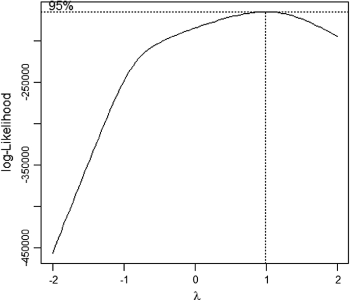
Box-cox transformation to normality
-
Step 2: Fit a model to the transformed data
-
The fitted model was as follows:
-
Call:
-
lm(formula = (CHULLORA.OZONE.1h.average..pphm. + 0.001)^0.77 ~ day + cos(2 * pi * day/365.25) + sin(2 * pi * day/365.25) + dw * (Time + cos(2 * pi * Time/24) + sin(2 * pi * Time/24)) + Lag1 + Lag1day + Lag2 + Lag3 + Temperature + WindSpeed + Humidity, data = OZONE.C)
-
The output from this is as follows (Fig. 6).
Fig. 6 
Output from model fitting


The autocorrelations of the residuals from this model are shown in Fig. 7 which indicate that there is significant autocorrelation up to 24 h but thereafter this autocorrelation is largely small to non-significant. The partial autocorrelations are significant for the first 24 h but the values are low (less than 0.11). Thus there is some evidence that the model does not do a great job at correcting within day variation, and may be improved. Nevertheless, for illustration, we decided to use this model to define the one hour-ahead forecasts, and then use a rational sub-group of hourly average ozone measures in a day. Given that measures were not recorded at 2 a.m. each day and that we are using 3 lagged autoregressive terms in the model this results in mostly 21 measures in a day.

Autocorrelation of the residuals of the fitted model
Even though the fitted model does not seem to remove all the influences of the hour of the day since the ACF values are significant for the first 24 h, this model is a reasonably adequate description of in-control data, particularly if we use a rational subgroup of daily measures. However, the other assumption in the model is that the variance of the error term is homogeneous which needs to be checked. In fact, looking at the time series in Fig. 2, there seems to be some questions about the validity of this homoscedasticity assumption. We use the gamlss library in R to assess whether the variance can be assumed homogeneous over time.
The R code is as follows:

Family: c(“NO”, “Normal”)
Call: gamlss(formula = (CHULLORA.OZONE.1 h.average..pphm. + 0.001)^0.77 ~ day + cos(2 * pi * day/365.25) + sin(2 * pi * day/365.25) + dw * (Time + cos(2 * pi * Time/24) + sin(2 * pi * Time/24)) + Lag1 + Lag1day + Lag2 + Lag3 + Temperature + WindSpeed + Humidity, sigma.formula = ~ day + cos(2 * pi * day/365.25) + sin(2 * pi * day/365.25) + ((dw == “Wednesday”) + (dw == “Sunday”) + (dw == “Saturday”)) * (Time + cos(2 * pi * Time/24) + sin(2 * pi * Time/24)) + Temperature + WindSpeed + Humidity, data = na.omit(OZONE.C)).
The output is shown in Fig. 8.


Model fitting results for the location and variance using gamlss library in R
Clearly the variances for this process are not homogeneous within days with the variance increasing with the hour of the day and there is a significant harmonic change in variances within the day.

The source of variation in the variances includes seasonal variation but no significant increase in variance over time. The changes in variances are also seasonally influenced but the variances are not significantly increasing with each day, this was anticipated as we observed that variance changes significantly with season in Figs. 2 and 3.

Indicating that the ozone values are increasing as the day number increases and the seasonal harmonics for the mean are both statistically significant. During the day the ozone values increase to a maximum at about noon and then decreases thereafter.

Note that there is a significant and different Sunday and Saturday influence for day of the week. This model was selected because it delivered the smallest AIC value.
In setting up a Phase II monitoring strategy, we use this model to compute the hour-ahead forecasts for each hour of the day for the last 366 days of data. The data used to provide these forecasts uses a moving window of 5 years of data for each forecast so that the accuracy of the forecast are expected to be the same. The model is used to forecast both the mean and variance of the normally distributed data for a month ahead, and then we calculate the usual month ahead ozone value minus this forecasted value, all divided by the forecast standard deviation. This result is assumed to be approximately normally distributed with mean zero and standard deviation 1 and a three-sigma control chart is used to monitor these standardized residuals. Note, generally speaking, even when the normal distribution fits the training data quite well (in Phase I) it does not guarantee that the forecast errors will be normally distributed (in Phase II—see qqplot in Fig. 9). However we recognize that this may contain out-of-control data and so such judgements are difficult to make. For example, the ozone values could increase significantly to a new steady state, and this new steady state distribution may be different from the normal.

qq-plot of the one hour-ahead standardized forecasts errors
The hour-ahead forecasts and the forecast errors are calculated and used to (Phase II) monitoring changes in the ozone level at Chullora. The assumption when applying the classical x-bar Shewhart chart to the forecast errors using all 23 hourly measures during a day (so the hourly measures within a day is viewed as a subgroup) is likely to be adequate in approximating the normal distribution because of the central limit theorem is likely to apply. Note however, that averaging as many as 23 values is unlikely in the application of most classical x-bar Shewhart Charts in manufacturing.
The x-bar chart with 3-sigma control limits is given for the standardized forecast errors in Fig. 10. It is clear that ozone level is mostly out-of-control on the high side at Chullora with an occasional signal for low ozone measures. This indicates that the ozone measures have been mostly higher than expected during this monitoring period.

The x-bar chart or the one hour-ahead standardized forecast errors with 3-sigma control limits
Although the x-bar chart in Fig. 10 may be appropriate for this application because it used a relatively large rational subgroup of 23 observations and the Box-Cox transformation is applied to improve the normality assumption. It is likely to provide earlier flags of ozone measures of a health concern. The x-bar chart flags 12 out-of-control high sided ozone days and 14 low sided ozone days. It is unclear whether the transformation to normality will be appropriate in the long-term, while the nonparametric Wilcoxon Signed Rank Control chart is always valid. So it may be a safer option if the planned monitoring strategy is going to run for several years. The Wilcoxon Signed Rank Control chart is presented in Fig. 11 and this chart flags four out-of-control high-sided ozone days and 20 low sided ozone days.

Wilcoxon signed-rank chart for the negative ranked values for the one hour-ahead standardized forecast errors
Let N be the number of standardized hour-ahead forecast errors in a day. The value of N varies from day to day which explains why the control limits vary according to the number of reported values in the day. Let the rank total for positive standardized forecast errors be T+, this is the classical Wilcoxon signed-rank statistic. The control limits, the UCL and the LCL are defined by
and
where the mean and the variance of are obtained from, for example, Gibbons and Chakraborti (2010), page 196. Note that since N is not the same every day, the control limits change, and hence the jagged appearance of the control chart.
A required assumption for the signed-rank chart is symmetry which may or may not be satisfied in general. On the other hand, an alternative, namely the sign chart is more general and requires only the assumption of continuity of the data. The control limits for the sign chart can be easily found along the lines for the signed-rank chart using the mean and the variance of the sign statistic, which are available, also in Gibbons and Chakraborti (2010). This chart, shown in Fig. 12, does not seem to lose much power compared to the Wilcoxon Signed Rank control chart.

Sign chart for the number of positive values for the hour-ahead standardized forecast errors
The sign control chart flags 4–5 out-of-control high sided ozone days and 12 low sided ozone days. Thus, simple nonparametric charts can do the job adequately and one does not need to use a parametric chart and worry about the underlying assumption(s).
5 Concluding Remarks
We have demonstrated the application of some nonparametric control charts in a real monitoring application, using an air pollution data example involving ozone measurements at Chullora, a suburb in Sydney, Australia. The example illustrates how these charts can be applied for monitoring in non-traditional settings, outside of the usual manufacturing situations. It reinforces that there are many facets to monitoring data observed over time in practice and one size fits all recipes using the classical assumptions about independence and normal distribution do not work in many situations. It also shows that in this example very little is lost in applying a nonparametric control chart to the forecast errors (residuals) and it may be a longer term safer option as the distribution of the variables are likely to change over time as the ozone concentrations change. In other words, we can not assume that the plan best at a given point in time is going to remain the best in the future. For this reason, the nonparametric approach may be a safer option unless the parametric chart is periodically reviewed and updated at least annually.
References
Chakraborti, S., & Graham, M. A. (2019a). Nonparametric (distribution-free) control charts: An updated overview and some results. Quality Engineering. https://doi.org/10.1080/08982112.2018.1549330.
Chakraborti, S., & Graham, M. A. (2019b). Nonparametric statistical process control. Wiley, New York, New York.
Chakraborti, S., van der Laan, P., & Bakir, S. T. (2001). Nonparametric control charts: An overview and some results. Journal of Quality Technology, 33, 304–315.
Gibbons, J. D., & Chakraborti, S. (2010). Nonparametric statistical inference (5th ed.). Boca Raton, FL: CRC Press.
Qiu, P. (2014). Introduction to statistical process control. Boca Raton, FL: Chapman Hall/CRC.
Acknowledgements
The authors are grateful to a referee for comments that improved the presentation.
Author information
Authors and Affiliations
Corresponding author
Editor information
Editors and Affiliations
Rights and permissions
Copyright information
© 2020 Springer Nature Switzerland AG
About this chapter

Cite this chapter
Chakraborti, S., Sparks, R.S. (2020). Statistical Process Monitoring and the Issue of Assumptions in Practice: Normality and Independence. In: Koutras, M., Triantafyllou, I. (eds) Distribution-Free Methods for Statistical Process Monitoring and Control. Springer, Cham. https://doi.org/10.1007/978-3-030-25081-2_4
Download citation
DOI: https://doi.org/10.1007/978-3-030-25081-2_4
Published:
Publisher Name: Springer, Cham
Print ISBN: 978-3-030-25080-5
Online ISBN: 978-3-030-25081-2
eBook Packages: EngineeringEngineering (R0)