
Abstract
Scales control the mapping from data to aesthetics. They take your data and turn it into something that you can see, like size, colour, position or shape. Scales also provide the tools that let you read the plot: the axes and legends. Formally, each scale is a function from a region in data space (the domain of the scale) to a region in aesthetic space (the range of the scale). The axis or legend is the inverse function: it allows you to convert visual properties back to data.
Access provided by Autonomous University of Puebla. Download chapter PDF
Keywords
These keywords were added by machine and not by the authors. This process is experimental and the keywords may be updated as the learning algorithm improves.
1 Introduction
Scales control the mapping from data to aesthetics. They take your data and turn it into something that you can see, like size, colour, position or shape. Scales also provide the tools that let you read the plot: the axes and legends. Formally, each scale is a function from a region in data space (the domain of the scale) to a region in aesthetic space (the range of the scale). The axis or legend is the inverse function: it allows you to convert visual properties back to data.
You can generate many plots without knowing how scales work, but understanding scales and learning how to manipulate them will give you much more control. The basics of working with scales is described in Sect. 6.2. Section 6.3 discusses the common parameters that control the axes and legends. Legends are particularly complicated so have an additional set of options as described in Sect. 6.4. Section 6.5 shows how to use limits to both zoom into interesting parts of a plot, and to ensure that multiple plots have matching legends and axes. Section 6.6 gives an overview of the different types of scales available in ggplot2, which can be roughly divided into four categories: continuous position scales, colour scales, manual scales and identity scales.
2 Modifying Scales
A scale is required for every aesthetic used on the plot. When you write:
ggplot(mpg, aes(displ, hwy)) +
geom_point(aes(colour = class))
What actually happens is this:
ggplot(mpg, aes(displ, hwy)) +
geom_point(aes(colour = class)) +
scale_x_continuous() +
scale_y_continuous() +
scale_colour_discrete()
Default scales are named according to the aesthetic and the variable type: scale_y_continuous(), scale_colour_discrete(), etc.
It would be tedious to manually add a scale every time you used a new aesthetic, so ggplot2 does it for you. But if you want to override the defaults, you’ll need to add the scale yourself, like this:
ggplot(mpg, aes(displ, hwy)) +
geom_point(aes(colour = class)) +
scale_x_continuous("A really awesome x axis ") +
scale_y_continuous("An amazingly great y axis ")
The use of + to “add” scales to a plot is a little misleading. When you + a scale, you’re not actually adding it to the plot, but overriding the existing scale. This means that the following two specifications are equivalent:
ggplot(mpg, aes(displ, hwy)) +
geom_point() +
scale_x_continuous("Label 1") +
scale_x_continuous("Label 2")
#> Scale for ’x’ is already present. Adding another scale for ’x’,
#> which will replace the existing scale.
ggplot(mpg, aes(displ, hwy)) +
geom_point() +
scale_x_continuous("Label 2")
Note the message: if you see this in your own code, you need to reorganise your code specification to only add a single scale.
You can also use a different scale altogether:
ggplot(mpg, aes(displ, hwy)) +
geom_point(aes(colour = class)) +
scale_x_sqrt() +
scale_colour_brewer()
You’ve probably already figured out the naming scheme for scales, but to be concrete, it’s made up of three pieces separated by “_“:
-
1.
scale
-
2.
The name of the aesthetic (e.g., colour, shape or x)
-
3.
The name of the scale (e.g., continuous, discrete, brewer).
2.1 Exercises
-
1.
What happens if you pair a discrete variable to a continuous scale? What happens if you pair a continuous variable to a discrete scale?
-
2.
Simplify the following plot specifications to make them easier to understand.
ggplot(mpg, aes(displ)) +
scale_y_continuous("Highway mpg") +
scale_x_continuous() +
geom_point(aes(y = hwy))
ggplot(mpg, aes(y = displ, x = class)) +
scale_y_continuous("Displacement (l)") +
scale_x_discrete("Car type") +
scale_x_discrete("Type of car") +
scale_colour_discrete() +
geom_point(aes(colour = drv)) +
scale_colour_discrete("Drive∖ntrain")
3 Guides: Legends and Axes
The component of a scale that you’re most likely to want to modify is the guide, the axis or legend associated with the scale. Guides allow you to read observations from the plot and map them back to their original values. In ggplot2, guides are produced automatically based on the layers in your plot. This is very different to base R graphics, where you are responsible for drawing the legends by hand. In ggplot2, you don’t directly control the legend; instead you set up the data so that there’s a clear mapping between data and aesthetics, and a legend is generated for you automatically. This can be frustrating when you first start using ggplot2, but once you get the hang of it, you’ll find that it saves you time, and there is little you cannot do. If you’re struggling to get the legend you want, it’s likely that your data is in the wrong form. Read Chap. 9 to find out the right form.
You might find it surprising that axes and legends are the same type of thing, but while they look very different there are many natural correspondences between the two, as shown in table below and in Fig. 6.1.

Axis and legend components
The following sections covers each of the name, breaks and labels arguments in more detail.
3.1 Scale Title
The first argument to the scale function, name, is the axes/legend title. You can supply text strings (using ∖n for line breaks) or mathematical expressions in quote() (as described in ?plotmath):
df <- data.frame(x = 1:2, y = 1, z = "a")
p <- ggplot(df, aes(x, y)) + geom_point()
p + scale_x_continuous("X axis")
p + scale_x_continuous(quote(a + mathematical ^ expression))

Because tweaking these labels is such a common task, there are three helpers that save you some typing: xlab(), ylab() and labs():
p <- ggplot(df, aes(x, y)) + geom_point(aes(colour = z))
p +
xlab("X axis") +
ylab("Y axis")
p + labs(x = "X axis", y = "Y axis", colour = "Colour∖nlegend")

There are two ways to remove the axis label. Setting it to "" omits the label, but still allocates space; NULL removes the label and its space. Look closely at the left and bottom borders of the following two plots. I’ve drawn a grey rectangle around the plot to make it easier to see the difference.
p <- ggplot(df, aes(x, y)) +
geom_point() +
theme(plot.background = element_rect(colour = "grey50"))
p + labs(x = "", y = "")
p + labs(x = NULL, y = NULL)

3.2 Breaks and Labels
The breaks argument controls which values appear as tick marks on axes and keys on legends. Each break has an associated label, controlled by the labels argument. If you set labels, you must also set breaks; otherwise, if data changes, the breaks will no longer align with the labels.
The following code shows some basic examples for both axes and legends.
df <- data.frame(x = c(1, 3, 5) * 1000, y = 1)
axs <- ggplot(df, aes(x, y)) +
geom_point() +
labs(x = NULL, y = NULL)
axs
axs + scale_x_continuous(breaks = c(2000, 4000))
axs + scale_x_continuous(breaks = c(2000, 4000), labels = c("2k", "4k"))

leg <- ggplot(df, aes(y, x, fill = x)) +
geom_tile() +
labs(x = NULL, y = NULL)
leg
leg + scale_fill_continuous(breaks = c(2000, 4000))
leg + scale_fill_continuous(breaks = c(2000, 4000), labels = c("2k", "4k"))

If you want to relabel the breaks in a categorical scale, you can use a named labels vector:
df2 <- data.frame(x = 1:3, y = c("a", "b", "c"))
ggplot(df2, aes(x, y)) +
geom_point()
ggplot(df2, aes(x, y)) +
geom_point() +
scale_y_discrete(labels = c(a = "apple", b = "banana", c = "carrot"))

To suppress breaks (and for axes, grid lines) or labels, set them to NULL:
axs + scale_x_continuous(breaks = NULL)
axs + scale_x_continuous(labels = NULL)

leg + scale_fill_continuous(breaks = NULL)
leg + scale_fill_continuous(labels = NULL)

Additionally, you can supply a function to breaks or labels. The breaks function should have one argument, the limits (a numeric vector of length two), and should return a numeric vector of breaks. The labels function should accept a numeric vector of breaks and return a character vector of labels (the same length as the input). The scales package provides a number of useful labelling functions:
-
scales::comma_format() adds commas to make it easier to read large numbers.
-
scales::unit_format(unit, scale) adds a unit suffix, optionally scaling.
-
scales::dollar_format(prefix, suffix) displays currency values, rounding to two decimal places and adding a prefix or suffix.
-
scales::wrap_format() wraps long labels into multiple lines.
See the documentation of the scales package for more details.
axs + scale_y_continuous(labels = scales::percent_format())
axs + scale_y_continuous(labels = scales::dollar_format("$"))
leg + scale_fill_continuous(labels = scales::unit_format("k", 1e-3))

You can adjust the minor breaks (the faint grid lines that appear between the major grid lines) by supplying a numeric vector of positions to the minor_breaks argument. This is particularly useful for log scales:
df <- data.frame(x = c(2, 3, 5, 10, 200, 3000), y = 1)
ggplot(df, aes(x, y)) +
geom_point() +
scale_x_log10()
mb <- as.numeric(1:10 %o% 10 ^ (0:4))
ggplot(df, aes(x, y)) +
geom_point() +
scale_x_log10(minor_breaks = log10(mb))

Note the use of %o% to quickly generate the multiplication table, and that the minor breaks must be supplied on the transformed scale.
3.3 Exercises
-
1.
Recreate the following graphic:

Adjust the y axis label so that the parentheses are the right size.
-
2.
List the three different types of object you can supply to the breaks argument. How do breaks and labels differ?
-
3.
Recreate the following plot:

-
4.
What label function allows you to create mathematical expressions? What label function converts 1 to 1st, 2 to 2nd, and so on?
-
5.
What are the three most important arguments that apply to both axes and legends? What do they do? Compare and contrast their operation for axes vs. legends.


4 Legends
While the most important parameters are shared between axes and legends, there are some extra options that only apply to legends. Legends are more complicated than axes because:
-
1.
A legend can display multiple aesthetics (e.g. colour and shape), from multiple layers, and the symbol displayed in a legend varies based on the geom used in the layer.
-
2.
Axes always appear in the same place. Legends can appear in different places, so you need some global way of controlling them.
-
3.
Legends have considerably more details that can be tweaked: should they be displayed vertically or horizontally? How many columns? How big should the keys be?
The following sections describe the options that control these interactions.
4.1 Layers and Legends
A legend may need to draw symbols from multiple layers. For example, if you’ve mapped colour to both points and lines, the keys will show both points and lines. If you’ve mapped fill colour, you get a rectangle. Note the way the legend varies in the plots below:

By default, a layer will only appear if the corresponding aesthetic is mapped to a variable with aes(). You can override whether or not a layer appears in the legend with show.legend: FALSE to prevent a layer from ever appearing in the legend; TRUE forces it to appear when it otherwise wouldn’t. Using TRUE can be useful in conjunction with the following trick to make points stand out:
ggplot(df, aes(y, y)) +
geom_point(size = 4, colour = "grey20") +
geom_point(aes(colour = z), size = 2)
ggplot(df, aes(y, y)) +
geom_point(size = 4, colour = "grey20", show.legend = TRUE) +
geom_point(aes(colour = z), size = 2)

Sometimes you want the geoms in the legend to display differently to the geoms in the plot. This is particularly useful when you’ve used transparency or size to deal with moderate overplotting and also used colour in the plot. You can do this using the override.aes parameter of guide_legend(), which you’ll learn more about shortly.
norm <- data.frame(x = rnorm(1000), y = rnorm(1000))
norm$z <- cut(norm$x, 3, labels = c("a", "b", "c"))
ggplot(norm, aes(x, y)) +
geom_point(aes(colour = z), alpha = 0.1)
ggplot(norm, aes(x, y)) +
geom_point(aes(colour = z), alpha = 0.1) +
guides(colour = guide_legend(override.aes = list(alpha = 1)))

ggplot2 tries to use the fewest number of legends to accurately convey the aesthetics used in the plot. It does this by combining legends where the same variable is mapped to different aesthetics. The figure below shows how this works for points: if both colour and shape are mapped to the same variable, then only a single legend is necessary.
ggplot(df, aes(x, y)) + geom_point(aes(colour = z))
ggplot(df, aes(x, y)) + geom_point(aes(shape = z))
ggplot(df, aes(x, y)) + geom_point(aes(shape = z, colour = z))

In order for legends to be merged, they must have the same name. So if you change the name of one of the scales, you’ll need to change it for all of them.
4.2 Legend Layout
A number of settings that affect the overall display of the legends are controlled through the theme system. You’ll learn more about that in Sect. 8.2, but for now, all you need to know is that you modify theme settings with the theme() function.
The position and justification of legends are controlled by the theme setting legend.position, which takes values “right”, “left”, “top”, “bottom”, or “none” (no legend).
df <- data.frame(x = 1:3, y = 1:3, z = c("a", "b", "c"))
base <- ggplot(df, aes(x, y)) +
geom_point(aes(colour = z), size = 3) +
xlab(NULL) +
ylab(NULL)
base + theme(legend.position = "right") # the default
base + theme(legend.position = "bottom")
base + theme(legend.position = "none")

Switching between left/right and top/bottom modifies how the keys in each legend are laid out (horizontal or vertically), and how multiple legends are stacked (horizontal or vertically). If needed, you can adjust those options independently:
-
legend.direction: layout of items in legends (“horizontal” or “vertical”).
-
legend.box: arrangement of multiple legends (“horizontal” or “vertical”).
-
legend.box.just: justification of each legend within the overall bounding box, when there are multiple legends (“top”, “bottom”, “left”, or “right”).
Alternatively, if there’s a lot of blank space in your plot you might want to place the legend inside the plot. You can do this by setting legend.position to a numeric vector of length two. The numbers represent a relative location in the panel area: c(0, 1) is the top-left corner and c(1, 0) is the bottom-right corner. You control which corner of the legend the legend.position refers to with legend.justification, which is specified in a similar way. Unfortunately positioning the legend exactly where you want it requires a lot of trial and error.
base <- ggplot(df, aes(x, y)) +
geom_point(aes(colour = z), size = 3)
base + theme(legend.position = c(0, 1), legend.justification = c(0, 1))
base + theme(legend.position = c(0.5, 0.5), legend.justification = c(0.5, 0.5))
base + theme(legend.position = c(1, 0), legend.justification = c(1, 0))

There’s also a margin around the legends, which you can suppress with legend.margin = unit(0, "mm").
4.3 Guide Functions
The guide functions, guide_colourbar() and guide_legend(), offer additional control over the fine details of the legend. Legend guides can be used for any aesthetic (discrete or continuous) while the colour bar guide can only be used with continuous colour scales.
You can override the default guide using the guide argument of the corresponding scale function, or more conveniently, the guides() helper function. guides() works like labs(): you can override the default guide associated with each aesthetic.
df <- data.frame(x = 1, y = 1:3, z = 1:3)
base <- ggplot(df, aes(x, y)) + geom_raster(aes(fill = z))
base
base + scale_fill_continuous(guide = guide_legend())
base + guides(fill = guide_legend())

Both functions have numerous examples in their documentation help pages that illustrate all of their arguments. Most of the arguments to the guide function control the fine level details of the text colour, size, font etc. You’ll learn about those in the themes chapter. Here I’ll focus on the most important arguments.
4.3.1 guide_legend()
The legend guide displays individual keys in a table. The most useful options are:
-
nrow or ncol which specify the dimensions of the table. byrow controls how the table is filled: FALSE fills it by column (the default), TRUE fills it by row.
df <- data.frame(x = 1, y = 1:4, z = letters[1:4])
# Base plot
p <- ggplot(df, aes(x, y)) + geom_raster(aes(fill = z))
p
p + guides(fill = guide_legend(ncol = 2))
p + guides(fill = guide_legend(ncol = 2, byrow = TRUE))

-
reverse reverses the order of the keys. This is particularly useful when you have stacked bars because the default stacking and legend orders are different:
p <- ggplot(df, aes(1, y)) + geom_bar(stat = "identity", aes(fill = z))
p
p + guides(fill = guide_legend(reverse = TRUE))

-
override.aes: override some of the aesthetic settings derived from each layer. This is useful if you want to make the elements in the legend more visually prominent. See discussion in Sect. 6.4.1.
-
keywidth and keyheight (along with default.unit) allow you to specify the size of the keys. These are grid units, e.g. unit(1, "cm").


4.3.2 guide_colourbar
The colour bar guide is designed for continuous ranges of colors—as its name implies, it outputs a rectangle over which the color gradient varies. The most important arguments are:
-
barwidth and barheight (along with default.unit) allow you to specify the size of the bar. These are grid units, e.g. unit(1, "cm").
-
nbin controls the number of slices. You may want to increase this from the default value of 20 if you draw a very long bar.
-
reverse flips the colour bar to put the lowest values at the top.
These options are illustrated below:
df <- data.frame(x = 1, y = 1:4, z = 4:1)
p <- ggplot(df, aes(x, y)) + geom_tile(aes(fill = z))
p
p + guides(fill = guide_colorbar(reverse = TRUE))
p + guides(fill = guide_colorbar(barheight = unit(4, "cm")))

4.4 Exercises
-
1.
How do you make legends appear to the left of the plot?
-
2.
What’s gone wrong with this plot? How could you fix it?
ggplot(mpg, aes(displ, hwy)) +
geom_point(aes(colour = drv, shape = drv)) +
scale_colour_discrete("Drive train")

-
3.
Can you recreate the code for this plot?


5 Limits
The limits, or domain, of a scale are usually derived from the range of the data. There are two reasons you might want to specify limits rather than relying on the data:
-
1.
You want to make limits smaller than the range of the data to focus on an interesting area of the plot.
-
2.
You want to make the limits larger than the range of the data because you want multiple plots to match up.
It’s most natural to think about the limits of position scales: they map directly to the ranges of the axes. But limits also apply to scales that have legends, like colour, size, and shape. This is particularly important to realise if you want your colours to match up across multiple plots in your paper.
You can modify the limits using the limits parameter of the scale:
-
For continuous scales, this should be a numeric vector of length two. If you only want to set the upper or lower limit, you can set the other value to NA.
-
For discrete scales, this is a character vector which enumerates all possible values.
df <- data.frame(x = 1:3, y = 1:3)
base <- ggplot(df, aes(x, y)) + geom_point()
base
base + scale_x_continuous(limits = c(1.5, 2.5))
#> Warning: Removed 2 rows containing missing values (geom_point).
base + scale_x_continuous(limits = c(0, 4))

Because modifying the limits is such a common task, ggplot2 provides some helper to make this even easier: xlim(), ylim() and lims() These functions inspect their input and then create the appropriate scale, as follows:
-
xlim(10, 20): a continuous scale from 10 to 20
-
ylim(20, 10): a reversed continuous scale from 20 to 10
-
xlim("a", "b", "c"): a discrete scale
-
xlim(as.Date(c("2008-05-01", "2008-08-01"))): a date scale from May 1 to August 1 2008.
base + xlim(0, 4)
base + xlim(4, 0)
base + lims(x = c(0, 4))

If you have eagle eyes, you’ll have noticed that the range of the axes actually extends a little bit past the limits that you’ve specified. This ensures that the data does not overlap the axes. To eliminate this space, set expand = c(0, 0). This is useful in conjunction with geom_raster():
ggplot(faithfuld, aes(waiting, eruptions)) +
geom_raster(aes(fill = density)) +
theme(legend.position = "none")
ggplot(faithfuld, aes(waiting, eruptions)) +
geom_raster(aes(fill = density)) +
scale_x_continuous(expand = c(0,0)) +
scale_y_continuous(expand = c(0,0)) +
theme(legend.position = "none")

By default, any data outside the limits is converted to NA. This means that setting the limits is not the same as visually zooming in to a region of the plot. To do that, you need to use the xlim and ylim arguments to coord_cartesian(), described in Sect. 7.4 This performs purely visual zooming and does not affect the underlying data. You can override this with the oob (out of bounds) argument to the scale. The default is scales::censor() which replaces any value outside the limits with NA. Another option is scales::squish() which squishes all values into the range:
df <- data.frame(x = 1:5)
p <- ggplot(df, aes(x, 1)) + geom_tile(aes(fill = x), colour = "white")
p
p + scale_fill_gradient(limits = c(2, 4))
p + scale_fill_gradient(limits = c(2, 4), oob = scales::squish)

5.1 Exercises
-
1.
The following code creates two plots of the mpg dataset. Modify the code so that the legend and axes match, without using facetting!
fwd <- subset(mpg, drv == "f")
rwd <- subset(mpg, drv == "r")
ggplot(fwd, aes(displ, hwy, colour = class)) + geom_point()
ggplot(rwd, aes(displ, hwy, colour = class)) + geom_point()

-
2.
What does expand_limits() do and how does it work? Read the source code.
-
3.
What happens if you add two xlim() calls to the same plot? Why?
-
4.
What does scale_x_continuous(limits = c(NA, NA)) do?

6 Scales Toolbox
As well as tweaking the options of the default scales, you can also override them completely with new scales. Scales can be divided roughly into four families:
-
Continuous position scales used to map integer, numeric, and date/time data to x and y position.
-
Colour scales, used to map continuous and discrete data to colours.
-
Manual scales, used to map discrete variables to your choice of size, line type, shape or colour.
-
The identity scale, paradoxically used to plot variables without scaling them. This is useful if your data is already a vector of colour names.
The follow sections describe each family in more detail.
6.1 Continuous Position Scales
Every plot has two position scales, x and y. The most common continuous position scales are scale_x_continuous() and scale_y_continuous(), which linearly map data to the x and y axis. The most interesting variations are produced using transformations. Every continuous scale takes a trans argument, allowing the use of a variety of transformations:
# Convert from fuel economy to fuel consumption
ggplot(mpg, aes(displ, hwy)) +
geom_point() +
scale_y_continuous(trans = "reciprocal")
# Log transform x and y axes
ggplot(diamonds, aes(price, carat)) +
geom_bin2d() +
scale_x_continuous(trans = "log10") +
scale_y_continuous(trans = "log10")

The transformation is carried out by a “transformer”, which describes the transformation, its inverse, and how to draw the labels. The following table lists the most common variants:
There are shortcuts for the most common: scale_x_log10(), scale_x_sqrt() and scale_x_reverse() (and similarly for y.)
Of course, you can also perform the transformation yourself. For example, instead of using scale_x_log10(), you could plot log10(x). The appearance of the geom will be the same, but the tick labels will be different. If you use a transformed scale, the axes will be labelled in the original data space; if you transform the data, the axes will be labelled in the transformed space.
In either case, the transformation occurs before any statistical summaries. To transform, after statistical computation, use coord_trans(). See Sect. 7.4 for more details.
Date and date/time data are continuous variables with special labels. ggplot2 works with Date (for dates) and POSIXct (for date/times) classes: if your dates are in a different format you will need to convert them with as.Date() or as.POSIXct(). scale_x_date() and scale_x_datetime() work similarly to scale_x_continuous() but have special date_breaks and date_labels arguments that work in date-friendly units:
-
date_breaks and date_minor_breaks() allows you to position breaks by date units (years, months, weeks, days, hours, minutes, and seconds). For example, date_breaks = "2 weeks" will place a major tick mark every two weeks.
-
date_labels controls the display of the labels using the same formatting strings as in strptime() and format():
Table 3 For example, if you wanted to display dates like 14/10/1979, you would use the string "%d/%m/%Y".
The code below illustrates some of these parameters.
base <- ggplot(economics, aes(date, psavert)) +
geom_line(na.rm = TRUE) +
labs(x = NULL, y = NULL)
base # Default breaks and labels
base + scale_x_date(date_labels = "%y", date_breaks = "5 years")

base + scale_x_date(
limits = as.Date(c("2004-01-01", "2005-01-01")),
date_labels = "%b %y",
date_minor_breaks = "1 month"
)
base + scale_x_date(
limits = as.Date(c("2004-01-01", "2004-06-01")),
date_labels = "%m/%d",
date_minor_breaks = "2 weeks"
)

6.2 Colour
After position, the most commonly used aesthetic is colour. There are quite a few different ways of mapping values to colours in ggplot2: four different gradient-based methods for continuous values, and two methods for mapping discrete values. But before we look at the details of the different methods, it’s useful to learn a little bit of colour theory. Colour theory is complex because the underlying biology of the eye and brain is complex, and this introduction will only touch on some of the more important issues. An excellent and more detailed exposition is available online at http://tinyurl.com/clrdtls.
At the physical level, colour is produced by a mixture of wavelengths of light. To characterise a colour completely, we need to know the complete mixture of wavelengths. Fortunately for us the human eye only has three different colour receptors, and so we can summarise the perception of any colour with just three numbers. You may be familiar with the RGB encoding of colour space, which defines a colour by the intensities of red, green and blue light needed to produce it. One problem with this space is that it is not perceptually uniform: the two colours that are one unit apart may look similar or very different depending on where they are in the colour space. This makes it difficult to create a mapping from a continuous variable to a set of colours. There have been many attempts to come up with colours spaces that are more perceptually uniform. We’ll use a modern attempt called the HCL colour space, which has three components of hue, chroma and luminance:
-
Hue is a number between 0 and 360 (an angle) which gives the “colour” of the colour: like blue, red, orange, etc.
-
Chroma is the purity of a colour. A chroma of 0 is grey, and the maximum value of chroma varies with luminance.
-
Luminance is the lightness of the colour. A luminance of 0 produces black, and a luminance of 1 produces white.
Hues are not perceived as being ordered: e.g. green does not seem “larger” than red. The perception of chroma and luminance are ordered.
The combination of these three components does not produce a simple geometric shape. Figure 6.2 attempts to show the 3d shape of the space. Each slice is a constant luminance (brightness) with hue mapped to angle and chroma to radius. You can see the centre of each slice is grey and the colours get more intense as they get closer to the edge.

The shape of the HCL colour space. Hue is mapped to angle, chroma to radius and each slice shows a different luminance. The HCL space is a pretty odd shape, but you can see that colours near the centre of each slice are grey, and as you move towards the edges they become more intense. Slices for luminance 0 and 100 are omitted because they would, respectively, be a single black point and a single white point
An additional complication is that many people (˜10 % of men) do not possess the normal complement of colour receptors and so can distinguish fewer colours than usual. In brief, it’s best to avoid red-green contrasts, and to check your plots with systems that simulate colour blindness. Visicheck is one online solution. Another alternative is the dichromat package (Lumley, 2013) which provides tools for simulating colour blindness, and a set of colour schemes known to work well for colour-blind people. You can also help people with colour blindness in the same way that you can help people with black-and-white printers: by providing redundant mappings to other aesthetics like size, line type or shape.
6.2.1 Continuous
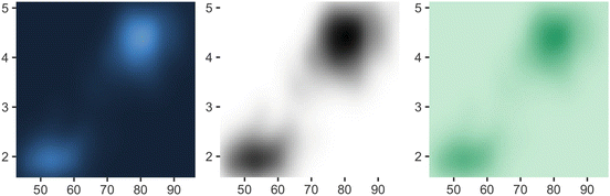
Colour gradients are often used to show the height of a 2d surface. In the following example we’ll use the surface of a 2d density estimate of the faithful dataset (Azzalini and Bowman, 1990), which records the waiting time between eruptions and during each eruption for the Old Faithful geyser in Yellowstone Park. I hide the legends and set expand to 0, to focus on the appearance of the data. . Remember: I’m illustrating these scales with filled tiles, but you can also use them with coloured lines and points.
erupt <- ggplot(faithfuld, aes(waiting, eruptions, fill = density)) +
geom_raster() +
scale_x_continuous(NULL, expand = c(0, 0)) +
scale_y_continuous(NULL, expand = c(0, 0)) +
theme(legend.position = "none")
There are four continuous colour scales:
-
scale_colour_gradient() and scale_fill_gradient(): a two-colour gradient, low-high (light blue-dark blue). This is the default scale for continuous colour, and is the same as scale_colour_continuous(). Arguments low and high control the colours at either end of the gradient.
Generally, for continuous colour scales you want to keep hue constant, and vary chroma and luminance. The munsell colour system is useful for this as it provides an easy way of specifying colours based on their hue, chroma and luminance. Use munsell::hue_slice("5Y") to see the valid chroma and luminance values for a given hue.
erupt
erupt + scale_fill_gradient(low = "white", high = "black")
erupt + scale_fill_gradient(
low = munsell::mnsl("5G 9/2"),
high = munsell::mnsl("5G 6/8")
)
-
scale_colour_gradient2() and scale_fill_gradient2(): a three-colour gradient, low-med-high (red-white-blue). As well as low and high colours, these scales also have a mid colour for the colour of the midpoint. The midpoint defaults to 0, but can be set to any value with the midpoint argument.
It’s artificial to use this colour scale with this dataset, but we can force it by using the median of the density as the midpoint. Note that the blues are much more intense than the reds (which you only see as a very pale pink)
mid <- median(faithfuld$density)
erupt + scale_fill_gradient2(midpoint = mid)

-
scale_colour_gradientn() and scale_fill_gradientn(): a custom n-colour gradient. This is useful if you have colours that are meaningful for your data (e.g., black body colours or standard terrain colours), or you’d like to use a palette produced by another package. The following code includes palettes generated from routines in the colorspace package. (Zeileis et al., 2008) describes the philosophy behind these palettes and provides a good introduction to some of the complexities of creating good colour scales.
erupt + scale_fill_gradientn(colours = terrain.colors(7))
erupt + scale_fill_gradientn(colours = colorspace::heat_hcl(7))
erupt + scale_fill_gradientn(colours = colorspace::diverge_hcl(7))

By default, colours will be evenly spaced along the range of the data. To make them unevenly spaced, use the values argument, which should be a vector of values between 0 and 1.
-
scale_color_distiller() and scale_fill_gradient() apply the ColorBrewer colour scales to continuous data. You use it the same way as scale_fill_brewer(), described below:
erupt + scale_fill_distiller()
erupt + scale_fill_distiller(palette = "RdPu")
erupt + scale_fill_distiller(palette = "YlOrBr")


All continuous colour scales have an na.value parameter that controls what colour is used for missing values (including values outside the range of the scale limits). By default it is set to grey, which will stand out when you use a colourful scale. If you use a black and white scale, you might want to set it to something else to make it more obvious.
df <- data.frame(x = 1, y = 1:5, z = c(1, 3, 2, NA, 5))
p <- ggplot(df, aes(x, y)) + geom_tile(aes(fill = z), size = 5)
p
# Make missing colours invisible
p + scale_fill_gradient(na.value = NA)
# Customise on a black and white scale
p + scale_fill_gradient(low = "black", high = "white", na.value = "red")

6.2.2 Discrete
There are four colour scales for discrete data. We illustrate them with a barchart that encodes both position and fill to the same variable:
df <- data.frame(x = c("a", "b", "c", "d"), y = c(3, 4, 1, 2))
bars <- ggplot(df, aes(x, y, fill = x)) +
geom_bar(stat = "identity") +
labs(x = NULL, y = NULL) +
theme(legend.position = "none")
-
The default colour scheme, scale_colour_hue(), picks evenly spaced hues around the HCL colour wheel. This works well for up to about eight colours, but after that it becomes hard to tell the different colours apart. You can control the default chroma and luminance, and the range of hues, with the h, c and l arguments:
bars
bars + scale_fill_hue(c = 40)
bars + scale_fill_hue(h = c(180, 300))

One disadvantage of the default colour scheme is that because the colours all have the same luminance and chroma, when you print them in black and white, they all appear as an identical shade of grey.
-
scale_colour_brewer() uses handpicked “ColorBrewer” colours, http://colorbrewer2.org/. These colours have been designed to work well in a wide variety of situations, although the focus is on maps and so the colours tend to work better when displayed in large areas. For categorical data, the palettes most of interest are ‘Set1’ and ‘Dark2’ for points and ‘Set2’, ‘Pastel1’, ‘Pastel2’ and ‘Accent’ for areas. Use RColorBrewer::display.brewer.all() to list all palettes.
bars + scale_fill_brewer(palette = "Set1")
bars + scale_fill_brewer(palette = "Set2")
bars + scale_fill_brewer(palette = "Accent")

-
scale_colour_grey() maps discrete data to grays, from light to dark.
bars + scale_fill_grey()
bars + scale_fill_grey(start = 0.5, end = 1)
bars + scale_fill_grey(start = 0, end = 0.5)

-
scale_colour_manual() is useful if you have your own discrete colour palette. The following examples show colour palettes inspired by Wes Anderson movies, as provided by the wesanderson package, https://github.com/karthik/wesanderson. These are not designed for perceptual uniformity, but are fun!
library(wesanderson)
bars + scale_fill_manual(values = wes_palette("GrandBudapest"))
bars + scale_fill_manual(values = wes_palette("Zissou"))
bars + scale_fill_manual(values = wes_palette("Rushmore"))


Note that one set of colours is not uniformly good for all purposes: bright colours work well for points, but are overwhelming on bars. Subtle colours work well for bars, but are hard to see on points:
# Bright colours work best with points
df <- data.frame(x = 1:3 + runif(30), y = runif(30), z = c("a", "b", "c"))
point <- ggplot(df, aes(x, y)) +
geom_point(aes(colour = z)) +
theme(legend.position = "none") +
labs(x = NULL, y = NULL)
point + scale_colour_brewer(palette = "Set1")
point + scale_colour_brewer(palette = "Set2")
point + scale_colour_brewer(palette = "Pastel1")

# Subtler colours work better with areas
df <- data.frame(x = 1:3, y = 3:1, z = c("a", "b", "c"))
area <- ggplot(df, aes(x, y)) +
geom_bar(aes(fill = z), stat = "identity") +
theme(legend.position = "none") +
labs(x = NULL, y = NULL)
area + scale_fill_brewer(palette = "Set1")
area + scale_fill_brewer(palette = "Set2")
area + scale_fill_brewer(palette = "Pastel1")

6.3 The Manual Discrete Scale
The discrete scales, scale_linetype(), scale_shape(), and scale_size_discrete() basically have no options. These scales are just a list of valid values that are mapped to the unique discrete values.
If you want to customise these scales, you need to create your own new scale with the manual scale: scale_shape_manual(), scale_linetype_manual(), scale_colour_manual(). The manual scale has one important argument, values, where you specify the values that the scale should produce. If this vector is named, it will match the values of the output to the values of the input; otherwise it will match in order of the levels of the discrete variable. You will need some knowledge of the valid aesthetic values, which are described in vignette("ggplot2-specs").
The following code demonstrates the use of scale_colour_manual():
plot <- ggplot(msleep, aes(brainwt, bodywt)) +
scale_x_log10() +
scale_y_log10()
plot +
geom_point(aes(colour = vore)) +
scale_colour_manual(
values = c("red", "orange", "green", "blue"),
na.value = "grey50"
)
#> Warning: Removed 27 rows containing missing values (geom_point).
colours <- c(
carni = "red",
insecti = "orange",
herbi = "green",
omni = "blue"
)
plot +
geom_point(aes(colour = vore)) +
scale_colour_manual(values = colours)
#> Warning: Removed 27 rows containing missing values (geom_point).

The following example shows a creative use of scale_colour_manual() to display multiple variables on the same plot and show a useful legend. In most other plotting systems, you’d colour the lines and then add a legend:
huron <- data.frame(year = 1875:1972, level = as.numeric(LakeHuron))
ggplot(huron, aes(year)) +
geom_line(aes(y = level + 5), colour = "red") +
geom_line(aes(y = level - 5), colour = "blue")

That doesn’t work in ggplot because there’s no way to add a legend manually. Instead, give the lines informative labels:
ggplot(huron, aes(year)) +
geom_line(aes(y = level + 5, colour = "above")) +
geom_line(aes(y = level - 5, colour = "below"))

And then tell the scale how to map labels to colours:
ggplot(huron, aes(year)) +
geom_line(aes(y = level + 5, colour = "above")) +
geom_line(aes(y = level - 5, colour = "below")) +
scale_colour_manual("Direction",
values = c("above" = "red", "below" = "blue")
)

See Sect. 9.3 for another approach.
6.4 The Identity Scale
The identity scale is used when your data is already scaled, when the data and aesthetic spaces are the same. The code below shows an example where the identity scale is useful. luv_colours contains the locations of all R’s built-in colours in the LUV colour space (the space that HCL is based on). A legend is unnecessary, because the point colour represents itself: the data and aesthetic spaces are the same.
head(luv_colours)
#> L u v col
#> 1 9342 -3.37e-12 0 white
#> 2 9101 -4.75e+02 -635 aliceblue
#> 3 8810 1.01e+03 1668 antiquewhite
#> 4 8935 1.07e+03 1675 antiquewhite1
#> 5 8452 1.01e+03 1610 antiquewhite2
#> 6 7498 9.03e+02 1402 antiquewhite3
ggplot(luv_colours, aes(u, v)) +
geom_point(aes(colour = col), size = 3) +
scale_color_identity() +
coord_equal()

6.5 Exercises
-
1.
Compare and contrast the four continuous colour scales with the four discrete scales.
-
2.
Explore the distribution of the built-in colors() using the luv_colours dataset.
References
Azzalini A, Bowman AW (1990) A look at some data on the old faithful geyser. Appl Stat 39:357–65
Lumley T (2013) dichromat: color schemes for dichromats. R package version 2.0-0. https://CRAN.R-project.org/package=dichromat
Zeileis A, Kurt H, Paul M (2008) Escaping RGBland: selecting colors for statistical graphics. Comput Stat Data Anal. http://statmath.wu-wien.ac.at/~zeileis/papers/Zeileis+Hornik+Murrell-2008.pdf
Author information
Authors and Affiliations
Rights and permissions
Copyright information
© 2016 the Author
About this chapter
Cite this chapter
Wickham, H. (2016). Scales, Axes and Legends. In: ggplot2. Use R!. Springer, Cham. https://doi.org/10.1007/978-3-319-24277-4_6
Download citation
DOI: https://doi.org/10.1007/978-3-319-24277-4_6
Published:
Publisher Name: Springer, Cham
Print ISBN: 978-3-319-24275-0
Online ISBN: 978-3-319-24277-4
eBook Packages: Mathematics and StatisticsMathematics and Statistics (R0)