
Abstract
Data has to be observed, evaluated, aggregated, and distributed from many sites in a short period of time to create a weather map of any significance for forecasting. Telegraphy permitted the construction of the first meaningful weather maps. For a century international cooperation has facilitated the sharing of weather-related data for coverage beyond national boundaries . Globally weather data are collected regularly through many processes and at many heights and distributed widely. Many mapping systems have been built on this data-rich environment. Weather maps were some of the first graphics available for view online when the Internet went public. Television integrated weather maps into their programming early on. Weather maps are included in many newspapers. Maps are tools used in the study of weather and climate. Many maps will be created and studied in attempts to understand the patterns and behavior of atmospheric phenomena at many levels. A detailed map study of the 1974 Super-Outbreak of tornadoes led to terminology used today to characterize tornadoes. The world map of climatic patterns published at the start of the 20th century has been updated to portray the patterns of climate predicted at the close of the 21st century. Weather is a global phenomenon operating at many scales and weather maps of many types are employed to try to understand and forecast this part of our dynamic environment.
Access provided by CONRICYT-eBooks. Download chapter PDF
Keywords
- Global weather observation
- Data rich mapping environment
- Weather radar
- Satellite imaging
- Television weather
- Climate models
Think of weather as the state of the atmosphere and climate being the expected range of weather. Thus, with weather we want to know what is happening now and predicted to happen in the near future. Climate takes the longer view based on what we have experienced. We want to understand how our atmosphere behalves at all spatial and temporal scales and maps are basic tools in gaining that understanding.
1 A World Map of Climates
Persons familiar with the world maps of climate are comfortable seeing red areas along the equator portraying tropical, moist zones; yellow and tan swaths indicating deserts at 25° North and South; and greens showing areas of dry summers and cool, moist winters around the Mediterranean Sea and in areas around Los Angeles, Santiago, Capetown and Perth. Such climate types and color symbolizations were developed by Wladimir Köppen in a quantitative study of world climates over many years. His first map of this nature appeared in 1900.
His climate classification was later updated by Rudolph Geiger and the current map is now known as the Köppen–Geiger map of World Climates (Kottek et al. 2006). Over the years variations in this system have been advanced but this map or something similar is found commonly in atlases and textbooks.
Sanderson (1999: 673) traced the evolution of classifying and mapping world patterns of climate, recognizing the dominance of the Köppen system. She notes many have explored and developed other climate classification systems but they have not been widely accepted. She suggested it is time to develop a new classification of world climates. However, Kottek et al. (2006) and Rubel and Kottek (2010) point to a number of recent studies using the Köppen–Geiger system as a reason to update the data on which the system is based. They created a new version of the map based on high resolution gridded data generated from digital models extending over the 50-year period 1951–2000 (Kottek et al. 2006).
Figure 1 is the current map based on their gridded datasets. With this detailed data they identified 31 classes of climates but note one class does not occur on the map and six classes occupy very small areas on the map at this scale . Note that with 31 classes it is difficult to define and portray this many colors such that each color is distinct from all others and can be identified with a particular climate type. Color choice and application are important components of mapping.

(Source Institute for Veterinary Public Health 2015b)
Updated Koppen–Geiger map based on separate gridded datasets of temperature and precipitation for 1951–2000
So, the world climate map that has been around for more than a century is still with us. Looking ahead, the authors engage in ‘Climate Forecasting’ by creating an animated map showing how the world patterns of climate will change through 2100 with their assumptions of global warming (Rubel and Kottek 2010). That animated map is the default image on the home web site (Institute for Veterinary Public Health 2015a).
2 A Global Map of Weather
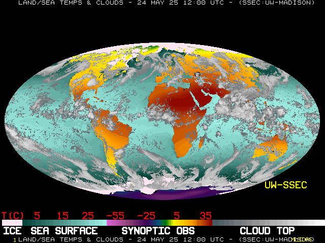
Every day a great number of weather maps and weather related images are posted on the Internet. Among this mix is the relatively small Global Satellite and Surface Temperature Montage updated every 6 h (Space Science Engineering Center 2011). This map is a composite of satellite data, weather observations and model outputs. Created as an image of 640 by 480 pixels, each cell has a resolution of about 35 km. As such it shows only larger weather features. Examining a single map in the series gives a broad perspective on global weather and is a complement to the climate map above. The Global Montage can be viewed as a sequence of 40 maps showing the weather evolving over a 10 day period. A single map is presented here for discussion, but many more await online viewers.
These maps are on a Mollweide equal area projection with lines of latitude parallel to the equator. Ocean temperatures are represented in a gradient of aqua colors ranging from 0 to about 32 °C. Land temperatures are portrayed in a color gradient ranging from purple through the color spectrum to dark red representing temperatures ranging from −60 to +40 °C. Note that the range of temperatures over land is much greater than over the oceans. These land/water temperature differences are drivers for much of our weather. Overlying all are images of clouds with the lightest being the coldest cloud tops (Fig. 2).

(Source Space Science and Engineering Center 2011)
An instantaneous global satellite and Surface temperature montage on equal-area map projection showing how the patterns of weather are consistent through broad latitude bands. This image represents noon at the Prime Meridian on February 2, 2011
This map is for February 2, 2011, when the northern hemisphere was in winter. The patchy line of clouds extending east-west a little south of the equator shows the ITCZ (Inter-tropical Convergence Zone) where warm moist air converges to produce the rains of the humid tropics. At this time Indonesia, Malaysia and eastern Australia were covered with massive clouds. That inverted comma-like mass of clouds over NE Australia shows Tropical Cyclone Yasi, which was rated a category four storm.
A cloud-free zone north of the ITCZ extends from Central America to eastern China . Here the air is subsiding to produce the deserts and borderlands. The Indian Sub-continent is cloud-free at this time but in 6 months that mass of clouds to the south will move north to bring the monsoonal rains (Carter and Kohrs 2011). Half of the Earth surface lies between 30°N and 30°S—the tropics and subtropics. Within this zone weather is dominated by the seasonal shift of the ITCZ with subsidence both to the north and south. Tropical cyclones, locally referred to as Hurricanes, Typhoons and Cyclones form in this area, move from east to west and normally move poleward.
At the time of this Global Montage much of Europe was cloud-free and relatively warm, especially compared to North America and Siberia, bathed in greens, blues and purples showing very cold air. Note this is at 12:00 UTC so it is noon in Europe and early AM in the Americas.
The cloud patterns in the middle latitudes in both hemispheres are more massive than in tropical areas and stretch out over hundreds of miles. In places the clouds spiral into a counter-clockwise rotations in the northern hemisphere and clockwise rotations in the southern hemisphere. Here cold air masses clash with warm air masses forming cold fronts and warm fronts, all moving west to east as is readily seen in a 10-day loop.
Viewing a 10-day loop of the Space Sciences Engineering Center Global Montage shows the distinction in the nature of the weather between the tropical areas and the middle latitudes. Because of these differences the nature of the weather maps created for the more tropical areas are frequently different from the weather maps of the middle latitudes, which have become the standard.
3 Evolution of the Weather Map
In the eighteenth and nineteenth centuries scientists in Europe and North America explored the nature of weather recognizing a relationship between atmospheric pressure, temperatures, winds, clouds and precipitation. Without an ability to collect and assemble observations from many sites in near real time, all scientific exploration was historical—reconstructing weather events based on observations from earlier times.
With the creation of the telegraph in the mid 1800s data were able to be assembled in near real time and soon weather maps were compiled in Europe and North America. Creating institutions and organizations to coordinate, construct and distribute weather maps was fitful at first. In 1873 the International Meteorological Organization was formed providing a mechanism to standardize the tools and procedures to gather weather data, code it, transmit it and map it in a systematic and consistent manner. No matter how attractive a map may be, it can be no better than the quality of the data that was used to make the map. The IMO evolved into the World Meteorological Organization under the United Nations which today still facilitates the systematic collection and sharing of weather data around the world. Such cooperation provides the rich source of quality information to produce weather maps.
Over the next few decades a basic weather map evolved as governmental organizations systematized the collection, dissemination, and display of data and maps to their own and international standards. As an example at the close of the 19th Century, the U.S. Weather Bureau was headquartered in Washington, D.C. Weather observers were set up across the country with the task of routinely making observations of temperature, pressure, wind speed and direction, and cloud cover at the same time twice a day. The collected data were coded and with priority were telegraphed to headquarters where the messages were decoded and plotted on a map. Then lines of equal pressure (isobars) and equal temperature (isotherms) were constructed to reveal centers of low and high pressure. Symbols indicating wind direction, speed and cloud cover were plotted at the location of the station on the map. Referencing preceding maps permitted plotting the tracks of lows. A team of persons constructed these maps and printed them in short order. They were then posted in public places and disseminated widely (Monmonier 1999: 7–9) .
In many cases the observed data were also telegraphed to regional centers where local weather persons crafted maps integrating local conditions. To build and maintain a network of trained observers employing standardized equipment and procedures required a bureaucracy and a sizable budget. In the United States this became the Weather Bureau and similar organizations were established in other countries.
As this technology became more routinized and weather scientists became more familiar with the maps and the resulting weather they became more comfortable issuing weather advisories and warnings. In some cases scientists saw patterns in the many weather maps and identified types of weather situations and based predictions on what had happened in the past given this particular setup. They also compiled maps of preferred storm tracks based on patterns observed in the past (Monmonier 1999, 10–17).
Getting access to the appropriate information is always a problem, more so then when few stations existed off shore. Of particular note was the case in 1900 where a hurricane hit near Galveston, Texas, killing more than 8000 persons—the worst natural disaster in U.S. history. At that time there was no mechanism to exchange information with ships at sea and the U.S. Weather Bureau had discontinued accepting information from Cuba. The Weather Bureau predicted a tropical cyclone would move up the east coast, as shown on their maps. Thus, because the map did not show a storm in the area there was no basis to warn Galveston (Emanuel 2005, 83–90). This example illustrates the importance of timely, accurate and relevant maps.
Weather observation and mapping became rather standardized throughout the developed world in the late 1800s and the early 1900s. With the onset of the Great War in 1914 priorities prevented sharing information because knowledge of the present and forecast weather has strategic advantages (Fig. 3).

(Source Tannehill 1955: 88)
This illustration demonstrates how the study of previous weather map patterns are useful in predicting the outcome of future weather events. The chart on the left, for 8th November 1913, was used as an analogue by forecasters to correctly predict a storm and heavy snow on the 25 November 1950
A good example of the surface weather maps in the first half of the twentieth century is seen in this pair of maps in Water: the Yearbook of Agriculture 1955 to illustrate how weather patterns from the past may foretell the future (Tannehill 1955: 88). In this case the map of 1950 was similar to that of 1913 and in both cases the resulting weather was very similar.
These two maps were simplified for presentation in that book but they show the basic form of the surface weather map. The smooth black lines are isobars, showing surface pressure reduced to sea level. The numbers are pressure, expressed in hectopascals. Standard sea level pressure is 1013.25 hPa. (1 hPa is the same as 1 mb, or millibar, the term still used frequently in the U.S.) On the November 1913 map on the left there are two centers of Low pressure bounded by a small circle labeled 1000, on the Carolina coast and over the northern Great Lakes. In northeast Canada there is High Pressure greater than 1030. On these maps the isobars are at every 5 hPa.
The map for November 1950 shows two lows similarly located over the area and two Highs, one in almost the same area of northeast Canada. The other High is located in the U.S. west of the Mississippi River. On the 1913 map the pressure west of the Mississippi was quite high, but not labeled a High. Indeed, the two maps show similar pressure patterns that produced similar ‘destructive storm and heavy snow’.
The other features on these maps are the bold black lines with semi-circles and barbs, representing fronts. Today we are familiar with warm, cold and occluded fronts but fronts were not recognized until the late teens when a team of meteorologists in Bergen, Norway set up a dense network of observation stations and determined that at the center of the low pressure where warm and cold air come together are discontinuities, misrepresented by smooth curvy isolines (Friedman 1989). The Bergen group established the Polar Front Theory as a three-dimensional model where the cold air undercuts less dense warm air and warmer less dense air overrides the cooler (Monmonier 1999: 57–66) . The concept of fronts inherent in the Polar Front Theory took time to be incorporated into weather maps . Thus, we must conclude that the fronts shown here on the 1913 map were not on the original weather map of that date.
The cold front is the black line with triangular barbs pointing in the direction the cold dense air is moving at ground level. The warm front employs semi-circles pointing in the direction the warm, less dense air is moving at ground level. In most cases the boundary between warm and cold air masses north of the center of Low pressure is above the surface. The trace of that boundary is called an occluded front because it is occluded from the ground. Today that is shown as alternating barbs and semi-circles pointing in the direction of motion. On these maps the symbolization is not clear.
These two surface weather maps are simplified versions of the maps meteorologist have been creating many times a day for decades. The weather scientists want details about what is observed at each weather station. This information is plotted as a complex code at each site. Over the years the weather maps have evolved as we learn more. The Government of Canada (2015) provides a web site where readers can bring up current and forecast surface weather maps for Canada and for the Northern Hemisphere.
The Government of Canadian (2015) statement at this site summarizes the process:
Understanding current conditions is the starting point, and the most critical part, of any weather forecast.
Hundreds of weather stations, ships, and aircraft across Canada, the US, and the rest of the world report readings of temperature, pressure, wind, moisture and precipitation. These reports are received at the CMC, and used to improve our picture of the current state of the atmosphere. The analyses made available four times daily on this page provide the latest snapshots of the state of the atmosphere over Canada and the Northern Hemisphere.
4 Weather Aloft and the 500 HPa Chart
In the early part of the twentieth century scientists sought to explore the atmosphere aloft. They employed many tools to capture information including kites, balloons and aircraft. With time we developed sounding devices and systematized the process so that we now regularly gather data from the surface to the upper reaches. With the development of computer models such observations are entered into routines which construct maps of the atmosphere aloft.
On surface weather maps we plot observed atmospheric pressure adjusted to sea level. We have to adjust pressure observations to a common elevation because pressure decreases rapidly with elevation. It is the small differences in atmospheric pressure that direct the winds.
The 500 hPa pressure surface has become a basic reference level to report and map upper-level pressure patterns. Sea level pressure is about 1000 hPa so the 500 hPa pressure level means about half of the atmosphere is above that level and half below. And, 500 is a nice round number. Currently, atmospheric pressures maps are created for many other pressure levels, such as 850, 700, 300, and 200 hPa.
We are interested in the height of that 500 hPa pressure level. On average that pressure occurs at roughly 3.5 miles, 5.5 km or 18,000 feet aloft. In the tropics where the air is warm the 500 hPa level will usually be well over 6 km high, while in the Arctic in winter that level is likely to be below 5 km. So, the 500 hPa chart uses contours to give shape to the pressure pattern at that level. (Note: the surface weather map uses isobars to show pressure patterns and the upper level pressure maps use contours to show the height of a pressure surface.)
The NOAA 500 mb (hPa) chart below is centered on the North Atlantic Ocean extending from the central U.S. to western Norway. It extends north from Cuba to the southern tip of Greenland. This is plotted on the Mercator Projection so that angles and directions are correct across the map (Fig. 4).

(Source NOAA 2015a)
Example of 500 mb (hPa) analysis for 14:09 UTC 20 February 2015 for the North Atlantic Ocean showing a ridge of high pressure at 35° West and troughs of low pressure off the North American coast and NW Africa
Those solid black lines running E–W are the contours in units of 10 s of meters. The darker index contour labeled 564 represents 5640 m. The contour interval is 60 m. The H-597 in the Atlantic is a high at 5970 m. The L-500 over Nova Scotia is a low at 5000 m. Between those two places there is a difference of 970 m in the height of that 500 hPa surface.
Air like all fluids flows downhill, thus it should flow from that high to the low along the pressure gradient. But, in the northern hemisphere the Coriolis Force diverts the air to the right so that at this level winds blow parallel to the contours. These winds, often called ‘westerlies’, are shown by arrows with barbs indicating wind speed.
Look at the height/pressure along 40°N moving west to east. Off the New England coast the contour is 510, it is 596 in the central Atlantic and about 556 in the Mediterranean Sea—representing heights of 5100, 5960 and 5,560 m respectively for the 500 hPa surface. Thus, moving west to east the 500 hPa surface dips off the east coast, crests over the Atlantic and dips again over the Mediterranean. Those dips are “troughs” and the crest is a “ridge”, terms used commonly in weather discussions.
On this map dashed lines perpendicular to the contours delineate the center of the troughs. One such line extends from New England to Cuba. Ridges are not delineated. Moving W to E the contours and winds curve in a clockwise rotation going over the ridge, what is called anticyclonic flow. In general, anticyclonic flow represents good weather. Trough lines are located at the center of the counter-clockwise curve of the contours. This indicates cyclonic flow which indicates the convergence of air and storminess. The word ‘cyclone’ is applied to cyclonic storms of the mid-latitudes, tropical cyclones (hurricanes and typhoons) and cyclones (tornadoes).
On these upper level charts there are places where the winds are strong enough to be called Jet Streams. Labeling such ribbons of fast flowing air jet streams is more important for presentations to the public than for forecasters—they prefer to look at the numbers.
For more than a century the atmospheric communities around the world have been producing weather maps based on frequent observations at the surface and aloft. With new technologies computers construct the maps and generate the graphic products, but humans still study the maps and make interpretations. There are a variety of computer systems that employ different programs to create the models of the weather. Thus, there are often small variations in the forecasts. The public became aware of such variation in 2015 when the Nor’easter named Juno was predicted to move northeast off the Atlantic coast and three commonly used forecast models generated different predictions of the track of the low offshore. In one model New York City was predicted to get 8 inches of snow and in another 20 inches. In the past weathercasters made forecasts based on interpreting the map patterns. Now humans have to choose which computer model output to follow.
‘Ensemble’ is the term given to the production of a collection of maps (models) based on running the same program with slight variations in inputs or parameters (Wikipedia 2015). Creating ensembles is recognition that we are not all-knowing in mapping weather.
5 Mapping to Gain Understanding of the Atmosphere
While most weather maps are based on the systematically collected data, some persons use maps to discover aspects of weather not addressed by such standard data. Dr. T. Theodore Fujita produced two color maps as by-products of his research on tornadoes and intense storm events.
In an 18-h period in April 1974, 148 tornadoes swept across a large swath of the eastern U.S. in what was called Super Outbreak. Fujita assembled a team to identify and map the tornado paths by flying over sites and taking photos and using other sources of aerial photography and satellite imagery . In the process he identified the varying widths of each touchdown and classified each segment according to his F-scale. To disseminate knowledge of this event and to solicit feedback from the larger public he put together a map (55 × 41 cm) detailing the path and width of each touchdown, F-scale intensities along each segment, the underlying topography, a table listing each tornado and many graphs and statistics. Twelve thousand copies of this map were printed and distributed widely (Fujita 1974, 1975a, b; the map is available for download at National Weather Service 2015c).
In 1992 Hurricane Iniki proved very destructive as it crossed the Island of Kauai, Hawaii, from south to north, with the first winds largely from the east and the second winds dominantly from the west. Using more than 800 air photos and 2800 ground photos plus field inspections Fujita and his colleagues identified 27 downbursts and 2 mini-swirls accompanying the hurricane. The focus was the effects of the hurricane in this area of high and complex relief. A product of this investigation was a multi-color map for public information with contours shown in green and hypsometric tints for the higher elevations. Locations of Microbursts are shown with large, numbered dots and the two Mini-swirls are shown with open circles. In great quantity are vectors showing the direction of blow down material. Red dots and vectors represent the first wind products and blue those from the second wind. There is much information to be gained by integrating the vectors and downbursts with the topography. This is a map to be studied and enjoyed. The Iniki map was included as a separate in NOAA Storm Data, 1992 (the map is available from the University of Hawai’i at Manoa web site; Fujita 1992; NOAA 1992).
These two colorful maps are the products of a scientist who appreciated the value of sharing his findings with a larger audience through cartography . They deserve to be recognized for their cartographic value as well as their scientific insights.
6 Weather Maps in Newspapers
Weather maps in newspapers first debuted in the mid 1800s in various forms and were more occasional features than regular, reliable sources of information. In the early 1910s, a brief program by the U.S. Weather Bureau saw more widespread dissemination of a daily weather map , but this program, while popular, was terminated for many reasons with demands of the First World War (Monmonier 1999: 153–168) . With time many national weather organizations came to work with the newspapers to make certain the maps were dispersed to inform the public and to build good will for the weather organization. But, in some cases and on some occasions there has been tension between the governmental weather organization and the media for a variety of reasons.
The modern era of weather maps in newspapers began in 1935 with the debut of the Associated Press’s Wirephoto network . Over the next few decades, most newspapers added a daily weather map; Call (2005) found that 90 % of major newspapers had such maps by the 1960s. Call classified newspaper weather maps in three typologies: synoptic, which show spatial weather features such as fronts, highs, lows, and areas of precipitation; symbolic—essentially the map is spatially-arranged table of forecasts or observations; and “hybrid-symbolic” which is symbolic map with a minimum of weather data.
In 1982 the national paper USA Today came out with a full page dedicated to weather with a large color map showing predicted high temperatures, essentially a symbolic map with isotherms. This bold presentation of weather led to much greater use of color in the weather maps of other newspapers. While there is considerable variation in the nature of the weather maps in newspapers around the world most emphasize the national or regional weather, in part depending on the size of the country and the nature of the weather in that area (Monmonier 1999: 153–176) .
As of 2015 newspapers are fighting for their niche in the news business but in most cases among the products they offer is a weather map . It may be in color with cold fronts shown in blue and warm in red if they show fronts. It may have golden suns, green rain patches and snow stars. Newspapers have been and will be a place to see weather maps in some form.
7 Television
During Second World War great advancements were made in science and technology as persons on all sides were trained and assigned to apply their knowledge and skills to gain strategic advantages. Radar became a functional tool. Aircraft became larger and flew higher, gaining new insights about the atmosphere aloft. Fleets and troops operated in tropical and polar environments and encountered storms and weather events they were not familiar with. Rocketry was developed which would have great impact on the atmospheric disciplines within years.
After that war the United States was relatively unscathed and had a great amount of technology, and persons who understood that technology. Henson (2010: 9) noted that in 1950 there were 9.7 million television sets in the U.S. broadcasting from stations scattered across the country. And, coming out of the War was a ‘bumper crop’ of persons trained in meteorology and looking for work. It was not long before television brought weathercasters with their weather maps into the homes of Americans.
In the U.S. television was little regulated and there was competition between broadcasters. (Note: this is not true in all countries, even today). The presentation of the weather became part of the competition between stations and weathercasters and maps competed for the eyes of viewers. In some cases clowns and skimpy clad girls were the attraction, but in many cases a knowledgeable weathercaster educated the viewers while developing the weather story on a series of maps. In those early years the weather person had to rely on numbers read from tabular forecasts or perhaps had access to crude maps not suitable to presentation to the public. So, they had to create the maps and graphs by sketching on large pieces of paper or standing behind a clear plastic wall and drawing maps backwards so it looked right for the viewers at home. The occasional doodle and a little humor created sizeable audiences to watch the weather locally and afar (Henson 2010).
With the development of color television, green screen technology (chromacolor) permitted a weather map to be shown on the TV screen while the actions of the weathercaster in front of a green screen were imposed on the map (Carter 1998). In many cases competent weather personalities walked viewers through the patterns on the maps and taught many viewers to read weather maps .
While television stations proliferated there were firms and research centers with meteorological expertise that specialized in assembling, customizing and packaging weather information and presentations. Still today, these firms provide maps and presentations to TV stations and industry. With many sources of expertise producing maps and forecasts there are variations and viewers switch channels to see competing forecasts with different maps. Today most television weather programming is made available for viewing on the web and mobile devices.
The weather community soon incorporated radar, a system that sends out a microwave signal and displays the reflected echo. As the technology developed meteorologists found they could detect specific weather events, including patterns that often lead to tornadoes. The U.S. government set up a system of weather radars that could provide national coverage. A few television stations purchased their own weather radar as a competitive advantage and so advertised that they had better weather forecasting for local concerns. With computer graphic developments, radar echoes became part of the dynamic image on the screen. Soon radar images were integrated with political boundaries and road networks to permit viewers to locate themselves relative to the weather event.
Within the United States the National Weather Service established systematic coverage of the conterminous country. The current system is known as WSR-88D, based on a prototype developed in 1988. With the Internet the output of this radar is made available as the images from a single weather radar site and as a composite for the 48 conterminous states . Users can click on the larger map which will take them to the radar display of the closest radar site.
Figure 5 shows the Composite Radar but viewers can toggle to base radar, two options of velocity showing how quickly things are moving toward or away from the radar site, and 1-h rainfall and total storm rainfall. In addition to these static maps, viewers have the option to show the map as a loop over the past hour. Each radar image is updated approximately every 5 min.

(Source National Weather Service 2015a)
The Short-range National weather service composite WSR-88D radar image map from the Louisville, Kentucky, radar station of 7 April 2015 at 22:42 UTC. Two red polygons show Tornado warnings, one yellow polygon forewarns of Severe Thunderstorms and many green polygons warn of Flash Flooding. On this map topo, county boundaries, highways and city symbols underlie the radar imagery. State boundaries and warning polygons overlay the radar imagery
While this type of map image is available directly from the National Weather Service, many organizations take the basic data and repackage it into enhanced presentations. In many cases such presentations are presented at larger map scales on more detailed base maps on television and web based media. With their own Doppler radar systems television stations can provide their local viewers with more timely and more focused images and warnings. In some cases weathercasters can point to a specific neighborhood and warn residents in that area to take shelter. Large scale maps viewed in real time have become important tools in saving lives.
While weather has become an integral part of the news programming of most local television stations, the weathercaster has to compete for time on screen. It is not uncommon for a 3-min weather segment to be cut in half minutes before going on air. On the other hand, in the event of a severe weather event in the local viewing area, weather programming may displace the other forms of news (Carter 1998).
In 1982 The Weather Channel came into existence in the U.S. on cable television presenting weather and weather maps 24 h a day. In this environment, weather maps are the priority. The Weather Channel model was tried abroad but did not survive. At least one 24-h weather competitor was created in the U.S. but it was unsuccessful. Thirty-three years later The Weather Channel continues showing animated isobars and fronts highlighting zones of rain, snow, ice, etc.
8 Satellite Imagery
In 1960 the first Tiros satellite was launched and within days was sending images of clouds. Meteorologists soon added these images to weather broadcasts to give perspectives unavailable before. In the half century since, satellites have provided a great amount of data which has been converted into images to add to weather maps . The multitude of satellites has added greatly to our knowledge of the state and behavior of our atmosphere. The Space Science and Engineering Center (2015) at University of Wisconsin-Madison offers a diverse collection of satellite based images and maps relating to weather.
Satellite imagery has proven particularly effective in identifying and monitoring the tropical cyclones, which are known as hurricanes in the America s and typhoons in East Asia . These systems form in the lower latitudes where clashing air masses and fronts are rare and mid-latitude weather maps have less meaning. So, satellite imagery provides a ready source of information about this large part of the world.
Many of us have seen loops of satellite images as weathercasters point out disturbances in West Africa moving west into the Atlantic to die out or to strengthen to become a tropical disturbance. Because there may be multiple tropical storms in existence at the same time and because such storms do not follow fixed paths we give them unique names when they reach tropical storm strength. With the potential nature of these storms we get to see many interesting weather maps showing the projected path of a particular storm, maps showing comparisons with the paths of previous large storms, and more. Then if the storm is predicted to move inland, we see maps of probable landfall, areas subject to flooding, potentials for interaction with other weather disturbances and warnings for travelers.
9 Computer Graphics, the Weather Map and the Internet
In the 1960s we developed the ability to store spatial information in the computer, analyze and manipulate the data and print out displays, including maps. Those line printer maps were crude but they were valid maps. By the 1970s we had graphic display terminals, where monochrome lines could be plotted on a screen. By the late 1970s the raster refresh display terminal emerged to bring forth what we now know as ‘computer graphics.’ On these screens combinations of red, green and blue pixels generated thousands of colors. Year by year the resolution of these displays increased and soon high quality graphic images were manipulated by scientists, artists and many others.
The atmospheric sciences were early and consistent users of this technology in large part because the there was an abundant flow of digital information ready to be processed, manipulated and displayed. Many university atmospheric science programs employed this technology for research and instruction.
Then in the early 1990s the World Wide Web became available for public access on something called the Internet. People could connect from home and office using their personal computers . In those early years there was little content on the web except the weather maps of those atmospheric science programs. They had the data, the technology and the freedom to share the displays. The maps were colorful, informative and the public took note. Likewise the university programs found they had viewers and took on the responsibility of providing maps and graphics for a larger audience. In 2015 a number of universities maintain web sites where they present images of our weather.
10 Lightning
Lightning is a weather phenomenon of lethal dimensions that historically has been difficult to monitor and map. Traditionally, when present, it is reported as observed at the station. In Meteorology Today, Ahrens (2003: 412) has a map showing “The average number of days each year on which thunderstorms are observed throughout the United States. (Due to scarcity of data, the number of thunderstorms is underestimated in the mountainous west.)”
With the emergence of electronic sensors and Internet connectivity we have gained the ability locate lightning strikes, assemble the data quickly and produce maps that can show the location of strikes in near real time. Holle and Cummins (2010) produced an atlas of monthly cloud to ground lightning flash density for conterminous United States and surrounding areas, expressed in flashes/km2/month for the years 2004–2008. The data was collected as part of the National Lightning Detection Network (NLDN) which was first deployed for the entire USA in 1989. The maps reveal distinct patterns of lightning activity which vary month by month.
Lightning data collection, processing and distribution is largely a private/academic enterprise and proprietary systems are employed by different organizations. There are many ways these organizations package their systems and consumers can purchase the delivery of timely information to be delivered as contracted or set up their own sensors and become part of a network . With GPS equipped mobile devices and appropriate aps, maps and advisories of lightning threats will be sent when lightning storms are within a specific range of the device. It took the Internet to permit individual lightning strikes to be mapped and that same technology permits such maps to be delivered to individuals in near real time.
11 Examples of Lightning Maps
While aps can deliver lightning warnings to individuals and firms, there are systems that let us view larger patterns of lightning as maps. The United States and North America Precision Lightning Networks (USPLN/NAPLN 2015) provide an animated map of lightning strikes extending from Mexico and Cuba on the south to the southern half of Hudson Bay. The map employs dark blue for water and dark green for land with a lighter gradation for elevation. Lightning strikes are shown by + marks, the oldest in dark red are plotted first and then the red, orange, yellow and white are plotted in sequence. The legend is scaled in UTC time units showing when the strikes occurred. Movement of storms is evident by watching the sequence of the appearance of ever lighter + marks. Users can customize the spatial and temporal resolution of the display.
The World Wide Lightning Location Network (WWLLN 2015) headquartered at the University of Washington relies on a network of sferic sensors at universities and organizations around the world to create daily maps of lightning hour by hour. The maps at this site are presented in 4 panels on equator centered maps for the America s, Europe-Africa , Asia-Australia, and the Pacific Ocean. Lightning is shown as blue dots on a black background. Each blue dot represents lightning within an hour period and the dots accumulate to show the total over 24 h. Satellite patterns of cloud motion complement the lightning patterns. Red circles show the location of the lightning sensors.
Using a similar technology LightningMaps.org (Blitzortung.org 2015) provides near real time maps of lightning for Europe , North America and Oceania, plotted on a variety of base maps that users can select between. Viewers can zoom into for considerable detail and by toggling appropriate switches watch red-yellow icons pop on the screen and fade out as newer flashes demand attention. According to the legend the capture and display of the strikes are delayed by less than 10 s. This lightning mapping system gives the user many options for viewing, including the ability to hear clicks with each strike and to display clouds and radar where available. This is a system in progress and shows where coverage is good and where more sensors are needed.
These lightning mapping systems are noted because they are suggestive of a direction efforts are moving to monitor and map this component of weather. Lightning has potential to damage and disrupt a world linked electronically and thus systems that can inform managers, decision makers and individuals with timely information are welcomed. In addition, being able to map lightning world-wide in near real time provides another perspective to help us understand weather. Such data and maps complement the traditional weather mapping systems.
The state of lightning mapping was tested when the author compared the way two mapping packages presented the evolution of thunderstorms in central Illinois. The Lightningmaps.org (Blitzortung.org 2015) images were viewed on a laptop computer and Spark (WeatherBug 2015) images were viewed on an IPad tablet. Both maps were zoomed into cover an area of about 60 miles/100 km on a side. Both systems employed base maps showing roads, hydrography, land cover and geographic names. The only substantive difference between the dynamic maps was the capture and display of lightning strikes.
The two mapping packages use different technology to detect lightning but the results were very similar. In only a few instances did a lightning symbol appear on one map and not seem to appear on the other and in most cases the capture of the lightning strike seemed to be quite synchronous. The Spark map employs a white dot which soon evolves into a yellow zig-zag icon to symbolize a lightning strike. That symbol stays in place for 30 min. Soon, a couple of areas appeared saturated with yellow icons while additional white dots added to the collection and showed the migration of the thunderstorm.
The lightningmaps.org display was viewed in ‘real time’ mode, which employs a larger red dot with a yellow center which evolves into a yellow dot which slowly grows darker to a brown color. It disappears after an hour. The change of color symbols over time made it easier to distinguish the total pattern of lightning strikes in areas with a high density of strikes.
In total, it is satisfying to have available near real time mapping systems of lightning so that individuals can monitor this weather threat on a number of personal devices that many people now have. While the functionality of such mapping systems is not world-wide, the trend is moving in that direction.
12 El Niño and La Niña
“The Year the Weather Went Wild” was the title for an article in National Geographic about winter 1976–1977 in the U.S. (Canby 1977) An annotated satellite image showed snow on the ground 1 day in all 48 states . According to long-range forecasters this weather related to surface temperatures of the Pacific Ocean. To illustrate they used a page-size perspective map showing the Jet stream, warm water and positions of highs and lows over North America , the Arctic and eastern Pacific Ocean in January 1977. A smaller map portrayed the normal January patterns.
Ecuador and Peru have long experienced an occasional warm coastal current which devastates their fishing industry. As it occurs at Christmas time they call this event ‘El Niño’ for the Christ Child. In 1982–1983 the rest of the world became familiar with this term to describe a world-wide weather phenomenon. In 1983 National Geographic employed a unique map projection to show the impacts of El Niño from India on the west to Africa on the east (Canby 1984). A two-page spread of five maps and a three-dimensional model was devoted to showing how warm currents move within the Pacific Ocean. That 1982–1983 El Niño event was reported with many maps in newspapers and magazines, including Macleans, Newsweek, Readers Digest and Time (Carter 2015).
The world was becoming aware that weather was global in its reach and that El Niño had a sister La Niña, the cold-water phase. ENSO (El Niño, Southern Oscillation) is the term now used for the larger complex incorporating both phases.
In our interconnected world great attention is devoted to forecasting the onset of El Niño and La Niña conditions. A rectangular area extending from 5°N to 5°S and from 120°W to 170°W in the central Pacific is designated as NINO3.4, the base area to evaluate departures and make predictions (NOAA 2015b). Periods of months of above average temperatures in this rectangle are designated El Niño events and periods below are La Niña events (Earth Systems Research Laboratory 2015).
The National Weather Service (2015b) provides a web page showing two animated maps of temperatures and temperature departures for the past 12 weeks of the Tropical Pacific Ocean. This gives information that people need to monitor trends relating to El Niño and La Niña.
There is much on the web relating to the effects of the ENSO weather phenomenon and many sites will have maps showing what has happened or is likely to happen with respect to El Niño or La Niña. The Australian Government (2015) has a collection of maps of Australia showing variations in rainfall patterns month by month for all El Niño and La Niña events back to 1902–1903.
The Royal Netherlands Meteorological Institute (2015) created world maps showing the correlation of precipitation and temperature departures by season around the world with the strength of the NINO3.4 index in the central Pacific. They also include a map of Tropical Cyclones relative to El Niño events. El Niño and La Niña are global weather phenomena and as such they provide much content to be mapped and studied (Fig. 6).

September—November correlation of the strength of the NINO3.4 Index in the central Pacific with precipitation departures around the world. The Red circles over Indonesia, the Philippines, Australia, central India, and northern South America indicate relatively dry conditions during high El Niño events and relatively wet conditions during La Niña events. The blue circles over the Iberian Peninsula, east Africa, central North America, and the southern half of South America indicate the opposite response to the Index. The larger the circle, the stronger the correlation between the Index and precipitation departures (Royal Netherlands Meteorological Institute 2015)
13 Monitoring Global and Regional Patterns of Atmospheric Conditions
With the fleet of satellites from many countries now circulating the globe we are able to monitor many aspects of the atmosphere in addition to those factors that produce our day-to-day weather. NASA (2015) provides animated maps showing change month to month of 16 atmospheric variables over many years. Among the maps are land surface temperature anomalies, cloud fraction, snow cover, total rainfall, water vapor, net radiation, carbon monoxide, and aerial optical size.
A map of Yellow Dust warning (NHK World 2015) in East Asia was included among the many maps in the daily television presentation of weather on NHK World on April 16, 2015. The Korea Meteorological Administration (2015) produces a daily forecast chart of winds and particulate loadings at 1,500 m for all of south and East Asia—thus showing yellow dust incidents. On these daily maps particulate matter densities are symbolized with isolines and color tints while winds are portrayed with red arrows in proportion to speed and surface pressure is shown with fine blue isobars. This map is noted as one of many unique but relevant weather maps in the world mix of mapping the weather.
Another weather related variable regularly mapped is drought, a measure of the relative condition of the surface in terms of soil moisture, vegetative health, streamflow and water supplies. Drought as mapped is based on the relative dryness of an area. Thus, deserts can be in drought or can be wetter than normal, as can the humid tropics. Moisture conditions maps integrate the weather of the preceding weeks, months and even years. The U.S. Drought Monitor (2015) is updated weekly and employs five levels of colors of indicate drought intensity as contrasted to areas not in drought. At this site are links to other related map indices.
14 Map Products of Weather Model Outputs
As noted a great amount of weather observations are incorporated into computer systems which generate models of the atmosphere. Model data are now readily available for those with the appropriate technology to capture and display it. Three web sites are noted for the innovative and interesting map products available at the click of a button. Surely, there are and will be many more sites offering innovative displays of weather data in its many dimensions.
COLA (2015) provides innovative weather map presentations for the entire world broken into 8 viewing areas, i.e., Northern Hemisphere, Africa , etc. There are seven maps for each viewing area portraying unique perspectives on the weather, at the surface and aloft. An interpretation guide is included to help the viewer understand what is being shown. The maps at this site are updated twice a day. Two of the maps include streamlines, which are vectors showing the flow of the air at a particular level. Streamlines are the cartographic symbolization used at two other web sites of note.
For the conterminous U.S. the HINT.FM (2015) wind map presents animated streamlines of varied thickness pulsing in the direction of the air flow. The author notes, “The wind map is a personal art project, not associated with any company.” The data come from the hourly posting of a government agency.
The Nullschool (2015) earth site portrays streamlines imposed on a variety of world map projections including a perspective globe , which can be rotated with the mouse. Viewers can select a wide variety of weather variables to portray as well as different map projections and scales . This is another personal project using model output data from a government agency.
15 Conclusion
We started by looking at global patterns of climate and then viewed a snapshot of global weather at a small scale. We saw how individual observations of temperature and pressure are integrated into weather maps and computer models that are used at many scales. Weather events range from local to global and weather maps are important tools helping us live with the vagaries of our atmospheric environment.
It is insightful to view these innovative map products in comparison to the current SSEC world weather map introduced at the start of the chapter and the current surface and upper air weather maps referenced in the chapter. Hopefully, viewers will be able to identify the same weather events represented in many different ways on these many maps. Indeed, weather is a data rich world and there is much to be seen and experienced with the weather maps now available on the Internet.
References
Ahrens, C. D. (2003). Meteorology today: An introduction of weather, climate, and the environment (7th ed.). Pacific Grove: Brooks/Cole.
Australia Government. (2015). El Niño—Detailed Australian analysis. http://www.bom.gov.au/climate/enso/enlist/. Accessed 14 Mar 2015.
Blitzortung.org. (2015). Lightning maps. http://www.lightningmaps.org/realtime. Accessed 2 May 2015.
Call, D. (2005). Fair weather ahead? Changes in newspaper weather maps: 1902–2005. The Pennsylvania Geographer, 43(2), 45–65.
Canby, T. Y. (1977). The year the weather went wild. National Geographic, 152, 798–829.
Canby, T. Y. (1984). El Niño’s ill wind. National Geographic, 165, 144–183.
Carter, J. R. (1998). Uses, users, and use environments of television maps. Cartographic Perspectives, 30(Spring), 18–37.
Carter, J. R. (2015). Weather map. In M. Monmonier (Ed.), History of Cartography, Vol. 6: Cartography in the twentieth century. Chicago: The University of Chicago Press.
Carter, J. R., & Kohrs, R. A. (2011). Recognition of six-hourly global maps of ice, temperature and clouds—Real-time and 10-year archive. In Proceedings, international cartographic conference, Paris, France.
COLA. (2015). Weather and climate data. http://wxmaps.org/pix/analyses.html. Accessed 15 May 2015.
Earth Systems Research Laboratory. (2015). Multivariate ENSO Index (MEI). http://www.esrl.noaa.gov/psd/enso/mei/. Accessed 21 Apr 2015.
Emanuel, K. (2005). Divine wind: The history and science of hurricanes. Oxford: Oxford University Press.
Friedman, R. M. (1989). Appropriating the weather: Vilhelm Bjerknes and the construction of a modern meteorology. Ithaca: Cornell University Press.
Fujita, T. T. (1974). Jumbo tornado outbreak of 3 April 1974. Weatherwise, 27(3), 116–124.
Fujita, T. T. (1975a). Superoutbreak Tornadoes of April 3–4, 1974. University of Chicago. http://www.erh.noaa.gov/iln/events/19740403/fujita_bigmap.png. Accessed 12 Apr 2015.
Fujita, T. T. (1975b). New evidence from April 3–4, 1974 Tornadoes. Department of the Geophysical Sciences, University of Chicago. SMRP research paper 127.
Fujita, T. T. (1992). Damage survey of hurricane Iniki in Kauai (map). NOAA Storm Data, 34, 9.
Government of Canada. (2015). Analyses. http://weather.gc.ca/analysis/index_e.html. Accessed 18 Mar 2015.
Henson, R. (2010). Weather on the air: A history of broadcast meteorology. Boston: American Meteorological Society.
HINT.FM. (2015). Wind map. http://hint.fm/wind. Accessed 18 Feb 2015.
Holle, R. L., & Cummins, K. L. (2010). Monthly distributions of U.S. NLDN cloud-to-ground lightning. In Proceedings of the 21st international lightning detection conference, Orlando, FL.
Institute for Veterinary Public Health. (2015a). World maps of Köppen–Geiger climate classification. http://koeppen-geiger.vu-wien.ac.at/. Accessed 14 Mar 2015.
Institute for Veterinary Public Health. (2015b). World map the of Köppen–Geiger climate classification updated. http://koeppen-geiger.vu-wien.ac.at/present.htm. Accessed 20 Apr 2015.
Korea Meteorological Administration. (2015). Asian dust forecast chart: surface pressure, streamline and wind vector at 1500 m. http://web.kma.go.kr/eng/weather/asiandust/forecastchart.jsp. Accessed 17 Apr 2015.
Kottek, M., Grieser, J., Beck, C., Rudolf, B., & Rubel, F. (2006). World map of the Köppen–Geiger climate classification updated. Meteorologische Zeitschrift, 15, 259–263.
Monmonier, M. (1999). Air Apparent: How meteorologists learned to map, predict, and dramatize weather. Chicago: The University of Chicago Press.
NASA. (2015). Earth observatory: Global maps. http://earthobservatory.nasa.gov/GlobalMaps/?eocn=topnav&eoci=globalmaps. Accessed 8 Apr 2015.
National Weather Service. (2015a). Enhanced radar image, Louisville, KY radar, composite reflectivity, 04/07/2015 22:42 UTC. http://radar.weather.gov/radar. Accessed 7 Apr 2015.
National Weather Service. (2015b). Climate prediction center. http://www.cpc.ncep.noaa.gov/products/analysis_monitoring/enso_update/sstanim.shtml. Accessed 21 Apr 2015.
National Weather Service. (2015c). Map: Superoutbreak Tornadoes of April 3–4, 1974. Eastern regional headquarters. http://www.erh.noaa.gov/iln/events/19740403/fujita_bigmap.png. Accessed 24 Feb 2014.
NHK World. (2015). NHK world television. (Program viewed 16 April 2015 on WILL-TV).
NOAA (National Oceanic and Atmospheric Administration) (1992). Storm Data. 34(9).
NOAA. (2015a). Weather charts: North Atlantic—Eastern USA. http://www.weathercharts.org/noaa-charts.htm.Accessed 20 Feb 2015.
NOAA. (2015b). Equatorial pacific sea surface temperatures. National Centers for Environmental Information. http://www.ncdc.noaa.gov/teleconnections/enso/indicators/sst.php. Accessed 28 May 2015.
Nullschool. (2015). Earth. http://earth.nullschool.net. Accessed 12 Mar 2015.
Royal Netherlands Meteorological Institute. (2015). Effects of El Nino on world weather. http://www.knmi.nl/research/global_climate/enso/effects/. Accessed 18 Feb 2015.
Rubel, F., & Kottek, M. (2010). Observed and projected climate shifts 1901-2100 depicted by world maps of the Köppen–Geiger climate classification. Meteorologische Zeitschrift, 19, 135–141.
Sanderson, M. (1999). The classification of climates from Pythagoras to Koeppen. Bulletin of the American Meteorological Society, 80(4), 669–673.
Space Science and Engineering Center. (2011). Global satellite & surface temperature montage: Latest global montage. University of Wisconsin-Madison. http://www.ssec.wisc.edu/data/comp/latest_cmoll.gif. Accessed 2 Feb 2011.
Space Science and Engineering Center. (2015). Images and data. University of Wisconsin-Madison. http://www.ssec.wisc.edu/data/. Accessed 14 Apr 2015.
Tannehill, I. R. (1955). Is weather subject to cycles? Water: The yearbook of agriculture (pp. 84–90). Washington, D.C.: U.S. Department of Agriculture.
US Drought Monitor. (2015). The United States drought portal. http://www.drought.gov/drought/. accessed 15 May 2015.
USPLN/NAPLN (United States Precision Lightning Network/North American Precision Lightning Network). (2015). Real time lightning data. http://www.uspln.com/product.html. Accessed 13 May 2015.
WeatherBug. (2015). Spark 101. http://www.earthnetworks.com/WeatherBug%C2%AE/Spark.aspx. Accessed 6 May 2015.
Wikipedia. (2015). Ensemble forecasting. http://en.wikipedia.org/wiki/Ensemble_forecasting. Accessed 15 May 2015.
WWLLN. (2015). World wide lightning location network. http://www.wwlln.net/new. Accessed 13 May 2013.
Author information
Authors and Affiliations
Corresponding author
Editor information
Editors and Affiliations
Rights and permissions
Copyright information
© 2017 Springer Science+Business Media B.V.
About this chapter
Cite this chapter
Carter, J.R. (2017). Weather Maps. In: Brunn, S., Dodge, M. (eds) Mapping Across Academia. Springer, Dordrecht. https://doi.org/10.1007/978-94-024-1011-2_8
Download citation
DOI: https://doi.org/10.1007/978-94-024-1011-2_8
Published:
Publisher Name: Springer, Dordrecht
Print ISBN: 978-94-024-1009-9
Online ISBN: 978-94-024-1011-2
eBook Packages: Earth and Environmental ScienceEarth and Environmental Science (R0)