
Abstract
Health-related information visualizations, such as infographics, may be used to engage and empower the viewer. These can be tailored to an individual with the inclusion of their personal health data. However, information visualizations must be designed with care to insure that they convey the intended message in a culturally relevant and easily comprehensible way. To that end, we propose a method that relies upon the participation of members of the intended viewing audience. In this chapter, we describe the five steps that comprise our method for developing tailored infographics of personal health data: (1) defining the intended audience and purpose, (2) understanding the data, (3) iterative design, (4) automation, and (5) evaluation. We developed and refined this method over the course of two projects that serve as the context for case studies that illustrate these steps. We conclude this chapter with a look at emerging trends and future opportunities such as the use of consumer health informatics to support self-management and integration with health care.
Access provided by Autonomous University of Puebla. Download chapter PDF
Keywords
- Automated tailoring
- Data attributes
- Digital literacy
- Electronic Tailored Infographics for Community Engagement, Education, and Empowerment (EnTICE3)
- Health communication
- Health literacy
- Heuristic evaluation
- Infographics
- Information visualization
- New York City Hispanic Dementia Caregivers Research Program (NHiRP)
- Participatory design
- Patient-reported outcomes (PROs)
- Style guide
- Washington Heights/Inwood Informatics Infrastructure for Community-Centered Comparative Effectiveness Research (WICER)
Introduction
Information visualization is a term used to refer to techniques ranging from data visualization in which the object is to support exploration of abstract data, to infographics which are used to present information, sometimes in a persuasive way (Cairo, 2012). Information visualizations have been used in a variety of ways to communicate with health care consumers. Examples include pictograms to teach correct medication administration, cartoons to illustrate the “do’s and don’ts” of post-discharge wound care, and icon arrays to show the predictive accuracy of a breast cancer screening test (Houts, Doak, Doak, & Loscalzo, 2006; Spiegelhalter, Pearson, & Short, 2011).
The rationale behind the use of visualizations is that they leverage viewers’ existing visual analysis skills while reducing the demand on their literacy and numeracy competencies. Indeed, well-designed visualizations have been demonstrated to help narrow the comprehension gap between individuals with low and high levels of health literacy , and between native and non-native speakers of the target language (Garcia-Retamero, Okan, & Cokely, 2012).
The focus of this chapter will be on the method we have developed to create infographics tailored for the individual health care consumer using data they generate. The resulting tailored infographics are intended to support comprehension as well as engage and empower the viewer. In this chapter, we will cover the five steps that make up our information visualization method : (1) defining the intended audience and purpose, (2) understanding the data, (3) iterative design, (4) automation, and (5) evaluation. We developed and refined this method over the course of two projects that will serve as the context for case studies that illustrate these steps.
The first case study context is the Washington Heights/Inwood Informatics Infrastructure for Community-Centered Comparative Effectiveness Research (WICER) Project.Footnote 1 The purpose of WICER was to gain an understanding of the health of the local community in which Columbia University Medical Center is located. Central to this effort was a survey of over 5800 community residents in which we collected self-reported measures on topics such as nutrition, mental health, health literacy , physical activity, and overall health, in addition to height, weight, waist circumference, and blood pressure. The impetus for our work in information visualization began with the need to return WICER data to the participants in a way that they would find easily comprehensible and actionable in the context of generally low levels of health literacy. Our solution to this communication challenge was to develop infographics of the WICER variables that are then tailored with the data of the individual participant.
The second case study context is the New York City Hispanic Dementia Caregivers Research Program (NHiRP) .Footnote 2 The visualization goal for NHiRP is to support family caregivers of dementia patients in their caregiving and health self-management efforts. Similarly to WICER, the NHiRP infographics are tailored with results from measures of the caregiver’s overall health, mental health, and caregiving burden as well as the behavior and stage of dementia of the care recipient. When complete, the infographics will be incorporated into a variety of digital platforms designed to meet the information and communications needs of family caregivers and support them in their self-management.
Intended Audience and Purpose
The first step in our information visualization method is to clearly describe the intended audience and purpose of the visualization. The identification of dissemination format(s) and desired outcome(s) for the visualization should be the logical outgrowths of audience and purpose, respectively. This step is critically important because many subsequent decisions are based on the determinations made at this step.
Intended Audience and Dissemination Format
The audience for a visualization will typically have one or more key characteristics in common, perhaps a health condition or care provider, that can be used as the basis for narrowing down the universe of visualization possibilities. Many characteristics may be relevant when defining or characterizing an audience including but not limited to:
-
demographics
-
educational attainment
-
health literacy
-
digital literacy
-
clinical knowledge/duration of diagnosis
-
cultural context
-
preferred language
-
geography
-
preferred media types
-
access to technology
Although technically the only common thread for WICER was geographic, residents of Washington Heights/Inwood neighborhoods predominantly have roots in the Dominican Republic so Hispanic ethnicity was a de facto dominant characteristic. Furthermore, based on WICER survey data, we saw that participants were predominantly female, with an average age of about 50, and had a high likelihood of limited health literacy . Based on these characteristics, we determined that we needed to create large-print infographics in both English and Spanish that minimized the demand on reading level and that would be culturally relevant. For example, in an infographic on the amount of physical activity needed to burn off the sugar in a can of soda, we explored the use of city blocks as a culturally meaningful metric for city-dwellers.
Having characterized the WICER audience, we considered the dissemination formats. Due to the need for the infographics to be accessible to WICER participants irrespective of their access to or comfort with technology, we concluded that we needed to be able to print the infographics on paper. As such, all WICER infographics had to be static.
By contrast, the NHiRP visualizations are intended for dissemination digitally and therefore we are exploring the use of interactive features to display information that does not lend itself to a static, single-page infographic format. Considerations for dissemination format include:
-
print vs. digital
-
static vs. interactive or animated
-
size of display (e.g., phone, tablet, desktop, and billboard)
-
operating system or platform
-
resolution
-
accessibility features (i.e., accommodations for disabilities)
-
usage setting (e.g., home, clinic waiting room)
Ultimately, the best dissemination format is the one with which the audience is most likely to engage. For some audiences, that may mean choosing the format that imposes the fewest technical requirements, whereas for others it may mean opting for the most eye-catching, cutting-edge technology.
Visualization Purpose and Desired Outcomes
Information visualization can be used to meet a variety of different health communication needs including data exploration/analysis, raising awareness of a health topic, delivering a persuasive message, aiding memorization, or promoting an emotional connection to a topic or entity. For both WICER and NHiRP infographics , their primary purpose is to support comprehension of individual health data. A secondary consideration is the extent to which they motivate the viewer to address the focal health issue. The desired outcomes then relate directly to the stated purpose. For example, a family caregiver who sees an infographic indicating that their self-reported symptoms indicate a high likelihood of psychological distress would ideally comprehend the message, recognize the need to take action, and then carry out self-management actions such as engaging in stress-reduction activities or soliciting professional help.
In our work, we found it useful to approach our infographic designs not by topic, but by the specifics of the comprehension task (Arcia et al., 2016). For instance, for a variable like body mass index (BMI) , the comprehension task is to compare a single piece of health information to standard criteria (see Fig. 10.1). The desired outcome is then the identification of that single value and determination of whether it is normal or abnormal. By contrast, for self-rated overall health, chronic stress, or energy levels, the comprehension task could be to compare one’s own rating to that of a comparison group (e.g., “other women your age”). Then, the desired outcome would be identification of a value and determination of whether it is lower, the same, or higher than that of the comparison group.

Body mass index (BMI) infographic from WICER showing an out-of-range value (38.3). Initially, we presented the body silhouettes (top portion) and the reference range number line (bottom portion) in participatory design sessions as separate graphical formats. We combined them into a single infographic at the suggestion of design session participants. Reprinted from “A systematic method for exploring data attributes in preparation for designing tailored infographics of patient reported outcomes” by A. Arcia et al. eGEMs 6(1), 2. doi:10.5334/egems.190
Clearly stating the purpose and desired outcomes of visualization is important because the purpose can point the way toward appropriate graphical formats (e.g., bar chart, icon array, branching diagram, etc.) and the desired outcomes serve as the criteria for eventual evaluation. An information visualization is successful to the extent that it yields the desired outcomes. Therefore, if the purpose of an infographic is to persuade the viewer of the perils of smoking, then it is successful insofar as it prompts smoking cessation behaviors.
Understanding the Data
With the intended audience and purpose defined, the next step in our visualization method is gaining a thorough understanding of the data (see Arcia et al., 2018). The attributes of the variables and datasets to be visualized will necessarily limit the types of graphical formats appropriate for visualization. However, those attributes can also suggest exciting design opportunities. Therefore, it is worthwhile to invest in a thorough exploration of data attributes in order to streamline the design process.
Our experience has led us to approach data exploration using three questions: (1) What does the variable mean?; (2) What values are possible?; and (3) How are values interpreted?
What Does the Variable Mean?
For many directly observed variables , such as beats per minute or cans of soda consumed per week, the meaning is readily apparent. For latent variables such as depression, however, the meaning may be more nuanced. For example, the PHQ-9, a validated instrument to screen for depression, is used both to assess the severity of symptoms and to determine if criteria for diagnosis are met (Kroenke & Spitzer, 2002). Visualization selection depends on such subtleties of meaning, in this case symptom intensity/degree versus diagnostic threshold.
For latent variables, although some can be measured using a single item (item A, Table 10.1) more often they require a composite measure derived from multiple items. In either case, it is advisable to start by identifying the underlying construct. The following questions can help to guide searches in Google and clip art databases for reference images associated with the desired meaning.
-
Do the authors identify a theoretical framework that guided instrument development? Do they provide a clear definition of the underlying construct?
-
What is the meaning of the items? How are respondents and/or viewers of the visualization likely to interpret them? For example, some groups may have a culturally based understanding of a “serving” of vegetables.
-
What type of response is sought? Common response types include frequency, intensity, duration, and level of agreement.
What Values Are Possible?
Our next step toward understanding the data was to identify the values and ranges that are possible for a given variable. Different considerations come into play for categorical/ordinal and continuous variables.
Categorical/Ordinal Variables
Variables that are categorical or ordinal typically have relatively few possible values and are easier to plan for and visualize. To understand these variables consider:
-
What are the response options and how are they encoded? Responses to item A in Table 10.1 might be coded as poor = 0, fair = 1, good = 2, etc. The coding scheme is important to know when information is reported as a mean and standard deviation versus a distribution. If some response options are rarely used, it may be possible to omit them in a visualization.
-
Are responses unipolar or bipolar? Unipolar response options (item A) suggest increasing quantities (e.g., “health”). Bipolar options (item B) can be positive and negative values on a number line centered over zero.
-
Do bipolar response options include a neutral midpoint? Bipolar response options imply a midpoint, but that midpoint is not always made available to respondents as in item C.
-
What transformations, such as collapsing categories, are possible and/or desirable? In the case of item B, the five options could conceivably be collapsed to three: improvement, no change, and worsening. For item C, responses could be dichotomized into agreement and disagreement.
Continuous Variables
Considerations useful for understanding continuous variables include:
-
What is the scaling or metric? Celsius, z-scores, grams, minutes of physical activity, and servings of vegetables are examples of metrics for continuous variables. Latent variables measured by a set of items usually result in a summed or averaged score treated as continuous even when individual items are categorical or ordinal.
-
If zero is a possible value, what is its meaning? For ratio measures such as meters, beats per minute, and servings of vegetables, zero signifies the absence of the phenomenon. Zero for a z-score is benchmarked to the population mean.
-
What are the minimum and maximum possible values? What are the minimum and maximum observed values? These values are useful not only for the design phase, but also for verifying that automated visualizations are generated correctly.
-
What is the range of typical values? Are values clustered tightly around the mean or is there a broad range of outliers? The effect of outlier values on a visualization can be undesirable (see Fig. 10.2a). Some outliers may be omitted depending on the purpose of the visualization. If not, creative solutions must be found.
Fig. 10.2 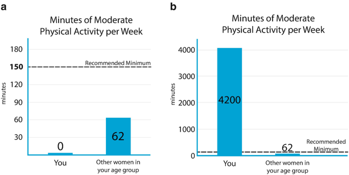
(a, b) Infographics from WICER demonstrating design techniques to accommodate the effects of extreme values. In (a), a very shallow bar is used to indicate where the bar would be if the value were not zero. The remaining visual elements are proportioned as the designer intended. In (b), the need to accommodate a very high value obscures the recommended minimum value . Reprinted from “A systematic method for exploring data attributes in preparation for designing tailored infographics of patient reported outcomes” by A. Arcia et al. eGEMs 6(1), 2. doi:10.5334/egems.190
-
How much rounding is optimal? Rounding should be a function of the nature of the variable and the purpose of the visualization. Data collected as whole numbers may be presented in smaller units to aid comparison. For example, WICER data for fruit and vegetable servings were reported in tenths (Maria, 2.0 servings; other women Maria’s age, 1.8 servings). If data are presented in graphs, axis labels should be rounded to increments larger than the individual data points, as in Fig. 10.2a, b.
-
Is binning appropriate? Conversion of continuous values into categories (binning) may be appropriate if precise values are not essential (e.g., age groups, income brackets, body mass index (BMI), or screening results).

How Are Values Interpreted?
Having determined the meaning of a variable and the range of possible values for it, the next task is to understand the meaning of the possible values. Considerations for value interpretation include:
-
If the variable is latent, what direction is the scoring? In other words, do high or low scores indicate high levels of the latent trait?
-
Are there value judgments associated with the values? What values are considered “good” or desirable? Relative value can be encoded with visual cues such as color (e.g., green = healthy, red = unhealthy), visual prominence, or symbols (e.g., check marks, happy/sad faces).
-
Are there cutpoints associated with a variable? Are there values that separate scores into meaningful categories? Cutpoints may be set by clinical practice guidelines, by instrument developers, based off of national/international norms, or even by arbitrary convention (e.g., 120 mmHg is the cutpoint between normal systolic blood pressure and pre-hypertension). If more than one set of cutpoints exist, determine which are the most relevant for the purpose.
-
Are normed scores available for the variable? Scores compared to population norms support interpretation of values, especially when cutpoints are not in use.
Answers from the above questions will produce a quick-reference summary of the data attributes (see Harris, 2000). The designer can then use existing tools and guides exist (see Selected Visualization Resources sidebar) to support selection of an appropriate graphical format to represent the data.
Selected Visualization Resources
Visualizing health Evidence based risk-communication visualizations |
Icon array generator Icon arrays display part-to-whole relationships for communicating health risks |
Chart chooser http://labs.juiceanalytics.com/chartchooser/index.html Use filters to find the right visualization for the data and download as Excel or PowerPoint templates |
Choosing a good chart http://extremepresentation.typepad.com/blog/2006/09/choosing_a_good.html Decision tree for chart selection |
Graphic cheat sheet http://billiondollargraphics.com/graphic-cheat-sheet/ Interactive chart selection tool |
Properties and best uses of visual encodings http://complexdiagrams.com/properties Suggested encoding elements according to data characteristics |
See http://selection.datavisualization.ch/ and http://dataviz.tools/ for an extensive curated selection of data visualization tools |
Case Study 1
Getting to know the data was an important early step for three main reasons. One, the data characteristics imposed limitations on possible designs. For example, to display a response to the question “During the past 30 days, for about how many days have you felt sad, blue, or depressed” (Centers for Disease Control and Prevention, 2000) we could show the total number of days but not their relationship to each other (i.e., all in a row vs. scattered throughout the month). Furthermore, research shows that when designers begin designing prior to fully understanding the data their assumptions about the patterns likely to be found in the data are often inaccurate (Bigelow, Drucker, Fisher, & Meyer, 2014).
Two, the precise variable meaning and the data characteristics sometimes suggest design opportunities or new ideas. Three, understanding the full range of values allows inclusion of all relevant use cases and paves the way for visualization automation. For WICER the biggest design and automation challenges arose from inconvenient outlier and non-missing zero values. Figures 10.1 and 10.2a, b illustrate how some of the considerations outlined above influenced design decisions.
Based on feedback from the WICER participants who generated the data, we selected bar graphs as the most effective presentation for physical activity (see Fig. 10.2a, b) (Arcia et al., 2016). An accurate title was sufficient to communicate the meaning of the variable. The recommended minimum, shown as a dotted line hovering above both bars, communicated the goal to be reached. The zero and outlier values presented a challenge. For zero, complete absence of a bar would potentially confuse, even if labeled. Our solution was to suggest zero with a shallow bar (Fig. 10.2a). The large outlier value in Fig. 10.2b distorts the relative proportions of the elements and the recommended minimum is no longer shown on the y-axis. Although aesthetically suboptimal, we kept this design because the proportion of high outliers was very small, and the purpose (i.e., gist comprehension) was not compromised.
Different considerations came into play for BMI (see Fig. 10.2). The metric, kg/m2, is not intuitive for the general public, meaning the infographic had to support identification of the value and interpretation of the metric. Based on our research of visualizations in this area and on participant feedback we elected to combine body silhouettes that evoke the meaning of the BMI categories with a number line to demarcate the reference ranges. The BMI infographic had to support verbatim comprehension over gist comprehension, because one of the cutpoints is between whole values (18.5) and because personal change along the continuum can occur in small increments (tenths). The cutpoints are not equidistant, which is a drawback aesthetically, but we determined that equality of intervals along the number line was preferable to over making the BMI categories visually symmetrical.
To select the range of values to display we considered (a) values that would allow visually balanced gradation in body silhouettes, (b) placement of the most common values in the center of the image, and (c) adequate spacing between values for ease of reading. However, a substantial proportion of respondents have values above the 15–35 range. In those cases the indicator box sits off the number line but overlaps the end of the arrow to suggest its placement, if number line was extended. We used green, orange, and red to encode value judgments associated with the categories.
Iterative Design
The next step in our visualization method is iterative design using a hybrid participatory design process . Unlike a design process that is entirely participatory, a hybrid process begins with initial prototyping by experts prior to moving on to participatory design sessions. Iterative design begins with initial prototypes created by experts and concludes with finalized information visualization designs informed by members of the intended audience. The rationale for a hybrid approach is that it is generally easier for the typical design session participant to choose from among and suggest changes to several options than to invent something from scratch. An important goal in the iterative design process is to identify the visual and symbolic language that is shared by the members of the health communication /design team and the intended audience.
Initial Prototyping
For WICER, a large, multi-disciplinary team of clinicians and scientists, some of whom had arts backgrounds, collaborated on the initial prototyping. A graphic designer was engaged at the end of the process, after the participatory design sessions had concluded. Armed with experience, we were able to streamline the process substantially for NHiRP and carry out initial prototyping with just one nurse scientist and a graphic designer. Depending upon the goals of the project, it may be useful to include an illustrator or animator at this stage.
For initial prototyping, we created many sketches to display each variable so as to have options from which to choose (see Arcia et al., 2013 for more details). The idea is to explore the range of graphical formats possible for a particular variable (both standard and novel) as well as variations within a particular format. The insights gained into the attributes of the data become useful at this point. What kinds of images convey the desired meaning? What visual and symbolic analogies can be incorporated? How can important features such as cutpoints or “good” values be highlighted? Visualization expert Edward Tufte encourages his workshop participants to consider, “What works in the wild?” That is, what formats, images, symbols, interfaces, etc., are familiar and successfully being used by the intended audience?
The application of basic information design principles (Katz, 2012; Lipton, 2011; Munzner, 2014) and lessons learned from prior visualization research (Ancker, Senathirajah, Kukafka, & Starren, 2006; Houts et al., 2006) can be used to narrow down and iterate upon the strongest sketches . Hallway testing, in which feedback is solicited from naïve viewers (such as by buttonholing someone in a hallway), is a very useful technique for getting a fresh perspective between iterations. The best ideas can then be fully fleshed out to yield the initial prototypes to be presented in participatory design sessions.
Participatory Design Sessions
A good participatory design session will include four to eight people recruited from the intended audience and last 1½–2 h (see Arcia et al., 2016 for additional methodological detail). If many opinions and lively discussion are desired, as many as 12 may be accommodated but for sensitive or emotionally charged topics, smaller groups are more desirable as they allow time for individuals to share their stories.
For both WICER and NHiRP, we gave participants identical stacks of 8½″ × 11″ card stock printed with a single infographic design per page. Infographics were tailored for fictional people with simulated data. Looking at the designs one by one, we guided discussion by asking, “What information do you think we are trying to convey with this image? What does it mean to you?” After considering a group of designs relating to the same variable, we asked the group to indicate by voice or hand vote which of the images they preferred and why and then solicited suggestions for improvement. Any additional questions will depend upon the topic and purpose of the visualization. For example, for infographics related to physical activity, nutrition, BMI, or blood pressure, we asked if the image would motivate them to address the health issue. For caregivers viewing information about mental health or caregiving burden, we asked a more open-ended question about how they would react to seeing a particular design.
A short peer-debriefing session between staff members immediately following the design session can be used to discuss impressions and make design decisions about how to iterate. Designs not favored by participants can be dropped, and successful ones can be further refined based on feedback. Occasionally, ideas for an entirely new design will emerge from design sessions. Scheduling design sessions about a week apart allows time to iterate accordingly.
It is not always obvious which participant feedback to pursue and which to set aside. Sometimes the solution is to gather more data and present the same options to additional groups. Additional data can help clarify the difference between a representative viewpoint that should be accommodated and an idiosyncratic, personal viewpoint that does not represent the larger group well. As the sessions progress, the differences between designs narrow and a consensus emerges as to which designs meets the stated purpose for the large majority of participants. This is the point of design saturation and the end of the participatory design process.
Case Study 2
The importance of engaging members of the target audience in the participatory design process cannot be understated. Some of the ideas that we developed during initial prototyping for WICER were confusing to or misinterpreted by participants whereas others proved to be more successful than we would have anticipated (Arcia et al., 2016). For example, a number of prototypes that we explored employed repeated icons to represent multiple instances of a more general class of things, such as apple icons to represent servings of fruit or silhouetted runners to represent days with physical activity. Many participants interpreted the icons very literally and did not spontaneously generalize to include other types of fruits or to activities beyond running.
By contrast, icons used as symbolic analogies, such as the use of a battery to represent sleep and energy or stars to rate overall health, were nearly universally understood. We speculate that this finding can be explained by participants’ level of familiarity with specific graphical conventions. Purveyors of movies and other products have trained us in the use of a five-star rating system and anyone who uses a portable device understands the consequences of a depleted battery icon. As Edward Tufte would say, these conventions have proven success “out in the wild.” It appears that some of the other iconographic formats we explored were not familiar to our target audience and therefore were frequently misinterpreted. Given the culturally specific nature of exposure to graphical formats our findings will not be applicable to all audiences, hence the importance of participatory design with each target audience.
Automation
This step in the method applies to visualizations that vary because they are tailored in some fashion. A style guide is useful for codifying the design specifications and communicating them to the programmer. Once programmed, the visualizations must go through quality control testing to ensure they render as planned.
Codifying Design Specifications
A style guide is a structured communication tool in which the design specifications of each visualization are codified in stand-alone entries (see Arcia, Velez, & Bakken, 2015 for details). The advantage of using a style guide is that it serves as a reference for how the finished product should look and behave but does not impose a specific programming approach.
For the WICER Style Guide (see Fig. 10.3) the fields we filled for each entry specified the variables (and any transformations thereto) needed to build the infographic, the comparison groups to be used (if any), the units of measure (and rules for rounding), a description of how tailoring affects the image, any reference ranges or criteria (e.g., blood pressure categories), Spanish translations of all text, and the versions to be produced (e.g., English and Spanish, male and female). We included a notes field with miscellaneous instructions for how to treat extreme and non-missing zero values. Each entry is illustrated with one or more sample images. In order to prepare for the formal comprehension testing that we used to evaluate the WICER infographics, we also included fields for text-only versions of the information shown in infographics as well as instructions for tailoring the text. We used the same font and color palette across infographics and so these were specified at the beginning of the style guide . For NHiRP, we have added a field to specify the values to be used during quality control testing.

The above excerpt from the WICER Style Guide includes the fields necessary to produce the BMI infographic shown in Fig. 10.1
When considering how an image may be affected by tailoring, it is desirable to have as few “moving parts” as possible because this simplifies the subsequent automation programming. For example, in our BMI infographic (Fig. 10.1), we used four static backdrops (varying by gender and language) and the only elements that change with tailoring are the location of the marker along the number line and the value shown inside of it and the body silhouette.
Programming and Quality Control Testing
In order to tailor the WICER infographics automatically, we developed a novel, adaptable, reusable, and generalizable software approach called EnTICE3 (Electronic Tailored Infographics for Community Engagement, Education, and Empowerment ).
Infographics are programmed individually into EnTICE3 as a set of rules that govern the selection and relative placement of metadata and graphical components based on the specifications laid out in the style guide. Using R Studio as an interface, the user directs EnTICE3 to the desired dataset and ID number(s) for which individual and population data are to be drawn. EnTICE3 then uses its rule-based programming to assemble infographics from the graphical components in its repository (see Fig. 10.4). The finished infographic is saved as a pdf file. Depending upon the graphical format chosen, it may not be necessary to write code from scratch. There are online libraries of visualizations from which R and D3.js code is freely available (see Selected Visualization Resources sidebar).

EnTICE3 uses the data provided by the user to assemble infographics from the graphical components in its repository according to style guide specifications. R Studio is used as the interface for running EnTICE3
Quality control testing requires very careful attention to detail to verify that the infographics appear as they should regardless of the data entered. For variables with only a handful of possible values, testing is straightforward. Problems are most likely to arise with continuous variables, especially for decimals, extreme values, and non-missing zero values (see Fig. 10.2a, b). One motivation for gaining a thorough understanding of the data attributes is precisely to anticipate and avoid difficulties with automation. Binning values and rounding to larger (e.g., 10s, 100s) numbers can simplify the process by limiting the possible outputs to be rendered. Illegal and out-of-range values should also be tested to ensure that the system can detect them and return an appropriate error message.
Evaluation
The purpose of evaluation is to determine the extent to which a visualization achieves the desired outcomes. As such, the method of evaluation should be selected for its sensitivity to those outcomes. Because comprehension support was the primary purpose for the WICER infographics , we conducted formal comprehension testing.
Suppose the purpose of a visualization is to prompt behavior change. An exploration of viewers’ intent to change behavior would be a good first step but ultimately, evaluation would need to compare the behaviors of people exposed to the visualization in comparison to those not so exposed. It is beyond the scope of this chapter to cover the myriad forms that evaluation can take. Rather, we will focus on two types of evaluation, heuristic evaluation and comprehension testing, as illustrative case studies.
Heuristic Evaluation
Heuristic evaluation is a usability inspection method in which experts compare the design being evaluated against a set of heuristics. The heuristics may vary depending upon the object being evaluated. For example, Nielsen’s general user interface heuristics have been broadly implemented to a variety of digital artifacts and are considered a discount usability method because a relatively small number of experts can detect the majority of usability problems (Nielsen, 1995). Others have proposed heuristics for specific types of applications or populations such as mobile apps for older adults or for information visualization evaluation (Silva, Holden, & Jordan, 2015; Zuk, Schlesier, Neumann, Hancock, & Carpendale, 2006).
Heuristic evaluation complements testing with intended users of an artifact since it tends to focus on ease of use while the latter has a major focus on usefulness (Yen & Bakken, 2009). Approaches to conducting the heuristic evaluation vary in level of formality and structure. We have used a number of approaches in our research. In some instances, the experts have been asked to think aloud as they explored a system and their interactions and utterances have been captured with specialized usability software (Choi & Bakken, 2010). In other situations, we have applied an approach in which, using a heuristic checklist, each expert provides general comments about each heuristic and then provides a rating on the severity of the heuristic violation from cosmetic problem only to usability catastrophe (Allen, Currie, Bakken, Patel, & Cimino, 2006; Bright, Bakken, & Johnson, 2006).
For both WICER and NHiRP , we have used a group, rather than individual, approach to heuristic evaluation, in which experts well-versed in heuristics assess information visualizations and make recommendations for improvement (Arcia et al., 2013). Recently, we have formalized the group and its processes as the Columbia Visualization Design Studio.
Comprehension Testing
We initially elected to conduct a randomized controlled trial to formally compare infographics to text alone with respect to comprehension and perceived ease of comprehension. As a secondary consideration, we also asked participants to rate how motivated they were to address the health issue presented in some of the infographics . In our experimental design, participants were randomized to four groups: A1, A2, B1, and B2. Group A served as group B’s control, and vice versa; group 1 saw text first, group 2 saw infographics first.
For example, group A was presented with text-only about prolonged stress and an infographic on depression symptoms while group B was presented an infographic on prolonged stress and with text-only about depression symptoms (see example in Fig. 10.5). This design was used to minimize potential sources of bias. Decks of infographic and text-only slides were tailored for participants with their own survey data. For each slide, participants completed a comprehension question (e.g., “Is your BMI category underweight, normal, overweight, or obese?”) and a rating of the ease of comprehension of the item (“Very difficult” to “Very easy” to understand).

Visually and conceptually similar infographics serve as controls for each other. “Maria” sees text about prolonged stress and an infographic for depression symptoms while “Gloria” sees an infographic for prolonged stress and text about depression symptoms
We did not expect that the infographics would perform equally well with respect to one another; some designs are likely stronger than others. Therefore, the key to our experimental design was that we were able to present infographics in visually or conceptually similar pairs. This allowed us to show both infographics and text to each group so that any differences between the two formats could genuinely be attributed to the format and not to variations in the quality of the infographics.
The comprehension test was designed to be largely self-administered with infographics and multiple choice questions shown separately on side-by-side screens with a research assistant on hand to provide technical support. However, after collecting data from about half of our target sample size of 144, we elected to change our approach because we noted that despite orienting participants to the task, many answered the questions according to their feelings, memories, or opinions on the topic rather than on the information presented. The multiple choice format also appeared to be unfamiliar to and problematic for some of the older participants whose educational attainment was equivalent to no higher than middle school.
As a result, we will be moving forward with a cognitive interview-style comprehension assessment that may be more culturally appropriate for our participant population. We speculate that research teams working with populations accustomed to computer-based multiple choice testing may still meet with success using our initial approach.
Emerging Trends and Future Opportunities
Consumer Health Informatics to Support Self-Management
For both WICER and NHiRP the intent was not only to create infographics that were understandable, but also to motivate action, particularly self-management activities. Although significant literature exists regarding the efficacy of consumer-facing technology-based behavior interventions (Free et al., 2013; Tao, Wang, Wang, Liu, & Qu, 2017), the evidence related to populations with low levels of health literacy is limited. In contrast to broadband at home, cellular phones are ubiquitous among most Hispanic populations and smartphone use ownership is similar to non-Hispanic whites (Rainie, 2017). Moreover, the number of Hispanics who use their phones for health-related purposes is increasing. This creates the potential for incorporating both static and interactive infographics as a strategy for enhancing self-management behaviors. In addition, tethered personal health records, which have traditionally been web-based, are now evolving to mobile-friendly user interfaces or apps.
Integration with Care
Patient-reported outcomes and patient contextual data are anticipated to play a critical role in improving health care delivery and patient experiences with care. A patient-reported outcome (PRO) is any report of the status of a patient’s health condition that comes directly from the patient, without interpretation of the patient’s response by a clinician or anyone else (Deutsch, Smith, Gage, Kelleher, & Garfinkel, 2012). This information is gathered from patients and families via the Patient Reported Outcomes Measurement Information System (PROMIS) , funded by the National Institutes of Health (Patient-Reported Outcomes Measurement Information System, 2017). PROMIS data are collected using standardized measurement questions so clinicians can use it to augment an individual’s care, or so it can be summarized for population level health management. PROs include information on quality of life, symptoms, and activities of daily living. They are particularly relevant for patients with multiple chronic conditions, elders, and those with functional impairments (Barile et al., 2013).
Despite their value, PROs are not well integrated into the care process. Most electronic health records are not designed to import these data in a usable format. Additional challenges to presenting PRO data stem from the fact that they change as a patient’s condition improves or worsens. Visualization can play an important role in facilitating the use of PROs. Application of sound design principles can ensure visual summaries of PRO data are designed to efficiently integrate into electronic record systems and to present information in a way that points toward appropriate action. Visual displays can also be created to return PRO results to patients to support their engagement with their care. The processes described here can guide development of visual displays that reduce the cognitive processing effort required by patients and providers to use PRO data for shared decision-making. Visualizations that appropriately return PRO results also can support patients to manage their own care and attain care goals.
Other Data Streams
Data for producing health visualizations may come from many sources. Patients now collect high frequency, longitudinal health data outside of the clinical setting, using mobile technologies. Nearly 90% of Americans have smartphones and about 21% use smartphone applications, wearable devices, and remote monitoring devices to track health (Poushter, 2016). Patient-generated health data is increasingly being sent to healthcare providers for review.
Rules for the new payment models being implemented, as part of national efforts to control cost and improve care, stipulate that patients have the opportunity to view, download, and transmit their health data to providers (Centers for Medicare and Medicaid Services (CMS), 2016). These systems themselves produce data that will provide opportunities for development of visualizations that communicate meaning to consumers about quality in the organizations that provide healthcare. One example is the Merit-based Incentive Payment System (MIPS) currently being implemented by the US Health and Human Services Administration (Medicare Access, 2015).
Conclusions
Patient engagement in self-management requires educating patients, families, and caregivers about their health conditions and empowering them to become involved. A key means to this end is through the return of personalized data and information about their care. When evidence-based visualizations, based on sound design practices, facilitate and augment these efforts, a compelling entry point emerges for patients at all levels of health literacy to engage in the health care process to achieve the best possible outcomes.
Notes
- 1.
Funding provided by the Agency for Healthcare Research and Quality (R01HS019853; R01HS022961) and New York State Department of Economic Development NYSTAR (C090157).
- 2.
Funding provided by the National Institute of Nursing Research (R01NR014430-03S1).
References
Allen, M., Currie, L. M., Bakken, S., Patel, V. L., & Cimino, J. J. (2006). Heuristic evaluation of paper-based web pages: A simplified inspection usability methodology. Journal of Biomedical Informatics, 39(4), 412–423.
American Heart Association. (2016). Understanding blood pressure readings. Retrieved April 24, 2017, from http://www.heart.org/HEARTORG/Conditions/HighBloodPressure/KnowYourNumbers/Understanding-Blood-Pressure-Readings_UCM_301764_Article.jsp#.WP6XC_nythE
Ancker, J. S., Senathirajah, Y., Kukafka, R., & Starren, J. B. (2006). Design features of graphs in health risk communication: A systematic review. Journal of the American Medical Informatics Association, 13, 608–618. https://doi.org/10.1197/jamia.M2115.Introduction
Arcia, A., Bales, M. E., Brown, W., 3rd, Co, M. C., Jr., Gilmore, M., Lee, Y. J., … Bakken, S. (2013). Method for the development of data visualizations for community members with varying levels of health literacy. In AMIA … Annual Symposium Proceedings/AMIA Symposium. AMIA Symposium, 2013 (pp. 51–60).
Arcia, A., Suero-Tejeda, N., Bales, M. E., Merrill, J. A., Yoon, S., Woollen, J., & Bakken, S. (2016). Sometimes more is more: Iterative participatory design of infographics for engagement of community members with varying levels of health literacy. Journal of the American Medical Informatics Association, 23(1), 174–183. https://doi.org/10.1093/jamia/ocv079
Arcia, A., Velez, M., & Bakken, S. (2015). Style Guide: An interdisciplinary communication tool to support the process of generating tailored infographics from electronic health data using EnTICE3. eGEMs (Generating Evidence & Methods to improve patient outcomes), 3(1), 3. https://doi.org/10.13063/2327-9214.1120
Arcia, A., Woollen, J., & Bakken, S. (2018). A systematic method for exploring data attributes in preparation for designing tailored infographics of patient reported outcomes. eGEMs (Generating Evidence & Methods to improve patient outcomes), 6(1), 2. https://doi.org/10.5334/egems.190
Barile, J. P., Reeve, B. B., Smith, A. W., Zack, M. M., Mitchell, S. A., Kobau, R., … Thompson, W. W. (2013). Monitoring population health for healthy people 2020: Evaluation of the NIH PROMIS® Global Health, CDC healthy days, and satisfaction with life instruments. Quality of Life Research, 22(6), 1201–1211.
Bigelow, A., Drucker, S., Fisher, D., & Meyer, M. (2014). Reflections on how designers design with data. Paper presented at the proceedings of the 2014 international working conference on advanced visual interfaces.
Bowling, A. (2005). Just one question: If one question works, why ask several? Journal of Epidemiology and Community Health, 59, 342–345.
Bright, T. J., Bakken, S., & Johnson, S. B. (2006). Heuristic evaluation of eNote: An electronic notes system. In AMIA … Annual Symposium Proceedings/AMIA Symposium. AMIA Symposium, 2006 (p. 864).
Cairo, A. (2012). The functional art: An introduction to information graphics and visualization. New Riders.
Centers for Disease Control and Prevention. (2000). Measuring healthy days: Population assessment of health-related quality of life. Atlanta, GA: CDC.
Centers for Medicare & Medicaid Services (CMS). (2016). Medicare program; merit-based incentive payment system (MIPS) and alternative payment model (APM) incentive under the physician fee schedule, and criteria for physician-focused payment models. Final rule with comment period. Federal Register, 81(214), 77008.
Choi, J., & Bakken, S. (2010). Web-based education for low-literate parents in Neonatal Intensive Care Unit: Development of a website and heuristic evaluation and usability testing. International Journal of Medical Informatics, 79(8), 565–575.
Deutsch, A., Smith, L., Gage, B., Kelleher, C., & Garfinkel, D. (2012). Patient-reported outcomes in performance measurement. Paper presented at the National Quality Forum (NQF), Washington, DC.
Donahue, K., Sloane, P., Callahan, L., & Mielenz, T. (2004). Identifying supports and barriers to physical activity in patients at risk for diabetes. Paper presented at the annual meeting of the American Diabetes Association, Orlando, FL.
Free, C., Phillips, G., Galli, L., Watson, L., Felix, L., Edwards, P., … Haines, A. (2013). The effectiveness of mobile-health technology-based health behaviour change or disease management interventions for health care consumers: A systematic review. PLoS Medicine, 10(1), e1001362.
Garcia-Retamero, R., Okan, Y., & Cokely, E. T. (2012). Using visual aids to improve communication of risks about health: A review. The Scientific World Journal, 2012, 562637. https://doi.org/10.1100/2012/562637
Harris, R. L. (2000). Information graphics: A comprehensive illustrated reference. New York, NY: Oxford University Press.
Houts, P. S., Doak, C. C., Doak, L. G., & Loscalzo, M. J. (2006). The role of pictures in improving health communication: A review of research on attention, comprehension, recall, and adherence. Patient Education and Counseling, 61, 173–190. https://doi.org/10.1016/j.pec.2005.05.004
Jorm, A., & Jacomb, P. (1989). The informant questionnaire on cognitive decline in the elderly (IQCODE): Socio-demographic correlates, reliability, validity and some norms. Psychological Medicine, 19(4), 1015–1022.
Katz, J. (2012). Designing information: Human factors and common sense in information design. Hoboken, NJ: John Wiley & Sons.
Kroenke, K., & Spitzer, R. L. (2002). The PHQ-9: A new depression diagnostic and severity measure. Psychiatric Annals, 32(9), 509–515.
Lipton, R. (2011). The practical guide to information design. Hoboken, NJ: John Wiley & Sons.
Medicare Access. (2015). CHIP Reauthorization Act of 2015. Public Law, 16(114–10), 129.
Munzner, T. (2014). Visualization analysis and design. Boca Raton, FL: CRC Press.
Nielsen, J. (1995). 10 usability heuristics for user interface design. Nielsen Norman Group, 1(1).
Patient-Reported Outcomes Measurement Information System. (2017). Health measures: Transforming how health is measured. Retrieved March 30, 2017, from http://www.healthmeasures.net/explore-measurement-systems/promis
Poushter, J. (2016). Smartphone ownership and Internet usage continues to climb in emerging economies. Washington, DC: Pew Research Center.
Rainie, L. (2017). Digital divides - feeding America. Washington, DC: Pew Research Center.
Silva, P. A., Holden, K., & Jordan, P. (2015). Towards a list of heuristics to evaluate smartphone apps targeted at older adults: A study with apps that aim at promoting health and well-being. Paper presented at the 2015 48th Hawaii international conference on system sciences (HICSS).
Spiegelhalter, D., Pearson, M., & Short, I. (2011). Visualizing uncertainty about the future. Science, 333, 1393–1400. https://doi.org/10.1126/science.1191181
Tao, D., Wang, T., Wang, T., Liu, S., & Qu, X. (2017). Effects of consumer-oriented health information technologies in diabetes management over time: A systematic review and meta-analysis of randomized controlled trials. Journal of the American Medical Informatics Association, 24, 1014–1023.
Yen, P.-Y., & Bakken, S. (2009). A comparison of usability evaluation methods: Heuristic evaluation versus end-user think-aloud protocol-an example from a web-based communication tool for nurse scheduling. In AMIA … Annual Symposium Proceedings/AMIA Symposium. AMIA Symposium, 2009 (p. 714).
Zuk, T., Schlesier, L., Neumann, P., Hancock, M. S., & Carpendale, S. (2006). Heuristics for information visualization evaluation. Paper presented at the proceedings of the 2006 AVI workshop on BEyond time and errors: Novel evaluation methods for information visualization.
Author information
Authors and Affiliations
Corresponding author
Editor information
Editors and Affiliations
Rights and permissions
Copyright information
© 2019 Springer Nature Switzerland AG
About this chapter

Cite this chapter
Arcia, A., Merrill, J.A., Bakken, S. (2019). Consumer Engagement and Empowerment Through Visualization of Consumer-Generated Health Data. In: Edmunds, M., Hass, C., Holve, E. (eds) Consumer Informatics and Digital Health. Springer, Cham. https://doi.org/10.1007/978-3-319-96906-0_10
Download citation
DOI: https://doi.org/10.1007/978-3-319-96906-0_10
Published:
Publisher Name: Springer, Cham
Print ISBN: 978-3-319-96904-6
Online ISBN: 978-3-319-96906-0
eBook Packages: MedicineMedicine (R0)