
Abstract
This chapter describes the use of Geographic Information Systems (GIS) in public health. An overview of GIS includes a brief history, military developments, computerized GIS software, and current tools. Examples of GIS applications for international, national, state, and local public health organizations will highlight how GIS is currently used. GIS advantages and disadvantages in the fields of epidemiology, medicine, and public health will provide a context for its use in the health industry. An overview of spatial statistics and space-time analysis will illustrate advanced GIS functions used by researchers and scientists for better understanding of spatial patterns, improved decision-making, and determining the statistical significance of spatial modelling.
After reading this chapter you will be able to:
-
Understand the history and current uses of GIS
-
Identify applications, advantages, and disadvantages of GIS for public health
-
Have a basic understanding of spatial statistics for public health applications
Access provided by Autonomous University of Puebla. Download chapter PDF
Keywords
- Global Navigation Satellite System
- Global Navigation Satellite System
- Geographic Information System
- Spatial Regression
- Public Health Organization
These keywords were added by machine and not by the authors. This process is experimental and the keywords may be updated as the learning algorithm improves.
GIS Overview
Definition
Geographic Information Systems (GIS) is a computerized system designed for the storage, retrieval, and analysis of geographically referenced data. GIS uses advanced analytical tools to explore at a scientific level the spatial relationships, patterns, and processes of biological, cultural, demographic, economic, geographic, and physical phenomena.
Early Health Maps
While the roots of cartography go back hundreds of years, the first known GIS related to health were hand drawn maps by Dr. John Snow during a cholera outbreak in London in 1854. Snow questioned the popular theory that cholera was an airborne miasma contagion and suspected that local cases were instead the result of a contaminated water pump on Broad Street in central London. As a physician, Dr. Snow treated many of those who died from the cholera outbreak in this area and was familiar with the neighbourhood and its citizens. Snow not only mapped the location of each death, he placed a horizontal bar for every person who died, thus demonstrating a clustering and quantity of deaths near the pump. His maps showed that no deaths occurred at a nearby pub or at an adjacent monastery where bar patrons and monks did not drink water from the Broad Street pump. However, these original maps did not convince the Board of Guardians that the pump was the cause of the cholera deaths, so Snow created a second map, an irregular line drawing showing a catchment area of those living closest to the pump. These maps showed that most of the cholera deaths were within this catchment area, finally convincing the Board of Guardians to disable the pump. The number of cholera cases declined, and water borne transmission of cholera was later established, not by Snow but by others, solidifying germ theory. John Snow is credited as a founder of the field of epidemiology and has a tavern named after him.
Around the same time but across the pond others were creating maps for studying health conditions. The New York City Metropolitan Board of Health was one of the first modern municipal public health authorities in the United States to use maps to understand the health and living conditions of the population. Figure 1 depicts health department maps of NYC’s fourth ward from 1864 showing that sanitary conditions at this time were overwhelmingly poor. Yellow structures on the map show tenement houses where the space for each occupant was less than 800 cubic feet. In this year, there were 486 tenement houses with 3636 families and a total population of 17,611. There was a population of 346 living in cellars and 151 tenements without sewers (Lubove 1963). This early mapping clearly helped city officials and the Board of Health understand and ultimately improve the health and living conditions of the population.

Lionel Pincus and Princess Firyal Map Division, The New York Public Library. ‘Sanitary and social chart of the Fourth Ward of the City of New York, to accompany a report of the 4th Sanitary Inspection District’. Source: The New York Public Library Digital Collections. 1864. http://digitalcollections.nypl.org/items/fc8b9560-f3a1-0130-679f-58d385a7b928)
Aerial Photography and Military Developments
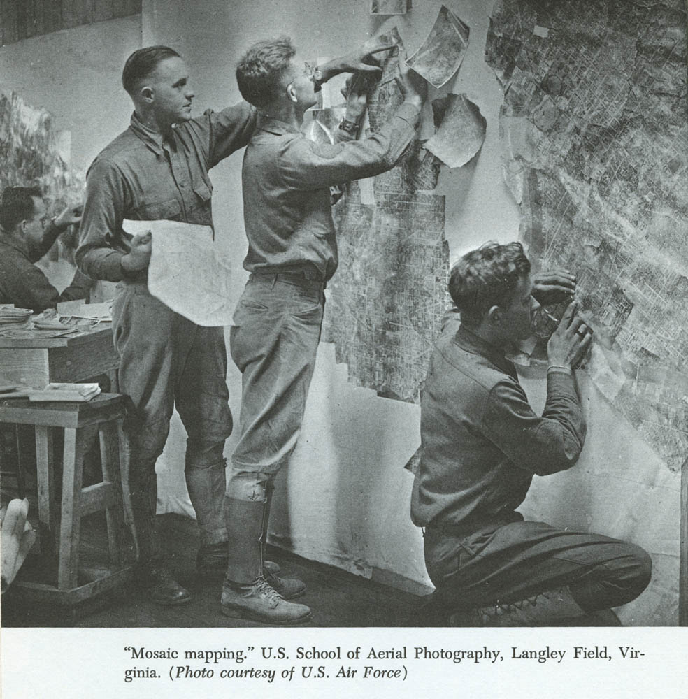
GIS as used today has its roots in photography and military uses. Remote sensing, a source of GIS map creation, is the technique of collecting information about the earth from a distance. The technical development of remote sensing began with aerial photography and by the 1860s photographs were taken from captive balloons. The first military use of aerial photos was June of 1862 during the American Civil War when photographs were taken by the US Army to analyse the defences of the city of Richmond. By the 1900s technology improved to a point where smaller cameras with faster lenses were used. In 1909 Wilbur Wright was credited with taking the first photograph from an airplane and soon thereafter German flying students trained at English flying schools were taking air photos. Military authorities in WWI were initially reluctant to use aerial photography technology, but when semi-official photographic missions produced air photos of military facilities in German-held territories, they were quickly convinced of their potential use (Arnoff 1995). Figure 2 shows how mosaic maps were made by taking a series of overlapping vertical photos and aligning them together to create a comprehensive view of the enemy’s trench network (Gettinger 2014). Photo interpreters became the ‘eyes of the armed forces’, and the use of aerial photos had a profound effect on military tactics by finding visual clues that might denote changes in the enemy’s position. Examples include soil displacement or shadows to identify trenches, embankments, artillery batteries, and troop movements (Arnoff 1995).

‘Mosaic mapping’ US School of Aerial Photography, Langely Field, Virgina. Source: US Air Force, http://dronecenter.bard.edu/files/2014/01/00001490-1.jpg
After WWII, aerial photography technology improved due to higher flying aircraft such as the U2. These military spy planes were out of reach of most land weapons and allowed the United States to use aerial photography during the ‘Cold War’ (Arnoff 1995). On 24 October 1946, rocket-borne cameras launched from the White Sands Missile Range/Applied Physics Laboratory in the New Mexico desert gave us the first look at the Earth from beyond the atmosphere (Reichhardt 2006).
Early Computerized Years
Roger Thomlinson, an English geographer, is known as the father of GIS for his involvement with the Canadian Geographic Information System, the first computerized GIS. After his military service in the Royal Air Force (1951–1954), Dr. Tomlinson received separate undergraduate degrees in geography and geology. It was during his time with the Canadian federal government in the 1960s that Tomlinson initiated, planned, and directed the development of the Canada Geographic Information System, one of the first known GIS applications for land use (Sampson 2014).
Many of today’s GIS computerized technologies stem from the work done by Howard T. Fisher and his graduate students at the Harvard School of Design Laboratory for Computer Graphics and Spatial Analysis. Most notable are Jack Dangermond, founder of Esri, Inc. (Environmental Systems Research Institute), Scott Morehouse, Hugh Keegan, and Duane Niemeyer of Esri, David Sinton of Intergraph, and Lawrie Jordon and Bruce Rado, founders of ERDAS. Applications created by these individuals encompass most of the current vector and raster technologies in use today (Hoel et al. 2009). Of these, the most dominant GIS software vendor is Esri, with 41 % of the GIS market, far more than any other GIS vendor (Esri and Jack Dangermond 2015). Its software, ArcGIS, is used by almost every US Federal agency; over 350,000 organizations globally; the 200 largest cities in the US; two-thirds of the Fortune 500 firms; and more than 7000 colleges and universities (Esri customers 2014). Esri has relationships with over 65 software, technology, data, hardware, system integrator and consulting companies including Amazon Web Services, AT&T, Citrix, IBM, Microsoft, Oracle, SAP, Nokia, and SAS (Esri partners 2013).
GIS Data
GIS data is in three formats: vector, raster, and tabular. Vector maps have features drawn using points, lines, and polygons (a polygon is a closed area that has a boundary consisting of connected straight lines) to represent discrete geographic objects such as automobile accident locations, streets, and counties. Raster maps are generally aerial photographs, satellite images, or representations of surfaces such as elevation, which are used to represent continuous geographies (Kurland and Gorr 2014). Tabular data is in the form of rows and columns such as spreadsheets and much of this data is created directly by organizations. For example, private and public health care agencies map address data from patient medical records or surveys. Common sources of tabular data are freely available from organizations such as the Australian Bureau of Statistics, the UK Office of National Statistics, the US Census Bureau and similar government organizations worldwide. These, and other local governments , are sources of business, demographic, economic, environmental, and other data used in GIS.
Data and the method for collecting and providing it have come a long way since early census taking. When it first began, the US Census sought very basic population information, but a significant change occurred in the 1940s, when the Census Bureau introduced statistical sampling. Processing and tabulation technology took a great leap forward during World War II, when the War Department began to explore the use of electronic digital computers to process ballistic information and after the war, many of the project’s engineers recognized peacetime benefits of such a device. In 1943, the US National Defense Research Council (NDRC) approved the design and construction of the Electronic Numeric Integrator and Computer (ENIAC) used by the War Department's Ballistic Research Laboratory. During this project, programmers met with several Census Bureau officials to discuss non-military applications for electronic computing devices; and in 1946, programmers began work on new a computer designed for use by the Census Bureau. The final results were specifications for the Universal Automatic Computer (UNIVAC). Their efforts brought the US Census Bureau into the computer age and laid the foundation for the census data as we know it today (Univac 2015).
Before the 1960s most maps were in hard copy form. Advances in optics, metallurgy, and industry during the eighteenth and nineteenth centuries allowed the mass production of surveying devices and by the mid-twentieth century cartometric quality maps were accurately representing objects on the earth’s surface. Other advances improving digital data used in GIS were Global Navigation Satellite Systems (GNSS) such as the US Global Positioning System (GPS). Optical scanning and manual digitizing (the process of collecting digital coordinates) became commonplace in the 1980s when many organizations began implementing GIS (Bolstad 2008).
Discussion Task
What tabular data could be surveyed or otherwise downloaded or created for a GIS public health study?
Discuss
Current and Future GIS Technologies
Aerial imagery, manual digitizing, remote sensing, satellites, and scanners are technologies used to create GIS map layers. Computer software of the 1970s, 1980s, and 1990s used to develop GIS data include Computer Aided Design (CAD), vector, and raster GIS. Companies such as Autodesk, Esri, Erdas, and Intergraph, and Pitney Bowes are among those who led the way in developing software applications. Tools were added for advanced spatial analysis and many of these required specialized knowledge and advanced training.
Open source GIS applications were first developed in the 1970s and 1980s and they continue to grow. Geographic Resources Analysis Support System (commonly referred to as GRASS) is a free and open source GIS used in academic, commercial, and governmental agencies for over 30 years. GeoDa is another open source GIS commonly used for spatial regression. Spatial regression not only asks where something occurs, but why it occurs. For example, GIS shows where higher than expected traffic accidents happen in a city but regression answers what factors contribute to accidents. Spatial regression allows one to model phenomena to better understand them and predict values at other places and times (Murak 2013). QGIS, an official project of the Open Source Geospatial Foundation (OSGeo), is a more recent open source GIS. QGIS runs on Linux, Unix, Mac OSX, Windows, and Android and supports numerous vector, raster, and database formats and functionalities (QGIS 2015).
Google Maps, Google Earth, Google Earth Pro, and Microsoft Virtual Earth (formerly Bing Maps) have had a strong impact on the field of GIS. The ease of viewing satellite imagery, maps, terrain, and 3D street views has greatly increased the awareness of the geospatial industry by the general public.
Technologies such as GPS and social media as well as cloud and mobile technologies are changing the way organizations collect and analyse location-based data. The new modality of GIS is the seamless integration of desktop GIS, mobile devices, and the Web. GIS maps, workflows, and analytic data models are now shared online with many and integrated as a system. Esri’s next generation of ArcGIS Platform allows users to design, edit, and publish GIS data anywhere, anytime, and from any device. Maps created in 2D and 3D from a desktop GIS can be easily published directly to Esri’s ArcGIS Online or Portal. Maps can then be downloaded and viewed on mobile devices and tables. A new tool such as Esri’s Collector for ArcGIS collects and updates field data on iOS and Android devices. These technologies, plus advances in medical record integration and surveys, will have a great impact on public health mapping.
GIS Applications in Public Health
Introduction
GIS has been widely used by government agencies since the 1970s and has made more recent strides into health care in both the private and public sectors. It provides an effective way to visualize, organize, and manage a wide variety of information including administrative and medical data, social services, and patient information. Public health organizations at the international, national, state/province, and local level use GIS to map health events, identify disease clusters, investigate environmental health problems, and understand the spread of communicable and infectious disease.
International Application
Organizations collecting, mapping, and spatially analysing international health data include the Kaiser Family Foundation, World Health Organization (WHO), the World Bank, and many more. The US Agency for International Development (USAID) and President’s Emergency Plan for AIDS Relief (PEPFAR) are examples of agencies working together and with various countries to solve public health problems using GIS. Both are large components of the US President’s Global Health Initiative. PEPFAR was established by presidential order to help educate and save the lives of those suffering from HIV/AIDS. Its goals are to strengthen the capacity of partnering governments to respond to and create sustainable programmes to prevent and treat HIV/AIDS and other infectious epidemics. USAID is responsible for administering civilian foreign aid and operates in Africa, Asia, Latin America, and Eastern Europe. Health and family planning is a field mission of USAID, whose projects strengthen the public health system by focusing on maternal-child care health.
PEPFAR and USAID created the Spatial Data Repository to link geographic health data to demographic data provided by The Demographic Health Surveys (DHS) Program and the US Census Bureau. Since 1984, the DHS Program has worked with over 90 countries to develop more than 300 surveys to improve our understanding of the health of developing countries. Data from the surveys include fertility, family planning, maternal and child health, gender, HIV/AIDS, malaria, and nutrition. Over the past six decades the US Census Bureau has worked internationally with over 100 countries on a variety of topics used for disaster and humanitarian relief planning. Working with PEPFAR and developing country counter parts, the US Census Bureau provides population and age/sex estimates, technical help, software products, and training to assist countries in the collection, processing, analysis, dissemination, and use of statistics to better understand public health conditions (US Census 2015).
The DHS Program’s Spatial Data Website (spatialdata.dhsprogram.com/home/) provides online maps as well as data that can be downloaded and used for advanced analysis using desktop GIS. Its STAT compiler application allows users to make customized tables, charts, line graphs , thematic maps, and scatter plots and has a mobile app for the 25 most popular health indicators for over 90 counties and 250 existing surveys. Figure 3 is an example downloaded DHS data mapped using Esri’s ArcGIS application (Kurland and Gorr 2014). The map compares women who tested positive for HIV/AIDS and the percentage of women with no education.

Zambia HIV study of women age 15–49. Source: PEPFAR Spatial Repository, Kurland and Gorr (2014), GIS Tutorial for Health, Esri Press, 5th Edition, 178
National Application
National organizations collecting data for public health use vary by country. Examples are the Australian Institute of Health and Welfare (aihw.gov.au), the UK’s Health and Social Care Information Centre (hscic.gov.uk), and the US Centers for Disease Control (CDC) (cdc.gov). Another US organization with strong data and GIS applications is the National Cancer Institute (NCI). For many years, NCI has provided data, maps, and advanced statistical tools via their website (gis.cancer.gov). Geospatial data from the NCI come from many sources including the National Center for Health Statistics, the Census Bureau, and lifestyle data from the CDC. Related collaborative research includes Surveillance, Epidemiology and End Results (SEER) Cancer Registries (Rapid Response Surveillance Studies). The SEER program funds special research studies by its cancer registries on topics of interest to NCI and cancer registries in general. In addition to online mapping, the NCI offers a variety of spatial statistic modelling tools, advanced geovisualization, and georeferenced statistics (National Cancer Institute 2015).
State Application
States and provinces use GIS for public health decision-making. California is the most populous state in the US, and public health officials must deliver a health care delivery system that meets the needs of its citizens. One tool designed to do this is the California Healthcare Atlas, developed and maintained by the Office of Statewide Health Planning and Development (OSHPD). In its early years OSHPD produced data that was used mostly by policy makers, researchers, or administrators with high level analytic skills. Data was stored in silos and not easily available. Today’s California Healthcare Atlas provides more than 16,000 searchable, cross-referenced geographic locations related to health care in a single source Web portal. The average citizen looking for the nearest hospital, a public health official wanting to learn more about population insurance coverage, or a health policy maker needing data about health care finances or workforce, or hospitalization and discharge data can each find many of the necessary materials within the Atlas (Healthcare Atlas 2015).
Local Application
Local public health agencies use GIS for mapping and analysing health related information. One of the leaders in these efforts is the New York City Department of Health and Mental Hygiene (DOHMH), hosting an online GIS Center. Evidence of the growing connection between basic GIS mapping and advanced spatial analysis, the GIS Center uses a number of products including ESRI’s ArcGIS, Google Earth, SaTScan, FleXScan, GeoDa, and R. The GIS Center is led by a GIS Working Group (GISWG) that comprises GIS users throughout the organization and serves as a liaison for other GIS users in New York City including the NYC Office of Emergency Management, and other New York City inter-agency GIS groups. Most notably, the GIS Center collaborates with the NYC Bureau of Epi Services, Division of Epidemiology , and Division of Informatics and Information Technology (DITI) (NYC DOHMH 2015).
Important sources of data for the GIS Center are public health surveys. Each year, the Community Health Survey queries a representative sample of New Yorkers about their health. Additional surveys focus on public high school students via the Youth Risk Behavior Survey and a large group of persons who were exposed to airborne pollutants associated with the attack on the World Trade Center (2001) are followed via a health registry. A more costly survey, the NYC Health and Nutrition Examination Survey, involves a small sample of New Yorkers who participate by answering questions about nutritional patterns plus undergoing a physical exam. The Health Department also uses surveys provided by state or national organizations including the Centers for Disease Control (CDC) National Center for Health Statistics and Behavioral Risk Factor Surveillance System. Data and tables can be downloaded and used in desktop GIS applications or interactive tools can be used on the Department of Health’s website to learn more about the environment, health, behaviour, and population of New York City.
Discussion Tasks
What is a possible use of GIS for a global or local public health organization?
Give an example of GIS layers used for a public health study.
Advantages and Disadvantages
Advantages
‘Public health’ can be defined as ‘the art and science dealing with the protection and improvement of community health by organized community effort and including preventive medicine and sanitary and social science’. Today’s public health organizations require multidiscipline collaborations among architecture, biology, business, computer science, education, engineering, epidemiology , medicine, public policy, sociology, and other domains. In fact, it could be argued that the most significant advances in medicine and public health over the last two centuries were due to sanitary improvements through civil engineering rather than by medical ‘breakthroughs’.
GIS is an essential tool used by many of the above disciplines, enabling public officials and policy makers to better understand their citizens, environment, and communities and, with this information, to identify and solve potential problems or hazards. One example of the use of GIS is in the area of access to health care for at-risk populations. Populations living in poverty must often rely heavily on public transportation. If clinics or other medical facilities are not located in areas where at-risk populations live, or if access to adequate public transportation is lacking in these neighbourhoods, these populations have been shown to have poor health outcomes (Syed et al. 2013). By combining clinic and population data in a visual format, GIS can illustrate complex relationships affecting health care delivery; this allows for improved evaluation of policy interventions, informs health services research, and guides health care planning (Phillips et al. 2000).
Figure 4 illustrates how multiple GIS layers are used to identify health care access in low income areas in Allegheny County, Pennsylvania. US Census data shows areas of poverty and population density compared with locations of Med Express (private for profit urgent care health facilities) and Federally Qualified Health Clinics (FQHC), which under Section 330 of the Public Health Service Act must provide health services to an underserved area or population. The map shows that FQHC are located in areas affected by poverty while Med Express locations tend to be in areas of lower population density less affected by poverty. One mile GIS buffers placed around each clinic demonstrates relative access.

Poverty Areas, Population Density by Census Tracts, and clinics in Allegheny County Pennsylvania. Source: Gorr and Kurland (estimated 2016), GIS Tutorial Basic Workbook for ArcGIS Platform
Another GIS advantage is the ability to visualize data in three dimensions (3D). Population density throughout an urban area varies widely, and it is difficult to depict this merely with colour coding on a map. In 3D, the differences in density are easily appreciated, and new tools in GIS make this a seamless effort as shown in Fig. 5.

Health Care Clinics 3D. Source: Gorr and Kurland (estimated 2016), GIS Tutorial Basic Workbook for ArcGIS Platform
A crucial benefit of GIS for public health organizations is in its ability to inform and educate partners and communities in a way that will help them identify and solve problems. Maps can be very powerful communication tools, especially when showing the linkages between multiple variables , indicating areas of interest or concern, or when showing geographic data over time. Because maps can deliver messages without much text, they are versatile for communicating health issues; however, maps themselves are not always completely understood and written explanation is often needed, especially for the general public. Previously, maps were sometimes difficult to understand because narrative text was missing. Story Maps, combining text with maps, images, and multimedia content, are now available to better engage audiences with public health data, analysis, and projects (Esri storymaps 2015). Along with story maps, the ability to publish maps on the Web or mobile devices further enables public health organizations to share information about its communities.
GIS can serve as early warning tools. Environmental information can be used to track and potentially predict future public health needs. For example, mapping environmental factors associated with known areas affected by malaria may give insights into other areas where malaria may be occurring but is currently not well reported. Other examples include mapping forest fires as an indication of air pollution, and mapping flood-prone areas as predictors of potential cholera outbreaks (World Health Organization 2015).
Disadvantages
GIS is not without its critics. Some in epidemiology and public health argue that GIS mapping is an inconsequential tool used in the struggle to understand states of disease and health. Arguments are made that GIS maps are merely graphic and visual rather than statistical, thus offering little benefit for modern researchers. In medical science it is not enough to use the phrase ‘it appears that’ without statistics justifying those observations. ‘GIS aficionados…see themselves as standing for the public health in the face of the jeering throng and as rushing out into the real world to save real lives while the stodgy, plodding scientists fussily demand more evidence’ (Vinten-Johansen et al. 2003). In the example of John Snow’s maps, it is clear that a greater understanding of the neighbourhood including the points of contagion at each household, network of streets, those using the Broad Street pump, and other environmental or locational attributes helped explain that the disease was waterborne (Koch 2005). At the same time, if a map is used solely as visual display it cannot predict the patterns of distribution nor does it infer causal relationships.
Lastly, the cost of creating, collecting, and analysing GIS data combined with privacy issues are potential important limitations. GIS requires specialized hardware and software, trained personnel, and often expensive and time-consuming means of acquiring, checking, interpreting, and inputting information. This is especially difficult in developing or poor nations. Surveys are costly to administer and privacy laws such as the US HIPPA (Health Insurance Portability and Accountability Act of 1996) prevent identifiable patient data for geographic subdivisions smaller than a state, including street address, city, county, precinct, zip code, and their equivalent geocodes difficult to be used without consent. Expert knowledge for satisfying a ‘safe harbour’ method of de-identification of data is often needed as well as project approval from Institutional Review Boards (Health and Human Services 2005). All of these issues may limit the utilization as well as the utility of GIS.
Spatial Statistics and Space Time Analysis
Spatial statistics is a field of study developed within mathematical sciences and has grown primarily by its application to disciplines such as agriculture, forestry, and mining engineering. The expansion of the use of spatial statistics resulted in the development of geostatistics. Over the past 20 years, there has been an explosion of interest in space and space-time problems. Advances in spatial statistics have resulted in the development of statistical methodologies, permitting the use of GIS more definitively into research-based fields including epidemiology , medicine, and public health. Other areas of study include archaeology, biology, crime analysis, retail analysis, and many more. Much of the growth in this field has been fuelled by the availability of inexpensive high speed computing as well as large spatial and spatio-temporal datasets, and the development of sophisticated statistical tools within geographic information systems (Gelfand et al. 2010). Spatial statistics can also be found in other statistical applications such as MatLAB, R, and SAS.
Traditional GIS techniques include overlaying of layers, spatial queries, buffer analysis, and proximity calculations. Tools to perform 3D, raster, and network analysis are also included in traditional GIS applications. Spatial statistics are used for a variety of analyses, including pattern analysis, shape analysis, surface modelling and surface prediction, spatial regression, statistical comparisons of spatial datasets, statistical modelling, prediction of spatial interaction, etc.
Spatial statistics are used to access patterns, trends, and relationships to better understand geographic phenomena, suggest causes to explain geographic patterns, and make decisions with a high level of confidence. It is now possible to determine geographic patterns and distributions and determine whether they are statistically significant.
Within GIS, spatial statistics tools use area, length, proximity, orientation, or spatial relationships directly in their mathematics and can answer questions such as: Does the spatial pattern of a disease mirror the population at risk? Is there an unexpected spike in pharmaceutical purchases? Are new AIDS cases remaining geographically fixed? Spatial statistics tools within GIS that analyse patterns include: Average nearest neighbour, which calculates the average distance from every feature to its nearest neighbour based on feature centroids; high/low clustering (Getis-Ord general G), which measures concentrations of high or low values for a study area; spatial autocorrelation (global Moran’s I), which measures clustering or dispersion based on feature locations and attribute values ; and multi-distance spatial cluster analysis (Ripley’s K function), which assesses spatial clustering/dispersion for a set of geographic features over a range of distances. GIS tools that map clusters include cluster and outlier analysis (Anselin’s local Moran’s I) which, given a set of weighted features, identifies clusters of high or low values as well as spatial outliers; and hot spot analysis (Getis-Ord Gi∗) which, given a set of weighted features, identifies clusters of features with high values (hot spots) and clusters of features with low values (cold spots). There are also spatial statistics tools for modeling spatial relationships and performing spatial regression. Regression analysis may be used to model and explore spatial relationships. For example, regression analysis might explain why a particular disease rate is exceptionally high in a particular area of a region or country (Scott and Getis 2008) values (cold spots). There are also spatial statistics tools for modelling spatial relationships and performing spatial regression. Regression analysis may be used to model and explore spatial relationships. For example, regression analysis might explain why a particular disease rate is exceptionally high in a particular area of a region or country (Scott and Getis 2008).
Examples of spatial statistics can be found in many academic journals. One peer-reviewed scientific journal that provides a home for high quality work which straddles the areas of GIS, epidemiology , exposure science, and spatial statistics is Spatial and Spatio-Temporal Epidemiology . A recent article in this journal entitled ‘A spatio-temporal model for estimating the long-term effects of air pollution on respiratory hospital admissions in Greater London’ had five aims: (1) propose a new model for estimating the effects of air pollution on human health; (2) present a new study of the effects of air pollution for human health in London; (3) show that space–time models are needed to account for residual autocorrelation; (4) show that pollution is associated with significant increases in respiratory hospital admissions; and (5) provide fast and free supporting software written in the R language (Rushworth et al. 2014). Recently released publically available data of health and social statistics from National Cancer Institute’s Surveillance Epidemiology and End Results (SEER, http://seer.cancer.gov/) database in the USA, and the Health and Social Care Information Centre (HSCIC, https://indicators.ic.nhs.uk/webview/) indicator portal in the UK, include population level annual aggregated summaries of disease incidence and socio-economic status for administrative units, such as electoral wards or census tracts. Additionally, modeled yearly average pollution concentrations estimated by computer dispersion models on a regular grid for the UK have also become freely available through the Department for the Environment, Food and Rural Affairs (DEFRA, http://uk-air.defra.gov.uk/data/pcm-data). These data sources have enabled researchers to estimate the long-term health impact of air pollution using small-area spatio-temporal study designs, which due to the easy availability of the data are quick and inexpensive to implement. While these studies cannot assess the causal health effects of air pollution due to their ecological design, their ease of implementation means that they contribute to and independently corroborate the body of evidence about the long-term population level impact of air pollution.
Discussion Task
Why is spatial statistics an important part of an epidemiological GIS study?
Discuss
Conclusion
The first known GIS applications related to health were drawn using paper maps in the 1800s. Advances in aerial imagery and other technologies during wartime in the early twentieth century laid the foundation for GIS as we know it today. Early uses of GIS were government and land use and work done at the Harvard School of Design produced leaders in the GIS industry including today’s largest GIS software vendor, Esri. The future of GIS is the integration of open source GIS, desktop, cloud based tools, and mobile devices. Social media and other means of collecting data offer new ways for public health officials to have a better understanding of communities. Organizations at all levels use GIS and advanced mapping technologies to better understand disease, the environment, and the overall health of the population world-wide. While there are advantages and disadvantages to GIS and maps, it is clear that advances in mapping applications and spatial statistics provide epidemiologists, medical doctors, scientists, and others in the field of public health tools to not only visualize, model, and share health related data, decisions can be made with solid scientific evidence.
References
Arnoff, S. (1995). GIS: A management perspective (pp. 48–50). Ottawa, CA: WDL.
Bolstad, P. (2008). GIS fundamentals: A first text on geographic information systems (3rd ed.). White Bear Lakem, MN: Eider Press.
Esri and Jack Dangermond. (2015). Retrieved from http://www.forbes.com/profile/jack-dangermond/
Esri customers. (2014). Retrieved from http://www.redlandsdailyfacts.com/social-affairs/20140531/redlands-tech-company-esri-aims-for-a-better-world.
Esri partners. (2013). Retrieved from http://techcrunch.com/2013/07/08/mapping-giant-esri-adds-real-time-traffic-information-from-nokias-here/
Esri storymaps. (2015). Retrieved from http://storymaps.arcgis.com/en/
Gelfand, A., Diggle, P., Guttorp, P., & Fuentes, M. (2010). Handbook of spatial-statistics (CRC handbooks of modern statistical methods). Boca Raton, FL: CRC Press (Preface).
Gettinger, D. (2014). The Ultimate Way of Seeing: Aerial Photography in WWI, Center for the Study of the. Bard College: Drone. Accessed January 28, 2014, from http://dronecenter.bard.edu/wwi-photography/.
Health and Human Services. (2005). Retrieved from http://www.hhs.gov/ocr/privacy/hipaa/understanding/coveredentities/De-identification/guidance.html#safeharborguidance
Healthcare Atlas. (2015). Retrieved from http://gis.oshpd.ca.gov/atlas.
Hoel, E, McGrath, M, & Gillgrass, C. (2009). History of GIS in the computer automation era 1940 to 1969, version 13. Esri User Conference San Diego, CA.
Koch, T. (2005). Cartographies of disease: Maps, mapping, and medicine. Redlands, CA: Esri Press.
Kurland, K., & Gorr, W. (2014). GIS tutorial for health (5th ed.). Redlands, CA: Esri Press.
Lubove, R. (1963). The progressives and the slums: Tenement house reform in New York City. Pittsburgh, PA: University of Pittsburgh Press. Appendix A.
Murak, J. (2013). Regression analysis using GIS, MIT libraries. Retrieved From https://libraries.mit.edu/files/gis/regression_presentation_iap2013.pdf.
National Cancer Institute. (2015). Retrieved from gis.cancer.gov
NYC DOHMH. (2015) Retrieved from http://www.nyc.gov/html/doh/html/data/gis-center.shtml.
Phillips, R. L., Jr., Kinman, E. L., Schnitzer, P. G., Lindbloom, E. J., & Ewigman, B. (2000). Using geographic information systems to understand health care access. Archives of Family Medicine, 9(10), 971–978.
QGIS. (2015). Retrieved from http://www.qgis.org/en/site/
Reichhardt, T. (2006). Air and Space Magazine, website. http://www.airspacemag.com/space/the-first-photo-from-space-13721411.
Rushworth, A., Lee, D., & Mitchell, R. (2014). A spatio-temporal model for estimating the long-term effects of air pollution on respiratory hospital admissions in Greater London. Spatial and Spatio-temporal Epidemiology, 10, 29–38.
Sampson, D. (2014). URISA, website. http://www.urisa.org/awards/roger-tomlinson/.
Scott, L., & Getis, A. (2008). Spatial statistics. In K. Kemp (Ed.), Encyclopedia of geographic informations. Thousand Oaks, CA: Sage.
Syed, S., Gerber, B., & Sharp, L. (2013). Traveling towards disease: Transportation barriers to health care access. Journal of Community Health, 38(5), 976–993.
Univac, I. (2015). US Census website. Retrieved from https://www.census.gov/history/www/innovations/technology/univac_i.html.
US Census. (2015). Retrieved from http://www.census.gov/population/international/
Vinten-Johansen, P., Brody, H., Paneth, N., Rachman, S., Rip, M., & Zuck, D. (2003). Cholera, chloroform, and the science of medicine: A life of John Snow. New York: Oxford University Press.
World Health Organization. (2015). Maps and spatial information technologies (Geographical Information Systems) in health and environment decision-making. Retrieved from http://www.who.int/heli/tools/maps/en/
Recommended Reading
Rushworth, A., Lee, D., & Mitchell, R. (2014). A spatio-temporal model for estimating the long-term effects of air pollution on respiratory hospital admissions in Greater London. Spatial and Spatio-temporal Epidemiology, 10, 29–38.
Koch, T. (2005). Cartographies of disease: Maps, mapping, and medicine. Redlands, CA: Esri Press.
Author information
Authors and Affiliations
Corresponding author
Editor information
Editors and Affiliations
Rights and permissions
Copyright information
© 2016 Springer International Publishing Switzerland
About this chapter
Cite this chapter
Kurland, K. (2016). Geographic Information Systems in Health. In: Regmi, K., Gee, I. (eds) Public Health Intelligence. Springer, Cham. https://doi.org/10.1007/978-3-319-28326-5_6
Download citation
DOI: https://doi.org/10.1007/978-3-319-28326-5_6
Published:
Publisher Name: Springer, Cham
Print ISBN: 978-3-319-28324-1
Online ISBN: 978-3-319-28326-5
eBook Packages: MedicineMedicine (R0)